


Visualizing the physical architecture of a software system is critical for engineers, architects, and stakeholders alike. A UML deployment diagram serves as the blueprint for where software components live and how they communicate in the real world. This guide walks you through the process of constructing these diagrams from scratch, ensuring clarity and accuracy without relying on specific tools or marketing hype.
What Exactly Is a Deployment Diagram? 📋
A deployment diagram belongs to the structural diagrams in the Unified Modeling Language (UML). Unlike class diagrams which focus on logic or sequence diagrams which focus on behavior, the deployment diagram focuses on hardware and software runtime.
It answers fundamental questions:
- Where does the application run? 🌍
- How do the different servers talk to each other? 📡
- What is the physical topology of the infrastructure? 🏗️
- Are there multiple environments like development, testing, or production? 🔄
By mapping these elements, teams can identify bottlenecks, security risks, and scalability challenges before a single line of code is deployed to production. It bridges the gap between abstract design and concrete infrastructure.
Core Building Blocks: Nodes, Artifacts, and Connections ⚙️
To build a robust diagram, you must understand the three primary elements. Each element has a specific semantic meaning that conveys information to the reader.
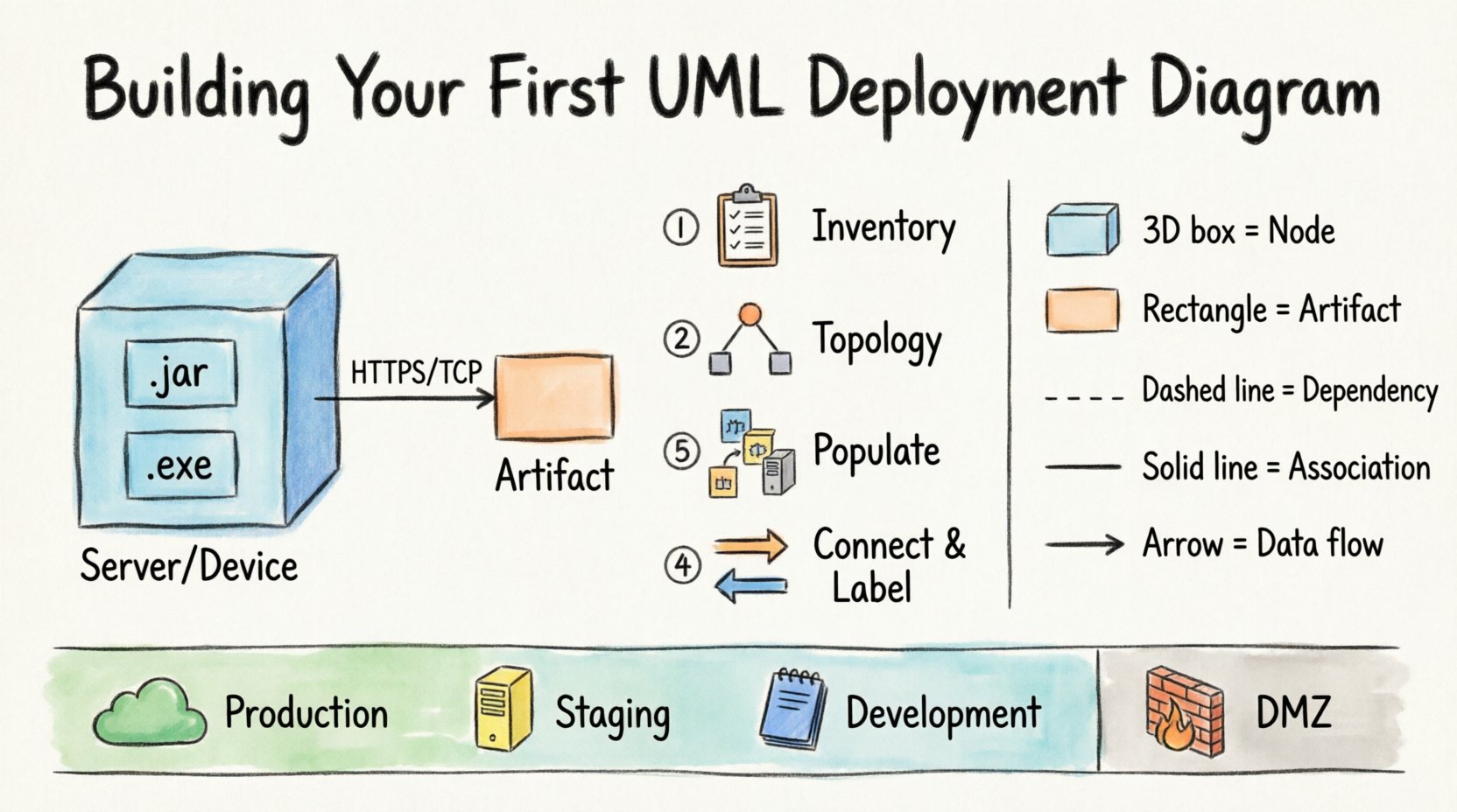
1. Nodes (The Hardware) 🖥️
A node represents a physical or computational resource. It is the container for artifacts. In a typical diagram, you will see different types of nodes:
- Device: A physical device with memory and processing capabilities. Examples include servers, routers, or workstations.
- Execution Environment: A software environment that provides a runtime for applications. Examples include application servers, databases, or virtual machines.
- Component: A modular part of the system that runs within a node.
When drawing nodes, think about the physical reality. Is this a cloud instance? Is it an on-premise rack? Is it a mobile device? The shape typically looks like a 3D box, but the label defines the type.
2. Artifacts (The Software) 📦
Artifacts represent the physical files or executables that are deployed to a node. They are the tangible results of the build process. Common artifacts include:
- Executable files (.exe, .jar, .dll)
- Configuration files (.xml, .json, .config)
- Database schemas or data dumps
- Libraries and dependencies
An artifact is often nested inside a node to show which hardware is hosting which software. This nesting is crucial for understanding ownership and resource allocation.
3. Associations (The Connections) 🔗
Lines connecting nodes represent communication paths. These are not just logical links; they imply network protocols and physical connectivity. Types of associations include:
- Communication Path: General network connectivity. Can be labeled with protocols like HTTP, TCP/IP, or HTTPS.
- Dependency: Indicates that one node relies on another for functionality.
- Association: A general structural link between elements.
Visual Notation Guide 🎨
Consistency in notation ensures that anyone reading the diagram understands the architecture without needing a legend. Below is a table summarizing standard symbols.
| Symbol / Shape | Element Name | Description |
|---|---|---|
| 3D Box | Node (Device) | Represents a physical device with processing power. |
| 2D Rectangle | Artifact | Represents a file, code, or data package. |
| Box with Tabs | Component | Represents a modular part of the software system. |
| Dashed Line | Dependency | Indicates a usage relationship. |
| Solid Line | Association | Indicates a structural link or connection. |
| Arrow | Directed Relationship | Indicates direction of data flow or dependency. |
Step-by-Step Construction Process 🛠️
Building a deployment diagram is not about drawing boxes randomly. It is a methodical process of discovery and mapping. Follow these phases to ensure accuracy.
Phase 1: Inventory and Discovery 📝
Before opening any modeling tool, gather information. You cannot map what you do not know. This phase involves interviewing system owners and reviewing technical documentation.
- Identify Hardware: List all servers, load balancers, firewalls, and storage units.
- Identify Software: List all applications, databases, and middleware components.
- Identify Protocols: Determine how these components communicate (APIs, messaging queues, file transfers).
- Identify Boundaries: Note where one system ends and another begins (e.g., internal network vs. public internet).
Phase 2: Define the Topology 🗺️
Once you have the inventory, arrange the nodes on the canvas. Do not worry about aesthetics yet; focus on logical grouping.
- Group by Environment: Create separate areas for Development, Staging, and Production. This helps visualize the deployment pipeline.
- Group by Function: Cluster nodes that serve similar purposes, such as a “Database Cluster” or “Web Tier”.
- Place External Systems: Clearly mark third-party services or legacy systems that interact with your architecture.
Phase 3: Populate with Artifacts 📦
Now, place the software elements onto the hardware nodes.
- Drag and Drop: Visually place artifacts inside the node shapes they reside on.
- Label Clearly: Ensure artifact names match the actual filenames or deployment package names used in the CI/CD pipeline.
- Indicate Versions: If critical, add version numbers to artifacts to track deployment history.
Phase 4: Connect and Label 🔗
Draw the lines that connect your nodes. This is where the “how” is explained.
- Draw Communication Lines: Connect nodes that exchange data.
- Label Protocols: Add text labels to the lines (e.g., “HTTPS”, “SQL”, “MQTT”).
- Indicate Direction: Use arrows to show which way data flows. For example, a request flows from Client to Server, while a response flows back.
Handling Multiple Environments 🔄
One of the most common challenges in deployment modeling is representing the differences between environments. You do not want to draw three identical diagrams if the architecture is similar but the configuration differs.
Consider using these techniques:
- Stacked Views: Draw the production environment as the primary view. Use a separate box or note to indicate that a development environment exists with similar nodes but fewer resources.
- Color Coding: Use colors to distinguish environments (e.g., Green for Production, Yellow for Staging, Blue for Development). This provides immediate visual context.
- Annotation: Add notes indicating resource constraints. For example, a note might say “Development Node uses 2GB RAM, Production Node uses 16GB RAM”.
Always ensure the diagram reflects the current state of the infrastructure. If the production environment has been scaled up, the diagram must reflect the new node count to remain useful.
Common Pitfalls to Avoid 🚫
Even experienced architects make mistakes when modeling. Being aware of these common errors will save you time and prevent confusion.
- Over-Complicating: Do not try to show every single microservice in a monolithic deployment diagram. Aggregate services into logical nodes. Detail belongs in sequence or component diagrams.
- Ignoring Security Zones: Failing to show firewalls or DMZ (Demilitarized Zone) boundaries can lead to security vulnerabilities. Clearly mark where the public network meets the private network.
- Static Data Flows: Deployment diagrams are often static, but data flows are dynamic. Use arrows to indicate the primary flow of information, but acknowledge that some connections are bi-directional.
- Outdated Diagrams: An architecture diagram that is months old is worse than no diagram. It gives a false sense of security. Plan for diagram maintenance.
- Confusing Logical and Physical: Do not mix logical components (like “User Interface”) with physical nodes (like “Web Server”) in a way that confuses the reader. Keep the distinction clear.
Security Implications of Topology 🔒
A deployment diagram is often the first document reviewed during a security audit. It reveals the attack surface of the system.
When reviewing your diagram for security, ask:
- Public Exposure: Are any database nodes directly connected to the internet? They should not be.
- Encryption: Are sensitive connections labeled with encryption protocols (TLS/SSL)? If a line represents sensitive data, it should be encrypted.
- Redundancy: Is there a single point of failure? If one node dies, does the whole system stop? Show redundant nodes in your diagram to demonstrate resilience.
- Access Control: Do the connections imply strict access controls? Use notes to specify “Auth Required” or “Firewall Restricted” on specific links.
Integration with Other Diagrams 🔗
A deployment diagram does not exist in isolation. It is part of a larger modeling ecosystem.
- Class Diagram: The deployment diagram shows where classes (code) run. The class diagram shows what the code does.
- Sequence Diagram: The deployment diagram shows the nodes. The sequence diagram shows the messages passing between objects on those nodes.
- Component Diagram: The component diagram breaks down the software. The deployment diagram places that software on hardware.
When creating a deployment diagram, reference the component diagram to ensure every artifact has a corresponding logical component. This ensures traceability from design to deployment.
Maintaining and Evolving Your Diagram 📈
Software systems are living entities. They change, scale, and evolve. Your deployment diagram must evolve with them.
Version Control
Store your diagram files in a version control system alongside your code. This allows you to:
- Track changes over time.
- Revert to previous architectures if a deployment fails.
- See who made changes and when.
Automated Generation
For large systems, manually updating diagrams is unsustainable. Some tooling allows you to generate diagrams from infrastructure-as-code (IaC) files like Terraform or Kubernetes manifests. This ensures the diagram is always in sync with reality.
Regular Reviews
Schedule regular reviews of your architecture diagrams during sprint planning or architectural governance meetings. Ask the team: “Does this diagram match what we deployed last week?” If the answer is no, update the diagram immediately.
Conclusion on Architecture Clarity 🧭
Creating a UML deployment diagram is a foundational skill for system architects. It transforms abstract requirements into a concrete map of reality. By focusing on nodes, artifacts, and connections, you create a visual language that aligns developers, operations, and business stakeholders.
Remember that the goal is clarity, not decoration. A simple diagram that accurately reflects the infrastructure is more valuable than a complex, beautiful one that is outdated. Use the steps outlined here to build diagrams that serve as reliable references throughout the software lifecycle. Keep your tools neutral, your notation standard, and your focus on the physical reality of your system.
Start with a small project. Map out a simple web application with a database. Then expand to microservices. As you practice, the process of visualizing infrastructure will become second nature, allowing you to spot design flaws before they reach production.

