


In the complex landscape of software engineering, understanding how an application behaves outside the development environment is critical. A deployment diagram serves as a technical blueprint that maps the physical architecture of a system. It moves beyond abstract logic to show where software components actually run. This visual representation provides stakeholders with a clear view of hardware, network topology, and software artifacts.
When teams invest time in creating accurate deployment diagrams, they gain insight into infrastructure dependencies, potential bottlenecks, and security boundaries. These diagrams are not merely static drawings; they are living documents that reflect the operational reality of a software product. By analyzing these diagrams, architects can identify risks before they impact production environments.
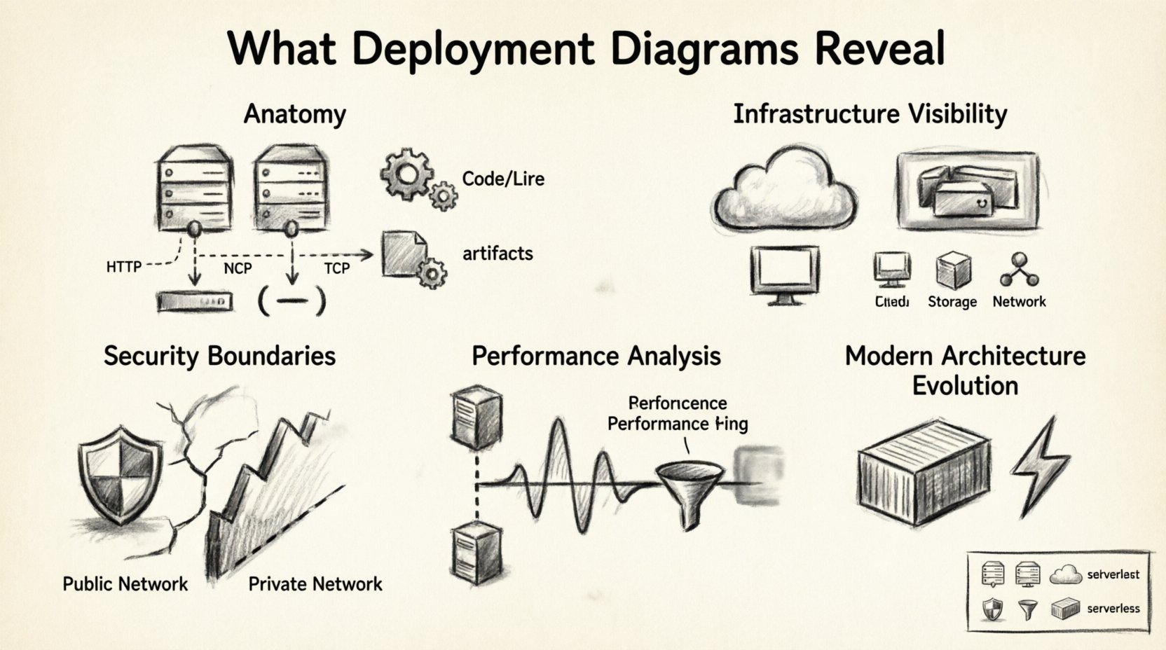
The Anatomy of a Deployment Diagram 🧩
At its core, a deployment diagram consists of three primary elements: nodes, artifacts, and communication paths. Each element plays a specific role in defining the system’s physical structure. Understanding these components is the first step to interpreting the real-world setup effectively.
- Nodes: These represent the physical or virtual computing resources. They can be servers, routers, mainframes, or mobile devices. In modern cloud environments, these nodes often represent virtual machines or container instances rather than physical hardware.
- Artifacts: These are the software components deployed onto the nodes. Examples include executables, libraries, database schemas, and configuration files. They represent the actual code and data that the system processes.
- Communication Paths: These lines connect nodes and artifacts, indicating how data flows between them. They specify the protocols used, such as HTTP, TCP/IP, or database query languages, and the network type, whether private or public.
By examining these elements together, you can determine the distribution of logic and data. This distribution directly influences performance and reliability. If too much processing is concentrated on a single node, that node becomes a single point of failure. Conversely, spreading logic across multiple nodes can improve resilience but may increase latency.
Infrastructure Visibility 🔌
One of the most significant insights a deployment diagram provides is infrastructure visibility. It answers questions about where the system lives and how it is provisioned. This visibility is essential for capacity planning and cost management.
Physical vs. Virtual Resources
Older diagrams often depicted physical racks and servers. Modern diagrams frequently utilize virtual nodes to represent cloud instances. Regardless of the medium, the diagram reveals the tier structure of the application.
- Compute Nodes: These run the application logic. The diagram shows how many instances exist and how they are distributed.
- Storage Nodes: These hold persistent data. The diagram indicates whether storage is local to a compute node or centralized on a separate storage array.
- Network Nodes: These include load balancers, firewalls, and gateways. Their placement in the diagram highlights where traffic enters and exits the system.
Scalability Indicators
Scalability is often inferred from the number of nodes and their connections. A diagram showing multiple identical nodes suggests horizontal scaling capabilities. It implies that the system can handle increased load by adding more instances. If the diagram shows a single central database node, it signals a vertical scaling limitation where performance depends on the power of that one machine.
Security and Compliance Boundaries 🔒
Security is a critical aspect of any real-world setup. Deployment diagrams help visualize trust boundaries and security controls. They show which parts of the system are exposed to the public internet and which are isolated within a private network.
Trust Zones
Architects use these diagrams to define zones of trust. For example, a web server facing the internet is in a low-trust zone, while a database server holding sensitive user data is in a high-trust zone. The diagram reveals how these zones are separated.
- Firewall Rules: Connections crossing zone boundaries often imply firewall rules. If a path exists from the internet to the database directly, it indicates a significant security risk.
- Encryption Points: Secure communication paths, often denoted by specific line styles or labels, show where data is encrypted. This is vital for compliance with standards like GDPR or HIPAA.
- Authentication Services: Dedicated nodes for identity management show where authentication occurs. This helps verify that user credentials are not exposed to application logic nodes.
Compliance Mapping
For regulated industries, the deployment diagram serves as evidence of control. Auditors often request these diagrams to verify that sensitive data does not leave a specific geographic region. By labeling nodes with location data, the diagram proves compliance with data residency laws.
Performance and Latency Analysis 📈
Performance issues often stem from poor architectural decisions visible in deployment diagrams. By analyzing the distance between nodes, teams can predict latency and throughput limitations.
Network Distance
The diagram shows the logical distance between components. If the application node and the database node are on the same physical machine, latency is minimal. If they are in different data centers, latency increases significantly. This distinction helps in optimizing data access patterns.
Bottleneck Identification
Nodes with many incoming connections often act as bottlenecks. If a single node processes requests from dozens of other nodes, it may become overloaded. The diagram highlights these choke points before they cause system slowdowns.
| Diagram Element | Performance Insight | Actionable Takeaway |
|---|---|---|
| Multiple Load Balancers | High availability and traffic distribution | Ensure health checks are configured to prevent routing to unhealthy nodes. |
| Single Database Node | Potential write bottleneck | Consider read replicas or sharding strategies. |
| Direct Internet-to-DB Connection | High latency and security risk | Introduce an application layer to mediate access. |
| Shared Storage Node | I/O contention risk | Monitor disk throughput and consider local storage for high-frequency data. |
Maintenance and Troubleshooting 🔧
When systems fail, deployment diagrams are invaluable for troubleshooting. They provide a map of dependencies, allowing engineers to trace the source of an error quickly.
Dependency Mapping
Every artifact relies on other components. The diagram clarifies these relationships. If a service stops responding, the diagram helps determine if the issue lies with the service itself, the network connecting it, or the data it requires.
- Root Cause Analysis: Engineers can follow the communication paths backward to find where the failure originated.
- Impact Assessment: If a specific node goes down, the diagram shows which applications are affected. This helps prioritize recovery efforts.
- Version Control: Diagrams can include version numbers for artifacts. This ensures that maintenance teams know which software version is running on which node.
Configuration Management
Deployment artifacts often require specific configuration files. The diagram can show where these configurations reside. This is crucial for ensuring consistency across environments. If a configuration drifts in one environment but not another, the diagram highlights the discrepancy.
Common Mistakes to Avoid ⚠️
Creating a deployment diagram is straightforward, but creating a useful one requires discipline. Several common pitfalls reduce the value of these diagrams.
- Overcomplication: Including every single microservice in a large system can make the diagram unreadable. It is better to group related services into clusters or nodes.
- Outdated Information: Infrastructure changes frequently. A diagram that is not updated regularly becomes misleading. It should be treated as part of the deployment pipeline.
- Lack of Context: A diagram without labels regarding network types or protocols is hard to interpret. Always annotate connections with the protocol used.
- Ignoring External Systems: Many applications rely on third-party APIs or legacy systems. These should be included as external nodes to show the full scope of the system.
Evolution in Modern Architecture 🔄
As technology evolves, so do deployment diagrams. Traditional server-based models are giving way to containerized and serverless architectures. Understanding how to represent these changes is essential for modern architects.
Containerization
In containerized environments, nodes represent orchestration platforms rather than individual servers. The artifacts represent container images. This shift changes how we view scaling. Instead of adding hardware, we add container instances. The diagram should reflect this abstraction layer.
Serverless Computing
Serverless architectures abstract the infrastructure entirely. In these cases, nodes might represent event sources or function endpoints. The diagram focuses more on data flow than on physical resources. This requires a different level of abstraction.
Hybrid Environments
Many organizations operate in hybrid environments, combining on-premise hardware with cloud resources. The diagram must clearly distinguish between these environments. Color coding or different node shapes can help separate internal resources from external cloud resources.
Best Practices for Documentation 📝
To ensure deployment diagrams remain effective, follow these guidelines during creation and maintenance.
- Standardize Notation: Use consistent symbols for nodes and connections. This reduces confusion for new team members.
- Version Your Diagrams: Store diagrams alongside the codebase. Tag them with the software version they represent.
- Keep it High Level: Focus on the topology. Do not clutter the diagram with internal logic details that belong in sequence or class diagrams.
- Review Regularly: Include diagram reviews in sprint planning or release management meetings. Ensure they match the deployed state.
- Automate Generation: Where possible, generate diagrams from infrastructure code. This ensures the documentation is always in sync with the reality.
Integrating with DevOps Pipelines 🚀
Deployment diagrams should not exist in isolation. They are part of the broader DevOps ecosystem. Integrating them into the pipeline ensures that the architecture is validated continuously.
- Infrastructure as Code: Use IaC tools to define the infrastructure. Generate diagrams from the code to ensure accuracy.
- Monitoring Integration: Link diagram nodes to monitoring dashboards. Clicking a node in the diagram should show real-time metrics.
- Deployment Verification: Use the diagram to verify that the deployment process completed successfully. Check if all expected artifacts are present on the nodes.
Understanding Cross-Platform Dependencies 🌐
In distributed systems, components often run on different operating systems. The deployment diagram reveals these heterogeneity requirements.
- OS Specifics: Some software requires Linux, while others run on Windows. The diagram should indicate the operating system for each node.
- Middleware: Middleware like message brokers or caching layers often have specific hardware requirements. These should be noted on the diagram.
- Language Runtimes: Different languages require different runtimes. The diagram helps identify where these runtimes are installed.
Final Considerations 🏁
Deployment diagrams provide a critical layer of visibility into the operational state of an application. They bridge the gap between logical design and physical implementation. By carefully analyzing nodes, artifacts, and connections, teams can optimize performance, enhance security, and streamline maintenance.
The value of these diagrams extends beyond the initial design phase. They serve as reference points during troubleshooting, planning for capacity, and communicating with stakeholders. A well-maintained diagram reduces ambiguity and accelerates decision-making. It ensures that everyone involved understands the system’s constraints and capabilities.
As systems grow in complexity, the need for clear architectural documentation increases. Deployment diagrams remain a fundamental tool for this purpose. They offer a structured way to communicate the physical reality of software systems. By adhering to best practices and avoiding common pitfalls, teams can leverage these diagrams to build more robust and reliable applications.
Investing in accurate documentation pays dividends over time. It reduces the risk of configuration errors and helps onboard new engineers more effectively. When the physical setup is well-documented, the path to innovation becomes clearer and less obstructed by infrastructure surprises.

")