


Unified Modeling Language (UML) provides a standardized set of diagrams to visualize, specify, construct, and document the artifacts of a software system. However, the sheer variety of available diagrams often leads to confusion among architects, developers, and stakeholders. Which diagram best represents the physical infrastructure? Which one captures the logical flow of data? And when should you rely on a deployment diagram versus a sequence diagram?
Understanding the distinct purpose of each diagram type is critical for effective system design. Misusing these tools can lead to architectural ambiguities, deployment failures, and communication breakdowns between teams. This guide provides a deep dive into the deployment diagram and contrasts it with other common UML artifacts. We will explore when to apply each model to ensure clarity and precision in your software architecture.
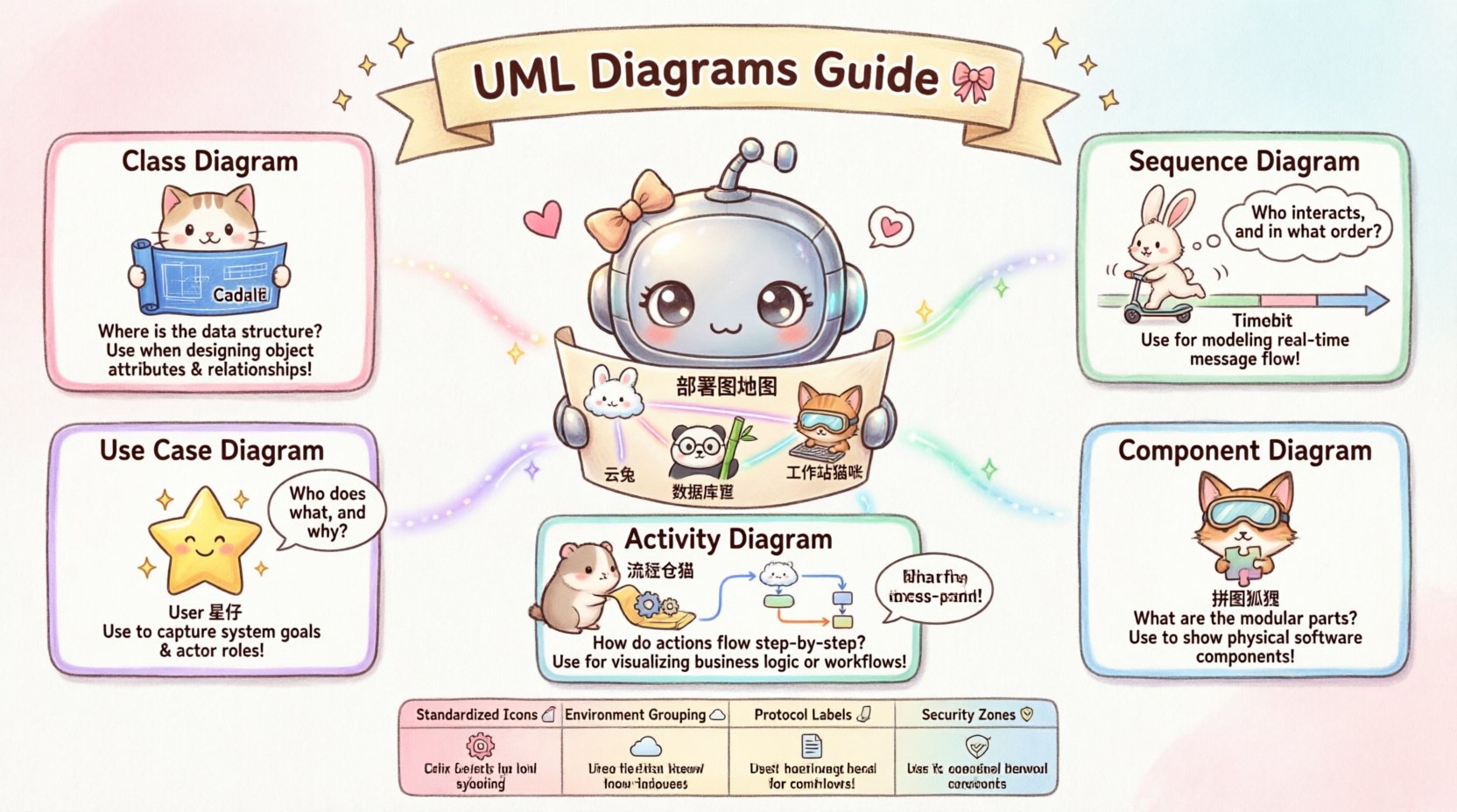
What is a Deployment Diagram? 🖥️
A deployment diagram represents the physical architecture of a system. It models the hardware and software components that constitute the runtime environment. Unlike other diagrams that focus on logic or behavior, this artifact maps the tangible resources where software executes.
- Nodes: These represent physical computing devices, such as servers, workstations, mainframes, or cloud instances. They can be categorized as computational nodes (where processing happens) or communication nodes (where routing occurs).
- Artifacts: These are physical representations of software units. Examples include executable files, libraries, database schemas, or configuration files. Artifacts are deployed onto nodes.
- Associations: These define the connections between nodes and artifacts. They illustrate how software components are distributed across the infrastructure.
- Communication Paths: These lines indicate how nodes interact with each other, often representing network protocols or physical connections.
The primary goal of a deployment diagram is to answer the question: Where does the software run? It provides a high-level view of the topology, helping operations teams understand the infrastructure requirements and security boundaries.
Deployment Diagram vs. Class Diagram 🏗️
The class diagram is perhaps the most common UML artifact, focusing on the static structure of the system from a software engineering perspective. It defines classes, their attributes, operations, and relationships (inheritance, association, aggregation).
Key Differences
- Focus: Class diagrams model the logical structure (code organization), while deployment diagrams model the physical structure (hardware organization).
- Abstraction Level: A class diagram abstracts away the hardware. It does not care if the code runs on a single laptop or a distributed cluster. A deployment diagram explicitly cares about the hardware.
- Stakeholders: Developers and architects use class diagrams to design code. System administrators and DevOps engineers use deployment diagrams to manage infrastructure.
When to Use Each
Use a class diagram when defining the domain model, database schema design, or API contract structures. It ensures that the code logic is sound before implementation begins.
Use a deployment diagram when planning the release strategy, configuring load balancers, or designing disaster recovery zones. It ensures the logical classes have a place to reside.
Example Scenario: You have an authentication service. The class diagram defines the User, Role, and Token classes. The deployment diagram shows where the authentication service executable is placed relative to the database server and the web server.
Deployment Diagram vs. Sequence Diagram ⏱️
Sequence diagrams illustrate how objects interact with each other over time. They depict a specific scenario, showing the order of messages passed between objects or components.
Key Differences
- Dimension: Sequence diagrams add the dimension of time. Deployment diagrams are static; they show the state of the system at a point in time.
- Interaction vs. Topology: A sequence diagram shows how a request flows logically. A deployment diagram shows where that request travels physically.
- Granularity: Sequence diagrams often focus on method calls between software objects. Deployment diagrams focus on network hops between servers.
When to Use Each
Use a sequence diagram to debug complex interactions, document API workflows, or explain user stories to business analysts. It clarifies the logic of a specific transaction.
Use a deployment diagram when analyzing latency, network bottlenecks, or security zones. If a sequence diagram shows a message taking too long, the deployment diagram helps identify if the network path is the cause.
Example Scenario: A user logs in. The sequence diagram shows the browser sending credentials to the API, which queries the database. The deployment diagram shows the browser connecting to a load balancer, which forwards traffic to an application server, which connects to a database cluster.
Deployment Diagram vs. Use Case Diagram 👤
Use case diagrams capture the functional requirements of a system from the perspective of external actors. They define what the system does, not how it does it.
Key Differences
- Boundary: Use case diagrams define the system boundary based on user goals. Deployment diagrams define the boundary based on physical resources.
- Actor vs. Node: Actors in use case diagrams represent human users or external systems. Nodes in deployment diagrams represent computing devices.
- Scope: Use cases are often cross-cutting and independent of the underlying technology. Deployment is inherently tied to the technology stack.
When to Use Each
Use a use case diagram during the requirements gathering phase. It helps stakeholders agree on what features are needed without getting bogged down in technical details.
Use a deployment diagram during the implementation and operations phase. It translates the agreed-upon features into a physical reality.
Example Scenario: A use case diagram shows a “Shopkeeper” actor interacting with a “Point of Sale” system. A deployment diagram shows the POS terminal, the local inventory server, and the central accounting cloud instance.
Deployment Diagram vs. Component Diagram 🧩
Component diagrams describe the organization and dependencies of software components. They are a step above class diagrams, grouping classes into modules or libraries.
Key Differences
- Logical vs. Physical: Both deal with software, but component diagrams are still logical. They group code. Deployment diagrams are physical. They place code on hardware.
- Port and Interface: Component diagrams define interfaces (provided/required). Deployment diagrams define communication protocols (HTTP, TCP, etc.) between nodes.
- Instantiation: A component diagram shows one component structure. A deployment diagram can show multiple instances of the same component running on different nodes.
When to Use Each
Use a component diagram to manage module boundaries, dependency injection, and service contracts. It helps developers understand how to plug different parts of the system together.
Use a deployment diagram to manage scaling, replication, and failover. It helps operations understand how to replicate components across the network.
Example Scenario: A component diagram shows a “Payment Service” and an “Inventory Service” linked via an interface. A deployment diagram shows the Payment Service running on three separate containers across three different availability zones.
Deployment Diagram vs. Activity Diagram 🔄
Activity diagrams model the flow of control or data within a system. They are similar to flowcharts and are used to describe the dynamic behavior of the system.
Key Differences
- Process vs. Platform: Activity diagrams describe the process or workflow. Deployment diagrams describe the platform.
- Flow vs. Placement: Activity diagrams show decision points and loops. Deployment diagrams show static relationships between resources.
- Concurrency: Activity diagrams show concurrent threads of activity. Deployment diagrams show concurrent hardware resources.
When to Use Each
Use an activity diagram to map business processes, workflow automation, or complex state transitions. It visualizes the journey of a task.
Use a deployment diagram to visualize the environment that supports the workflow. It ensures the workflow has the necessary resources to complete.
Example Scenario: An activity diagram shows the steps of an order fulfillment process (Receive Order -> Check Stock -> Ship). A deployment diagram shows the servers hosting the order service, the stock service, and the shipping service.
Decision Matrix: Which Diagram to Choose? 📋
Choosing the right diagram depends on the specific question you are trying to answer. The following table summarizes the primary use cases for each diagram type.
| Diagram Type | Primary Question | Target Audience | Abstraction Level |
|---|---|---|---|
| Deployment | Where does it run? | Ops, Architects, Security | Physical Infrastructure |
| Class | What is the data structure? | Developers, Database Admins | Logical Code Structure |
| Sequence | How does it interact over time? | Developers, QA, Analysts | Behavioral Logic |
| Use Case | What does the user achieve? | Stakeholders, Product Managers | Functional Requirements |
| Component | How are modules organized? | Developers, System Architects | Logical Grouping |
| Activity | How does the process flow? | Business Analysts, Process Owners | Workflow Dynamics |
Best Practices for Deployment Diagrams 🛠️
Creating effective deployment diagrams requires discipline. A cluttered diagram obscures the architecture rather than revealing it. Follow these guidelines to maintain clarity.
- Standardize Node Icons: Use consistent shapes for different types of nodes (e.g., cylinders for databases, boxes for servers). This allows readers to identify resources instantly.
- Group by Environment: Clearly separate production, staging, and development environments. Use distinct boundaries or colors to indicate isolation.
- Label Communication Protocols: Don’t just draw lines. Label them with the protocol (e.g., HTTPS, SSH, JDBC) to indicate security and performance characteristics.
- Minimize Detail: Do not list every single server in a large cloud environment unless they are unique. Use stereotypes or aggregate nodes to represent clusters.
- Indicate Security Zones: Use dashed lines or shaded regions to denote firewalls, DMZs, or secure internal networks. This is vital for security audits.
- Version Control: Treat deployment diagrams as code. They change frequently with infrastructure updates. Keep them in the same repository as your configuration files.
Deployment Diagrams in Modern Architectures ☁️
The landscape of software deployment has shifted dramatically. Traditional monolithic architectures have given way to microservices, containerization, and serverless computing. This evolution impacts how we draw deployment diagrams.
Containerization and Orchestration
In containerized environments, nodes are less relevant than clusters. A deployment diagram might show a cluster of nodes running a container orchestration platform. The artifacts are no longer just executables; they are container images.
- Nodes: Represent worker nodes in a cluster.
- Artifacts: Represent container images and configuration maps.
- Connections: Represent internal service meshes rather than direct network calls.
Cloud-Native Dynamics
Cloud environments are often dynamic. Servers spin up and down automatically. Static deployment diagrams can become outdated quickly.
- Logical Deployment: Focus on the logical topology (regions, availability zones) rather than specific instance IDs.
- Managed Services: Represent managed services (like database-as-a-service) as distinct nodes, even if you do not manage the underlying hardware.
- Asynchronous Messaging: Include message queues and event streams as artifacts, as they are critical infrastructure components.
Hybrid and Multi-Cloud Strategies
Many organizations run hybrid models. Your diagram must clearly show the split between on-premises hardware and cloud resources.
- Connectivity: Highlight the link between private networks and public clouds. This is often a security bottleneck.
- Data Sovereignty: Label nodes with geographic locations to ensure compliance with data residency laws.
- Latency: Use thicker lines or specific labels to indicate high-latency links that might affect application performance.
Common Pitfalls to Avoid ⚠️
Avoiding mistakes is just as important as following best practices. Here are common errors that reduce the value of deployment diagrams.
- Over-Engineering: Do not draw every single switch, router, or firewall unless it is critical to the system’s logic. Too much detail creates noise.
- Ignoring Non-Functional Requirements: A deployment diagram should reflect performance needs. If you need high availability, show redundant nodes. If you need low latency, show co-location.
- Disconnecting from Code: Ensure the artifacts in your diagram match the actual codebase. If the code changes but the diagram does not, it becomes misleading documentation.
- Static Representation of Dynamic Systems: Do not present a dynamic scaling system as a fixed set of servers. Use annotations to indicate auto-scaling capabilities.
- Skipping Security Context: Never omit security boundaries. A deployment diagram without security zones is a security risk in itself.
Integrating Diagrams into the Workflow 🔄
Deployment diagrams do not exist in isolation. They are part of a larger ecosystem of documentation. Integrating them effectively ensures a cohesive understanding of the system.
- Link with CI/CD: Connect the diagram to your pipeline configuration. The pipeline should deploy artifacts to the nodes shown in the diagram.
- Link with Monitoring: Map the nodes in the diagram to your monitoring dashboards. This allows you to visualize system health on the infrastructure map.
- Link with Incident Response: Use the diagram during outages. It helps teams quickly identify which physical resources are affected by a logical failure.
The integration of these diagrams creates a single source of truth. Developers understand the code, operations understand the infrastructure, and architects understand the relationship between the two. This alignment reduces friction and accelerates delivery.
Final Thoughts on UML Selection 🎯
Selecting the correct UML diagram is a matter of intent. A deployment diagram is not a replacement for a class diagram, nor is it a substitute for a sequence diagram. Each serves a specific function in the lifecycle of software development.
By understanding the unique strengths of the deployment diagram, teams can better bridge the gap between software design and infrastructure reality. It transforms abstract code into a tangible system that can be secured, scaled, and maintained.
When planning your next architecture review, ask yourself what you need to communicate. If the answer involves hardware, network, or runtime environment, the deployment diagram is your tool of choice. If the answer involves logic, data, or user interaction, other diagrams take precedence. Using the right tool for the job ensures clarity, precision, and successful project outcomes.
Remember, documentation is a living artifact. As the system evolves, so must the diagrams. Keep them updated, keep them relevant, and keep them aligned with the actual state of the infrastructure. This commitment to accurate modeling pays dividends in maintainability and operational stability.

")