


System architecture serves as the blueprint for software engineering. It dictates how components interact, how data flows, and how infrastructure supports business logic. Within this landscape, the UML Deployment Diagram stands out as a critical tool for visualizing the physical topology of a system. It maps software artifacts to hardware nodes, providing a clear view of the deployment environment.
However, as systems grow, these diagrams often become tangled webs of connections. Excessive detail can obscure the true architecture, making maintenance difficult and communication inefficient. This guide explores how to construct deployment diagrams that remain useful, clear, and maintainable over time.
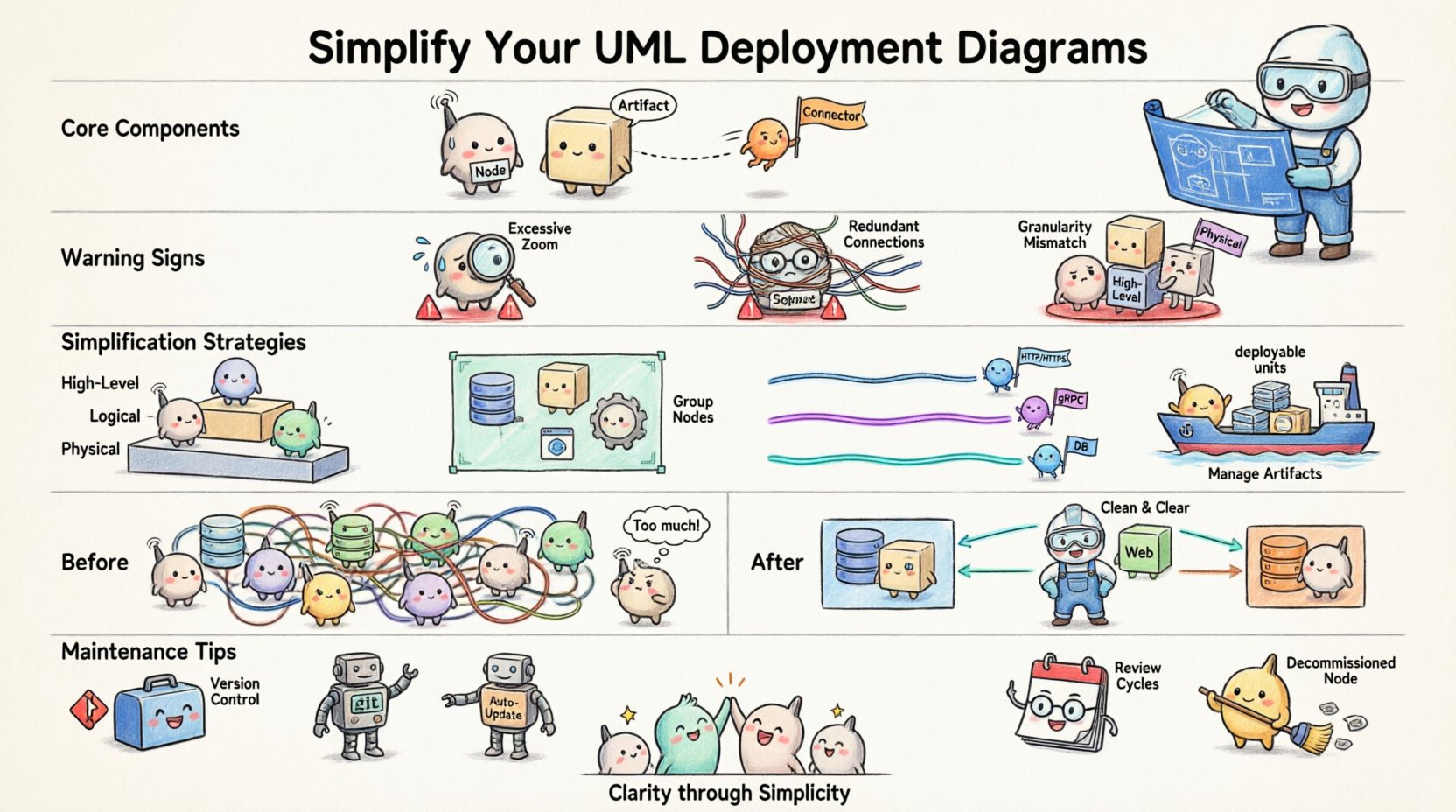
🏗️ Understanding the Core Components
Before addressing complexity, one must understand the fundamental elements. A deployment diagram is not merely a drawing; it is a specification of the physical infrastructure.
- Nodes: These represent physical or virtual computing resources. They can be servers, databases, mobile devices, or cloud instances.
- Artifacts: These are the deployable units of software, such as executables, libraries, configuration files, or containers.
- Connectors: These depict the communication paths between nodes, often representing network protocols or APIs.
When these elements are combined without discipline, the diagram loses its value. The goal is to represent the system accurately without overwhelming the reader.
🚩 Signs of Over-Complexity
Complexity does not always equate to sophistication. Sometimes, a diagram is too detailed for its intended audience. Recognizing the symptoms of an overly complex diagram is the first step toward improvement.
- Excessive Zoom Levels: If you cannot see the whole system on one screen without constant scrolling, the scope is likely too broad for a single view.
- Redundant Connections: Multiple lines connecting the same two nodes often indicate a lack of abstraction. A single line labeled with the protocol is usually sufficient.
- Granularity Mismatch: Mixing high-level server clusters with individual microservice containers in the same view creates visual noise.
- Missing Abstraction: Failing to group related components forces the viewer to process too many individual items at once.
🧩 Strategies for Simplification
Simplifying a deployment diagram requires deliberate design choices. The following strategies help maintain clarity while preserving essential technical details.
1. Leverage Abstraction Layers
Do not attempt to model every server and container in a single diagram. Instead, create multiple views based on the audience and the purpose of the documentation.
- High-Level View: Focus on regions, data centers, or major cloud zones. Use grouped nodes to represent clusters of servers.
- Logical View: Show how services interact across the network without detailing the specific hardware specs.
- Physical View: Reserve this for DevOps teams who need to know exact IP ranges, specific hardware configurations, or container orchestration details.
2. Group Related Nodes
Use compartments or frames to group nodes that belong to the same logical unit. This reduces the cognitive load required to understand the topology.
- Group all database nodes under a “Data Layer” frame.
- Group web servers under a “Frontend” frame.
- Group processing units under a “Backend” frame.
This visual hierarchy allows stakeholders to focus on the flow of data between major systems rather than individual machines.
3. Standardize Connections
Network connections should follow a consistent naming convention. Avoid drawing unique lines for every API call. Instead, use standardized connectors.
- Use a single line labeled “HTTP/HTTPS” for web traffic.
- Use a line labeled “gRPC” for internal service communication.
- Use a line labeled “Database Protocol” for data persistence requests.
Consistency ensures that the diagram is readable at a glance. If a reader sees a specific line type, they should immediately know the nature of the communication.
4. Manage Artifacts Carefully
Artifacts should represent deployable units, not code files. Linking a specific class file to a node is rarely useful. Focus on the binaries, containers, or libraries that run on the node.
- Use container images instead of specific JAR files.
- Use configuration packages instead of individual config files.
- Highlight only critical artifacts that change frequently or are security-sensitive.
📊 Comparison of Complex vs. Clean Models
The table below illustrates the difference between a cluttered approach and a streamlined approach.
| Feature | Over-Complex Model | Optimized Model |
|---|---|---|
| Node Representation | Individual VMs and containers shown separately | Clusters and logical groups represented |
| Connectivity | Every API call drawn as a separate line | Protocol-based lines summarizing traffic flow |
| Labeling | Full file paths and version numbers | Service names and generic artifact types |
| Layout | Random placement based on initial drawing | Logical flow from left to right or top to bottom |
| Utility | Only useful for a specific deployment instance | Useful for architecture planning and onboarding |
🔄 Maintenance and Evolution
A deployment diagram is a living document. As the system evolves, the diagram must evolve with it. However, frequent changes often lead to decay. To prevent this, establish a maintenance routine.
- Version Control: Treat diagrams like code. Store them in a repository alongside the application source. This ensures history is tracked and changes are reviewed.
- Automated Updates: Where possible, use tools that generate diagrams from infrastructure code. This reduces the gap between reality and documentation.
- Review Cycles: Schedule periodic reviews during sprint retrospectives. Ask if the diagram still accurately reflects the current infrastructure.
- Remove Dead Code: If a node is decommissioned, remove it from the diagram immediately. Stale information erodes trust in the documentation.
🔍 Common Pitfalls to Avoid
Even experienced architects make mistakes when modeling deployment environments. Being aware of common pitfalls helps avoid them.
- Ignoring Latency: Failing to show geographical distribution can hide latency issues. If a node in Tokyo communicates with a node in London, indicate this distinction.
- Over-Modeling Security: While security is vital, drawing every firewall rule makes the diagram unreadable. Use a separate security diagram for granular access control details.
- Static Assumptions: Assume infrastructure is static. Cloud environments scale dynamically. Use labels to indicate auto-scaling groups rather than fixed numbers of servers.
- Ignoring External Services: Third-party APIs and SaaS platforms are part of the deployment. Include them as external nodes to show dependencies clearly.
🛠️ Implementation Patterns
Certain patterns emerge repeatedly in system architecture. Adopting these patterns in your diagrams promotes consistency across teams.
The Hub-and-Spoke Model
When multiple services depend on a central resource, such as a database or message queue, draw them radiating from the center. This highlights the central dependency and potential bottleneck.
The Pipeline Model
For data processing systems, arrange nodes horizontally to show the flow of data from ingestion to storage. This helps visualize where data transformations occur.
The Redundant Pair Model
For high-availability requirements, show paired nodes clearly. Use dashed lines to indicate failover relationships between primary and secondary nodes.
📝 A Review Checklist
Before finalizing a deployment diagram, run through this checklist to ensure clarity and accuracy.
- Scope: Does the diagram fit on a standard page or screen?
- Labels: Are all nodes and connections clearly labeled with standard terms?
- Consistency: Are similar components drawn in the same style?
- Relevance: Does every element add value to the understanding of the system?
- Audience: Is the level of detail appropriate for the intended reader?
- Updates: Is this diagram synchronized with the current infrastructure state?
🚀 Final Considerations
The value of a UML Deployment Diagram lies in its ability to communicate. If the diagram confuses the reader, it has failed its primary purpose. By focusing on abstraction, consistency, and maintenance, you can create diagrams that serve as reliable references for your team.
Remember that simplicity is not about removing information; it is about organizing it so that the critical details stand out. A well-structured diagram reduces onboarding time for new engineers, aids in troubleshooting production issues, and clarifies architectural decisions for stakeholders.
Start with the high-level view. Add detail only when necessary. Remove detail when it no longer serves a purpose. This iterative approach ensures your diagrams remain relevant assets throughout the lifecycle of the software.
By adhering to these principles, you contribute to a culture of clear technical communication. Your diagrams become a shared language that bridges the gap between business requirements and technical implementation.

