


In modern software architecture, visualizing how software components interact with physical hardware is critical. A UML Deployment Diagram provides the blueprint for this infrastructure. It maps the execution environment, showing nodes, artifacts, and communication paths. For mid-level engineers, understanding this diagram type bridges the gap between abstract code and tangible systems. This guide offers a deep dive into the mechanics, usage, and maintenance of deployment diagrams.
Understanding the Core Purpose 🎯
A UML Deployment Diagram is a structural diagram that illustrates the physical architecture of a system. Unlike class diagrams that focus on logic, or sequence diagrams that focus on behavior, the deployment diagram focuses on topology. It answers the question: where does this software run?
For engineers managing distributed systems, this visualization is not just documentation; it is a diagnostic tool. It helps in identifying bottlenecks, planning migrations, and onboarding new team members. The diagram represents the hardware and software infrastructure.
- Hardware Perspective: Shows servers, databases, and network devices.
- Software Perspective: Displays executables, libraries, and configuration files.
- Connectivity: Defines how these elements communicate via protocols.
By mapping these elements, teams can ensure that the logical design aligns with the physical reality. Misalignment here often leads to latency issues, security vulnerabilities, or deployment failures.
Key Elements of the Diagram 🔑
To construct a meaningful diagram, one must understand the standard stereotypes and shapes used. These elements form the vocabulary of the diagram.
1. Nodes 🖥️
A node represents a computational resource. It is a physical or virtual device capable of executing software. Nodes are typically depicted as 3D cubes. There are two main types of nodes:
- Device: Represents physical hardware like a server, router, or mobile phone. This is often used for the underlying infrastructure.
- Execution Environment: Represents a software environment where artifacts run, such as a JVM or a container runtime.
When defining nodes, specify their capabilities. For example, a node might have multiple processors or specific memory constraints. These details influence deployment strategies.
2. Artifacts 📦
Artifacts are physical representations of software components. They are the files or packages that get deployed to the nodes. Examples include:
- Executable files (.jar, .exe)
- Database schemas
- Configuration files
- Static assets (images, scripts)
Artifacts are often drawn as documents with a folded corner. They reside inside nodes. An artifact might be deployed to multiple nodes if it is a shared library or a microservice instance.
3. Communication Paths 🔗
Nodes do not exist in isolation. They communicate. Communication paths show the links between nodes. These are usually represented by lines connecting the nodes.
- Protocol: Specify the communication protocol (e.g., HTTP, TCP/IP, AMQP).
- Network Type: Indicate if the connection is local, LAN, or WAN.
Clear labeling on these paths is essential for security audits. Knowing which nodes talk to which prevents unauthorized data flow.
4. Interfaces and Port Symbols ⚡
Interfaces define the contract a node or component exposes. In deployment diagrams, these are often shown as lollipop symbols or provided/required icons. They clarify how an artifact interacts with the node or other artifacts.
Element Comparison Table 📊
| Element | Symbol | Represents | Common Usage |
|---|---|---|---|
| Node | 3D Cube | Hardware or Runtime | Server, Container, Database Instance |
| Artifact | Document | Software File | Binary, Script, Library |
| Association | Line | Relationship | Deployment, Containment |
| Dependency | Dashed Line | Usage | Requires library or config |
Structuring the Diagram for Clarity 📐
A deployment diagram can become chaotic quickly if not structured correctly. Engineers should avoid creating a “big picture” diagram that tries to show everything. Instead, use abstraction layers.
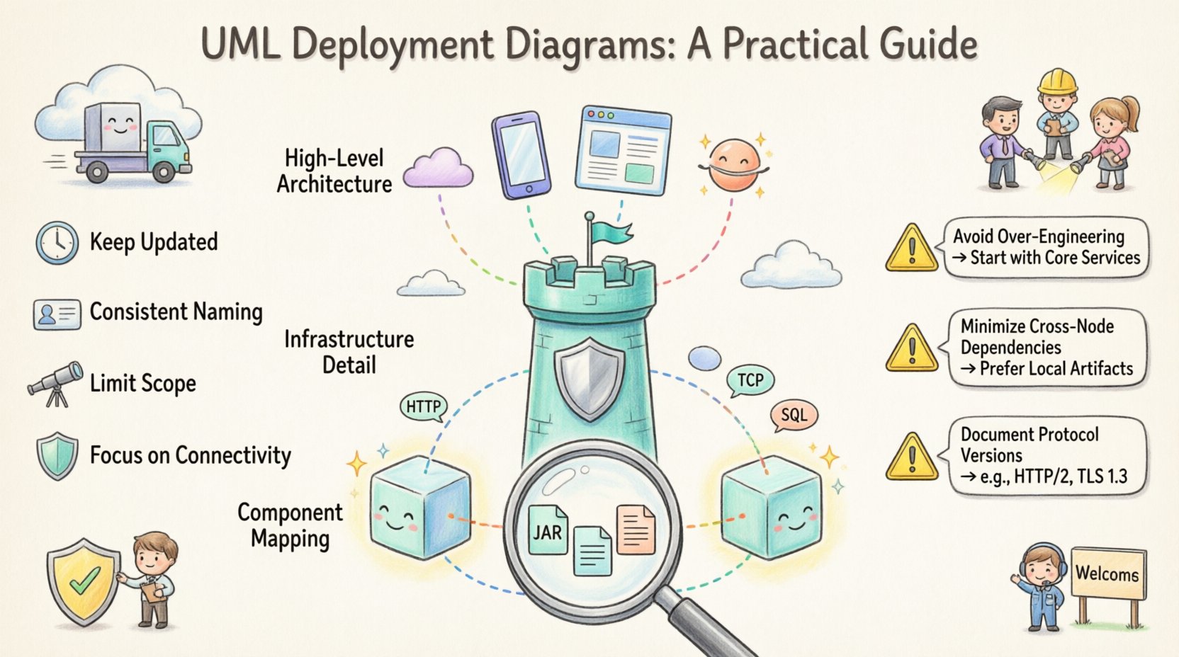
Level 1: High-Level Architecture 🌍
This view shows the major components of the system. It includes:
- Client tiers (Web, Mobile)
- Application servers
- Data storage layers
- External services
This level is useful for stakeholders and architects. It does not show individual files but rather logical groupings of services.
Level 2: Infrastructure Detail 🏠
This view dives into the specific hardware or cloud resources. It details:
- Specific server configurations
- Load balancers and firewalls
- Network segmentation
Engineers use this for capacity planning and infrastructure provisioning.
Level 3: Component Mapping 🔍
This is the most granular level. It maps specific artifacts to specific nodes. It is used during the deployment phase to ensure the correct files are placed on the correct servers.
Relationships and Dependencies 🔄
Understanding how elements relate is just as important as the elements themselves. Relationships define the flow of data and control.
Deployment Relationship
This shows that an artifact is placed on a node. It is a solid line with an arrow pointing to the node. The label usually says “deployed to”. This is the most common relationship in the diagram.
Communication Relationship
This shows connectivity between nodes. It implies a network link. Labels here should include the protocol. For example, a line between a Web Server and a Database Server labeled “SQL”.
Association
Used to show that two nodes are part of the same system or cluster. It helps in grouping logical units within the physical infrastructure.
Best Practices for Engineering Teams 🛠️
Creating these diagrams is a skill that improves over time. Adhering to best practices ensures the documentation remains useful.
- Keep it Updated: An outdated diagram is worse than no diagram. Infrastructure changes frequently. Update the diagram whenever a deployment strategy changes.
- Use Consistent Naming: Ensure node names match the configuration files. This reduces confusion during troubleshooting.
- Limit Scope: Do not include every single server in a massive cluster. Use aggregation to show a cluster of identical nodes rather than drawing fifty individual cubes.
- Focus on Connectivity: Security is often about connections. Highlighting the network paths helps in identifying potential attack vectors.
- Separate Concerns: Keep logical architecture separate from physical deployment. Do not mix class diagrams with deployment diagrams in the same view.
Common Pitfalls and How to Avoid Them ⚠️
Even experienced engineers can make mistakes when modeling deployment. Being aware of these pitfalls saves time during code reviews and system design sessions.
1. Over-Engineering
Trying to model every microservice in a single diagram makes it unreadable. Use grouping boxes or swimlanes to organize complex systems. If the diagram is too large, split it into multiple files based on domain or tier.
2. Ignoring Network Topology
Just drawing lines between nodes is insufficient. If the nodes are in different regions or data centers, the latency and reliability characteristics change. Specify the network type on the communication paths.
3. Mixing Abstraction Levels
Do not show a high-level cloud service alongside a specific virtual machine configuration in the same diagram. This confuses the reader about the level of detail required. Choose one level per view.
4. Missing Dependencies
Artifacts often rely on external services. If a diagram shows an application but not the external API it calls, it is incomplete. Include third-party integrations as external nodes.
Real-World Scenarios 🌐
Understanding theory is one thing; applying it is another. Here are practical scenarios where these diagrams are essential.
Scenario 1: System Migration 🚚
When moving from an on-premise data center to a cloud provider, the deployment diagram is the migration plan. It maps existing artifacts to new virtual nodes. Engineers can identify which services need refactoring to fit the new environment.
Scenario 2: Incident Response 🚨
When a system goes down, engineers look at the diagram to trace the failure. If the database node is unreachable, the diagram shows which application nodes are affected. This speeds up the root cause analysis.
Scenario 3: Security Audits 🔒
Security teams review deployment diagrams to check for compliance. They look for nodes that expose sensitive data without encryption. They verify that firewalls are represented as nodes protecting other nodes.
Scenario 4: Onboarding New Engineers 👋
New team members need to understand the system landscape. A deployment diagram provides a quick overview of where the services live and how they connect. It is often the first document read during the onboarding process.
Maintenance and Lifecycle 🔄
A deployment diagram is a living document. It requires maintenance throughout the software lifecycle. Here is a strategy for keeping it relevant.
- Version Control: Store the diagram files in the same repository as the code. This ensures changes are tracked alongside code commits.
- Automated Checks: If possible, generate diagrams from infrastructure code (IaC). This reduces manual updates.
- Review Cycles: Include diagram updates in the definition of done for major features. If a new server is added, the diagram must be updated.
- Access Control: Ensure that sensitive infrastructure details are accessible only to authorized personnel. Deployment diagrams can reveal security boundaries.
Advanced Concepts: Clusters and Redundancy 🛡️
Modern systems rarely rely on a single node. They use clusters for high availability. Deployment diagrams can represent these concepts effectively.
Cluster Representation
Instead of drawing every server, draw a box labeled “Web Server Cluster”. Inside, place a representative node. Add a note indicating the count (e.g., “3 Instances”). This keeps the diagram clean while conveying scale.
Load Balancing
Load balancers are critical nodes. They distribute traffic across multiple backend nodes. In the diagram, show the load balancer node connected to the cluster nodes. This visualizes the distribution logic.
Replication
For databases, replication is common. Show the primary node and the replica nodes. Indicate the sync relationship. This helps engineers understand data consistency models.
Integration with Other Diagrams 🧩
Deployment diagrams do not exist in a vacuum. They work best when integrated with other UML views.
- Class Diagram: Shows what the software does. The deployment diagram shows where it runs.
- Sequence Diagram: Shows how data moves over time. The deployment diagram shows the path that data takes physically.
- Component Diagram: Shows the logical structure. The deployment diagram maps these components to physical hardware.
Linking these diagrams provides a complete picture of the system. A component named “User Service” in a class diagram should have a corresponding artifact in the deployment diagram.
Conclusion on Implementation 🚀
Building a UML Deployment Diagram requires a balance of technical accuracy and visual clarity. It serves as a contract between development and operations. By focusing on nodes, artifacts, and communication paths, engineers create a map that guides the system through its lifecycle.
Remember that the goal is understanding, not just drawing. If a diagram does not help a team member understand the infrastructure, it needs revision. Keep it simple, keep it accurate, and keep it updated.
As systems grow in complexity, the need for clear architectural documentation increases. This diagram type remains a fundamental tool for mid-level engineers to navigate and manage modern distributed systems. Use it to plan, debug, and communicate effectively.

")