


Understanding the infrastructure behind software is a critical skill for anyone working in technology. Whether you are an architect, a developer, or a project manager, visualizing how code interacts with hardware is essential. The deployment diagram serves as the map for this interaction. It shows where software components are physically or logically located within the computing environment.
Many people find these diagrams intimidating at first glance. The symbols can seem abstract, and the connections might look chaotic. However, once you understand the foundational elements, reading them becomes a straightforward process. This guide will walk you through the core concepts, notation, and patterns you need to interpret deployment diagrams with confidence and clarity. No jargon without explanation, just clear, actionable knowledge. 🚀
What Is a Deployment Diagram? 🗺️
A deployment diagram is a specific type of diagram used in Unified Modeling Language (UML). It captures the physical architecture of a system. While other diagrams might show the logic or the code structure, this diagram focuses on the runtime environment. It depicts the hardware nodes, the software artifacts running on them, and the communication paths between them.
Think of it as a blueprint for a building. The floor plan shows where the rooms are. The deployment diagram shows where the servers are. It answers questions like:
- Where does the application live?
- What hardware is required to run it?
- How do different parts of the system talk to each other?
- Are there security boundaries in place?
For new learners, the best approach is to break the diagram down into its smallest components. Do not try to understand the whole picture at once. Focus on individual nodes first, then look at the links between them.
The Core Anatomy of a Deployment Diagram 🔍
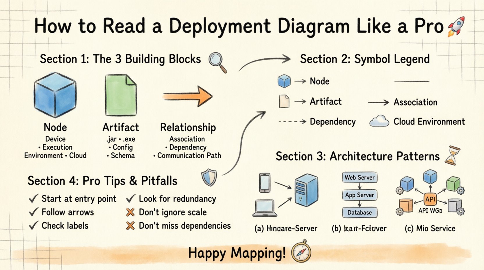
To read these diagrams effectively, you must recognize the standard building blocks. Every deployment diagram consists of three primary elements: Nodes, Artifacts, and Relationships. Mastering these three areas provides a solid foundation for interpretation.
1. Nodes: The Compute Resources 🖥️
Nodes represent the physical or virtual computing resources where software runs. They are usually depicted as 3D cubes or simple rectangles with a specific icon. In a standard notation, a node is a container for other elements.
Common types of nodes include:
- Device Nodes: Represent physical hardware like routers, servers, or mobile devices.
- Execution Environments: Represent virtual spaces like operating systems or container runtimes.
- Cloud Environments: Represent logical groupings of resources in a cloud setting.
When you see a node, ask yourself: “What is the capability of this box?” Is it a database server? Is it a web client? The label usually gives a clue, but the shape and icon provide technical context.
2. Artifacts: The Software Pieces 📦
Artifacts are the physical representations of software units. They are what actually get installed or executed on the nodes. You will often see artifacts drawn as smaller rectangles with a folded corner, resembling a piece of paper.
Examples of artifacts include:
- Executable files (e.g., .jar, .exe)
- Database schemas
- Configuration files
- Libraries and dependencies
An artifact is attached to a node to show that it resides there. If a node has multiple artifacts, it means that server hosts multiple components of the application.
3. Relationships: The Connections 🔗
Relationships define how nodes and artifacts interact. These are the lines connecting the boxes. The type of line and the label on it are critical for understanding data flow.
Key relationship types include:
- Association: A general connection showing that two nodes can communicate.
- Dependency: Shows that one node relies on another to function.
- Communication Path: Indicates the specific protocol or channel used for data transfer.
Pay close attention to the arrowheads on these lines. They indicate directionality. Does data flow from Node A to Node B, or is it bidirectional?
Understanding Notation and Symbols 🎨
Standardization makes communication easier. While tools may vary slightly, the underlying UML standard remains consistent. Recognizing the symbols saves time and reduces confusion.
Here is a breakdown of the most common symbols you will encounter:
| Symbol/Icon | Meaning | Context |
|---|---|---|
| 3D Cube | Node | Server, Device, or Container |
| Rectangle with Folded Corner | Artifact | File, Component, or Document |
| Dashed Line | Dependency | One element depends on another |
| Solid Line with Arrow | Association | Direct connection or link |
| Dashed Line with Open Arrow | Realization | Implementation of an interface |
| Cloud Shape | Cloud Environment | Remote or distributed infrastructure |
When reading a diagram, do not ignore the text labels. A line might be labeled “HTTP” or “TCP/IP.” This tells you the protocol being used. A node might be labeled “Linux Server” or “Windows Host.” This tells you the operating system. These details are often where the critical constraints lie.
Decoding Communication Paths 📡
The most complex part of a deployment diagram is often the network. It shows how the distributed parts of a system stay connected. Understanding this flow is key to troubleshooting and planning.
Identifying Protocols
Protocols define the rules for communication. On a diagram, these are usually written near the connecting lines. Common protocols include:
- HTTP/HTTPS: Standard web traffic.
- SSH: Secure shell for remote management.
- SQL: Database queries.
- AMQP: Message queuing for asynchronous tasks.
If you see a line labeled “HTTPS,” you know the data is encrypted. If you see “TCP,” you know it is a reliable stream. This affects how you think about security and performance.
Mapping the Data Flow
Trace the path from the user to the backend. Start at the client node (like a browser or mobile app). Follow the line to the first server. Where does the data go next? Is there a load balancer? Is there a caching layer?
Follow the arrows. They act as a roadmap. If an arrow points from a client to a server, the client initiates the request. If the arrow points back, the server sends a response. Understanding this back-and-forth helps you visualize the user experience.
Common Architecture Patterns 🔧
Deployment diagrams often follow established patterns. Recognizing these patterns allows you to predict how the system behaves without reading every single line. Here are three common structures.
1. Client-Server Model
This is the most traditional pattern. A client node requests services, and a server node provides them. The diagram will typically show a single client node connected to a single server node, or a cluster of servers behind a load balancer.
Look for:
- One or more client devices.
- A central server node.
- A single path of communication.
This pattern is simple to understand but can become a bottleneck if the server is overloaded. The diagram might show multiple servers to indicate scalability.
2. Multi-Tier Architecture
In this pattern, responsibilities are split across different nodes. You will often see a three-tier structure: Presentation, Application, and Data.
Breakdown of tiers:
- Presentation Tier: Handles the user interface (e.g., web server).
- Application Tier: Handles business logic (e.g., API server).
- Data Tier: Handles storage (e.g., database server).
On the diagram, these tiers are usually arranged vertically or horizontally in a sequence. Data flows from the top tier down to the bottom tier. This separation allows teams to work on different parts of the system independently.
3. Microservices Architecture
Modern systems often use microservices. The diagram will look busier. You will see many small nodes, each running a specific service. They all connect to a central gateway or service mesh.
Characteristics to spot:
- Many small, distinct nodes.
- Each node has its own database or shared storage.
- Inter-service communication is explicit.
This pattern offers flexibility but increases complexity. The diagram is the best tool to visualize how these services interact without code.
Analyzing for Bottlenecks and Risks 🔍
Reading a deployment diagram is not just about understanding structure; it is about finding potential issues. A skilled reader looks for red flags that could cause problems in production.
Single Points of Failure
Look for nodes that have no redundancy. If a single server node is critical and there is no backup, that is a risk. The diagram might show one database node connected to all application nodes. If that database goes down, the whole system stops.
Ask:
- Is there a second node for this component?
- Are there multiple paths to the database?
Security Boundaries
Security is often represented by firewalls or network zones. Look for dashed boxes that enclose groups of nodes.
Check for:
- Public vs. Private zones.
- Firewalls between tiers.
- Encrypted connections (HTTPS).
If sensitive data nodes are in the same zone as public-facing servers without a firewall, that is a security risk visible in the diagram.
Network Latency
Distance matters. If a client in one region connects to a server in another region, latency will increase. Look at the labels. If nodes are labeled by location (e.g., “US-East” vs “EU-West”), consider the physical distance.
Long lines crossing zones might indicate high latency. In a diagram, this is often implied by the separation of nodes into different logical groups.
Best Practices for Interpretation 📝
To get the most out of these diagrams, adopt a systematic approach. Do not rush. Follow these steps to ensure accurate analysis.
- Start with the Legend: Always check if there is a key explaining custom symbols. Not all tools use standard UML perfectly.
- Identify the Entry Point: Find the user or client node. This is where the action begins.
- Follow the Arrows: Trace the flow from start to finish. Do not jump around the diagram.
- Group Related Nodes: Look for nodes enclosed in the same box. They likely function as a single unit.
- Check for Labels: Read every text label. Numbers, versions, and protocols are often hidden in small text.
Consistency is key. If you use the same method every time, your speed and accuracy will improve. Over time, you will spot patterns instantly.
Common Pitfalls to Avoid ⚠️
Even experienced professionals make mistakes when reading complex diagrams. Being aware of common errors helps you avoid them.
Ignoring Scale
Diagrams are often not to scale. A small box might represent a powerful supercomputer, while a large box might be a simple router. Do not judge capability by the size of the shape.
Overlooking Dependencies
It is easy to focus on the main lines and miss the dashed dependency lines. These lines often show critical integrations. Missing them can lead to incomplete system understanding.
Assuming Realism
Diagrams are often theoretical. They show the ideal state. They might not reflect the actual messy configuration of a live system. Always verify the diagram against the current environment if possible.
Conclusion 🎓
Deployment diagrams are powerful tools for visualizing the physical reality of software systems. They bridge the gap between abstract code and tangible hardware. By understanding the nodes, artifacts, and connections, you gain insight into how a system operates.
You do not need to memorize every symbol immediately. Start with the basics: the cube, the rectangle, and the line. As you practice reading more diagrams, the complexity will feel less daunting. This skill empowers you to communicate better with infrastructure teams, plan deployments more accurately, and troubleshoot issues faster.
Take your time with the diagrams. Treat them like maps. The more you explore them, the more familiar the terrain becomes. With patience and practice, you will be able to read any deployment diagram with clarity and precision. Happy mapping! 🌍

