


In modern software architecture, complexity is inevitable. As systems scale, the interactions between components, services, and infrastructure grow exponentially. When a production environment experiences latency, a service outage, or a data consistency error, relying solely on application logs often feels like searching for a needle in a haystack. You see the symptom, but the root cause remains hidden within the infrastructure.
This is where the deployment diagram becomes an essential asset. Unlike a class diagram that focuses on code structure or a sequence diagram that focuses on runtime behavior, a deployment diagram maps the physical or logical hardware and software components. It provides a topological view of the system. By visualizing nodes, artifacts, and communication paths, teams can pinpoint bottlenecks, misconfigurations, and architectural flaws much more quickly.
Effective debugging is not just about fixing code; it is about understanding the environment in which the code executes. This guide explores how deployment diagrams serve as a critical diagnostic tool for system-level issues, improving visibility and accelerating resolution times.
📐 The Anatomy of a Deployment Diagram
Before diving into troubleshooting, it is necessary to understand the standard elements that constitute a deployment diagram. These elements represent the tangible and logical resources required to run the software.
🖥️ Nodes: The Computational Units
Nodes are the physical or virtual devices where the software components are executed. They represent the hardware or runtime environments. Identifying nodes correctly is the first step in diagnosing performance issues.
- Computational Nodes: These represent servers, workstations, or cloud instances. They are the primary location for application logic.
- Device Nodes: These can include hardware devices such as routers, switches, or specialized appliances that handle network traffic.
- Execution Environments: These are the software layers running on top of the hardware, such as operating systems or container runtimes.
When debugging, the distinction between these node types is vital. A latency issue might stem from the operating system kernel on a computational node, or it might originate from a hardware limitation on a device node.
📦 Artifacts: The Software Deliverables
Artifacts are the physical units of software that are deployed to nodes. They are the tangible evidence of what is actually running. Examples include executable files, libraries, configuration files, or database schemas.
- Executable Files: The compiled code that performs the business logic.
- Configuration Files: Settings that dictate how the software behaves in that specific environment.
- Database Schemas: The structure and data within the storage layer.
Version mismatches between artifacts on different nodes are a common source of system-level errors. A deployment diagram explicitly shows which artifact is associated with which node, allowing teams to verify consistency across the infrastructure.
🔗 Communication Paths: The Data Flow
Artifacts do not exist in isolation. They communicate with each other. These paths represent the network channels or message queues used for data exchange.
- Network Protocols: HTTP, TCP/IP, or gRPC connections.
- Message Queues: Asynchronous communication channels.
- Shared Storage: Network-attached storage or file systems.
Understanding the path is crucial for diagnosing connectivity issues. If a node is unable to reach a dependency, the diagram reveals the physical route the data must take, highlighting potential points of failure.
🔍 Visualizing Infrastructure for Troubleshooting
Debugging system-level issues requires a shift from viewing the application as code to viewing it as a distributed system. The deployment diagram bridges this gap. It transforms abstract concepts into concrete visual relationships.
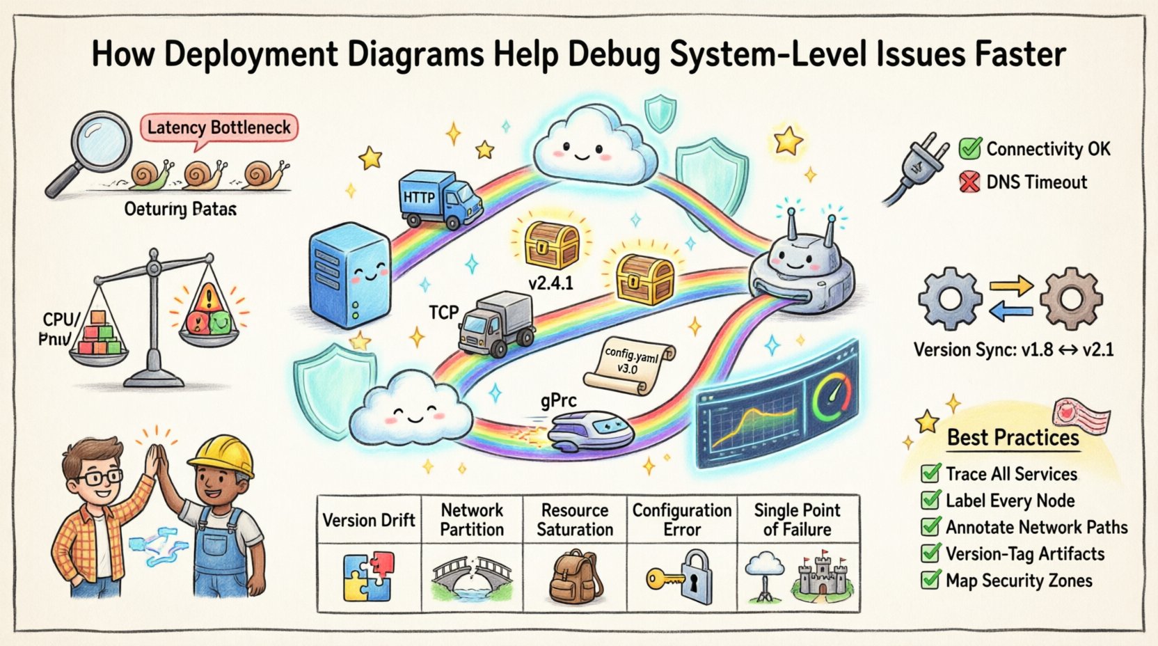
📉 Identifying Latency Bottlenecks
Performance degradation often manifests as increased latency. When a user reports slow response times, logs might show timeouts, but they rarely indicate where the delay occurred in the network topology.
A deployment diagram helps by visualizing the distance between nodes. If Node A sends data to Node B, and Node B sends data to Node C, the path is clear. If Node A and Node B are in different data centers while Node C is local, the diagram highlights this geographic separation. Teams can correlate latency spikes with specific network hops.
Additionally, the diagram can indicate the type of connection. A direct Ethernet link implies lower latency than a wireless connection or a virtual tunnel. By mapping these details, engineers can hypothesize where the delay is introduced.
🔌 Diagnosing Connectivity Failures
When a service becomes unavailable, the first question is always: “Is it reachable?” Deployment diagrams define the expected connectivity. They show which ports are open and which nodes are expected to talk to each other.
If a node is marked as offline in the monitoring tools but appears active in the diagram, there is a discrepancy. This discrepancy signals a configuration drift. The diagram serves as the source of truth for expected connectivity, allowing teams to verify if the actual network state matches the architectural design.
- Firewall Rules: Does the diagram align with firewall policies? If Node A cannot reach Node B, check if the diagram implies a direct connection that is blocked.
- Load Balancers: Are the nodes behind a load balancer distributed evenly? The diagram shows the distribution of artifacts across nodes.
- Redundancy Paths: If a primary path fails, does the diagram show a secondary path? Missing redundancy paths in the design often lead to single points of failure.
⚖️ Resource Contention Analysis
System crashes often occur due to resource exhaustion. While monitoring tools track CPU and memory usage in real-time, the deployment diagram provides the context for those numbers. It shows the capacity of the nodes.
If a specific node is overloaded, the diagram allows you to see what artifacts are deployed there. Are there too many heavy processes running on a single node? Is a database node handling more traffic than it was designed for? The visual layout helps identify over-provisioning or under-provisioning issues.
🛠️ Common Debugging Scenarios and Diagram Indicators
To illustrate the practical application of deployment diagrams in troubleshooting, consider the following scenarios. These examples demonstrate how specific visual elements correlate with specific system failures.
| Issue Category | Visual Cue in Diagram | Diagnostic Action |
|---|---|---|
| Version Drift | Different artifact versions linked to different nodes | Verify build consistency across all nodes; force redeployment. |
| Network Partition | Missing or broken communication path between nodes | Check network hardware; verify routing tables and firewall rules. |
| Resource Saturation | High density of artifacts on a single computational node | Scale horizontally; distribute artifacts to additional nodes. |
| Configuration Error | Configuration artifacts pointing to invalid endpoints | Validate connection strings and environment variables on the target node. |
| Single Point of Failure | Single node handling critical dependencies without backup | Implement redundancy; add failover nodes to the architecture. |
This table serves as a quick reference for engineers during incident response. Instead of guessing, they look for the visual indicators that match the observed symptoms.
🔄 Versioning and Consistency Checks
One of the most persistent issues in distributed systems is version inconsistency. In a large deployment, it is common for some nodes to be updated while others remain on a legacy version. This leads to compatibility errors where the client expects a new API format, but the server still runs the old code.
A deployment diagram makes versioning explicit. By labeling artifacts with version numbers, the diagram immediately reveals mismatches. If Node X has Artifact v2.0 and Node Y has Artifact v1.5, the diagram flags this inconsistency visually before the system crashes.
During debugging, engineers can use this visual cue to isolate the problem. They know exactly which nodes are out of sync. This prevents the common mistake of restarting the entire system, which is time-consuming and disruptive. Instead, they target the specific nodes that require redeployment.
📝 Artifact Lifecycle Management
The diagram also aids in managing the lifecycle of artifacts. When a new version is released, the diagram shows where it needs to be placed. It tracks the transition from development to staging to production environments.
- Staging Verification: Before production, verify the staging diagram matches the production target.
- Rollback Strategy: If an issue arises, the diagram helps identify the previous version of the artifact needed for rollback.
- Dependency Mapping: Ensure that if Artifact A requires Artifact B, both are present and compatible on the relevant nodes.
🏗️ Infrastructure Changes and Impact Analysis
Systems are not static. They evolve. New services are added, old ones are retired, and hardware is upgraded. Every change introduces risk. A deployment diagram acts as a map for these changes.
When planning a modification, such as moving a database to a different node or adding a new microservice, the diagram allows for impact analysis. Engineers can trace the communication paths to see which other nodes rely on the changed component.
For example, if a database node is moved to a new subnet, the diagram reveals all application nodes that connect to it. This allows the team to anticipate network configuration changes required for those application nodes. Without the diagram, this dependency might be overlooked, leading to connectivity issues immediately after the change.
🚨 Post-Deployment Validation
After a deployment, the diagram serves as a checklist. It lists the expected state of the system. Engineers compare the actual state against the diagram.
- Node Count: Does the number of running nodes match the diagram?
- Artifacts: Are the correct versions deployed to the correct nodes?
- Connections: Are all required communication paths active?
This validation step is crucial for catching deployment failures early. If the diagram shows five nodes but monitoring shows only three, the deployment script likely failed silently on two nodes. Identifying this discrepancy allows for immediate remediation.
🤝 Collaboration Between Development and Operations
One of the most significant benefits of deployment diagrams is that they provide a common language for developers and operations teams. Developers often focus on the code, while operations focus on the infrastructure. This separation can lead to miscommunication.
A deployment diagram bridges this gap. It shows developers where their code runs and operations teams how the code interacts with the infrastructure. When an incident occurs, both teams can look at the same diagram to understand the context.
- Shared Context: Both teams refer to the same visual representation of the system.
- Faster Triage: Instead of asking “Where is the service hosted?”, the team can point to the diagram.
- Clear Responsibilities: The diagram clarifies who owns which part of the infrastructure, reducing finger-pointing during post-mortems.
This alignment reduces the Mean Time to Resolution (MTTR) for incidents. When everyone understands the topology, debugging becomes a collaborative effort rather than a siloed one.
📋 Best Practices for Diagram Maintenance
A deployment diagram is only useful if it is accurate. An outdated diagram can be more dangerous than no diagram at all, as it leads to false assumptions. To ensure the diagram remains a valid debugging tool, follow these maintenance practices.
🔄 Automated Synchronization
Manual updates are prone to error. Whenever possible, integrate diagram generation with the infrastructure provisioning process. If the infrastructure is defined as code, the diagram should be generated from that same code.
- Source of Truth: Ensure the diagram is generated from the same configuration files used to deploy the system.
- Version Control: Store the diagrams in version control alongside the application code. This allows you to see how the architecture has evolved over time.
- Review Process: Include diagram updates in the code review process. If a deployment changes, the diagram should be updated as part of the same pull request.
📐 Granularity Levels
Not all diagrams need to be the same level of detail. A high-level diagram is useful for executives to understand the system flow, while a detailed diagram is needed for engineers to debug specific issues.
- System Level: Shows major components and their interactions.
- Component Level: Shows specific nodes and the software running on them.
- Artifact Level: Shows specific files and configurations.
Maintaining different views for different audiences ensures that the diagram remains readable while still providing the necessary detail for technical troubleshooting.
🧩 Integrating with Monitoring Tools
The deployment diagram does not exist in a vacuum. It gains more power when integrated with monitoring and observability tools. By overlaying real-time data onto the diagram, teams can see the health of the system at a glance.
Imagine a deployment diagram where the nodes change color based on their CPU usage. Red indicates high load, green indicates healthy. This visual enhancement turns a static map into a dynamic dashboard.
- Alert Correlation: When an alert triggers, click the corresponding node on the diagram to see its neighbors and dependencies.
- Log Aggregation: Link the diagram nodes to log sources. Clicking a node opens the logs for that specific server.
- Performance Metrics: Display latency metrics on the communication paths between nodes.
This integration reduces the cognitive load on engineers. Instead of switching between tabs and dashboards, they can investigate the issue within the context of the architecture.
🌐 Scaling and Distributed Systems
As systems grow, they often become distributed across multiple regions or cloud providers. This adds a layer of complexity regarding data sovereignty, latency, and redundancy. The deployment diagram is the primary tool for managing this complexity.
When debugging a distributed issue, the diagram clarifies the geographic distribution. It shows which nodes are in which region. This is critical for understanding issues related to data replication lag or regional outages.
- Region Failover: The diagram should explicitly show failover paths between regions. If one region goes down, the diagram shows the alternative route.
- Data Consistency: It highlights where data is stored and replicated. This helps diagnose issues where data is not synchronized across regions.
- Cost Optimization: By visualizing the infrastructure, teams can identify redundant resources that are driving up costs without adding value.
🛡️ Security and Access Control
Security is another area where deployment diagrams provide value. They visualize the security perimeter and access controls. When investigating a security incident or a permission error, the diagram shows the trust boundaries.
- Network Segmentation: The diagram shows which nodes are in the public zone and which are in the private zone.
- Authentication Points: It indicates where authentication and authorization occur in the flow.
- Encryption: Communication paths can be marked as encrypted or unencrypted, highlighting potential security risks.
If a node is unexpectedly accessible from the internet, the diagram provides the baseline to identify the misconfiguration. It defines the intended security posture.
📈 Conclusion
Debugging system-level issues is a complex task that requires more than just log analysis. It demands a comprehensive understanding of the system’s topology. Deployment diagrams provide this understanding by mapping the physical and logical structure of the software environment.
By visualizing nodes, artifacts, and communication paths, teams can identify bottlenecks, version mismatches, and connectivity failures with greater speed and accuracy. The diagram serves as a source of truth, a communication tool, and a diagnostic aid.
Maintaining accurate diagrams and integrating them with monitoring tools ensures that the infrastructure remains visible and manageable. In an era of increasing system complexity, the deployment diagram is not just a documentation artifact; it is a critical component of operational resilience.
Investing time in creating and maintaining these diagrams pays dividends during incidents. When the system fails, the diagram is the map that guides you back to stability.

