


Architecture documentation often fades into obsolescence as quickly as the code it describes. A deployment diagram is not merely a static picture; it is a living contract between the design intent and the operational reality. When constructed with precision and foresight, these diagrams serve as reliable references for developers, operations teams, and stakeholders alike. This guide explores the methodology for creating deployment diagrams that remain accurate and useful throughout the lifecycle of a system.
Understanding the Core Purpose 🎯
A deployment diagram visualizes the physical architecture of a system. It maps software artifacts to the hardware nodes where they execute. Unlike class diagrams or sequence diagrams, which focus on logic and behavior, deployment diagrams focus on topology, infrastructure, and connectivity. The goal is to provide a clear view of how components interact in the physical environment.
Effective diagrams reduce cognitive load. They allow engineers to understand the environment without needing to inspect configuration files or logs. This clarity is essential for troubleshooting, onboarding new team members, and planning capacity upgrades.
Key Objectives of a Robust Diagram
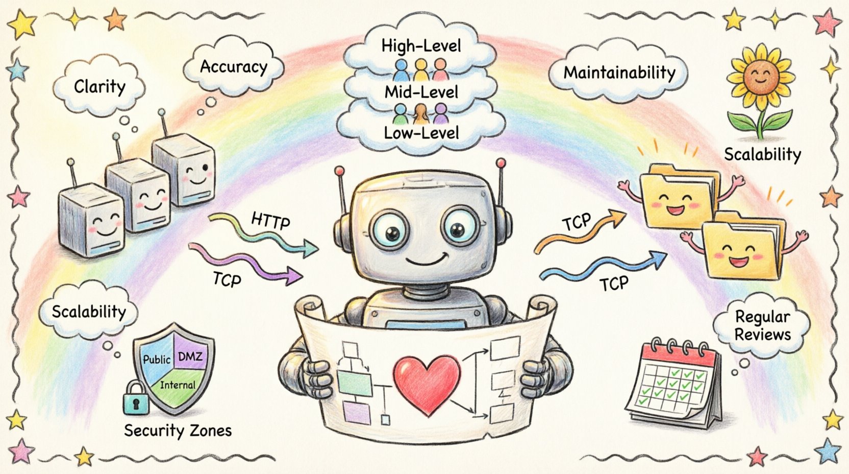
- Clarity: Distinguish between logical components and physical hosts.
- Accuracy: Reflect the current state of the infrastructure.
- Maintainability: Updateable without requiring a complete redesign.
- Scalability: Capable of showing growth without becoming unreadable.
Defining the Fundamental Elements 🧱
Before drawing lines and boxes, one must understand the vocabulary of deployment modeling. Every element serves a specific function in the diagram. Using standard terminology ensures that the diagram is interpretable by anyone familiar with systems engineering.
1. Nodes
Nodes represent the physical or virtual hardware resources. They are the containers for the execution environment. In a modern context, these can range from physical servers to container orchestration platforms.
- Computational Nodes: Servers, workstations, or cloud instances that run application logic.
- Network Nodes: Routers, firewalls, and switches that manage traffic flow.
- Storage Nodes: Dedicated devices for data persistence, such as SANs or object storage buckets.
2. Artifacts
Artifacts are the tangible software components deployed onto nodes. They represent the actual files or packages that are installed or executed.
- Executable Files: Binaries, scripts, or compiled code.
- Libraries: Shared dependencies required by the application.
- Configuration Files: Settings that define runtime behavior.
- Database Schemas: Structures defining data storage.
3. Connections
Connections represent the communication paths between nodes. They define how data moves through the infrastructure. It is crucial to specify the protocol used for communication to ensure the diagram conveys technical constraints.
- Communication Protocols: HTTP, TCP/IP, gRPC, or messaging queues.
- Physical Media: Ethernet, Fiber Optic, or Wireless.
- Logical Channels: Virtual Private Networks or encrypted tunnels.
Managing Abstraction Levels 📊
One of the most common errors in diagramming is attempting to show everything at once. A single diagram cannot effectively display the details of a microservice cluster alongside the physical rack layout. Instead, diagrams should be layered based on the audience and the level of detail required.
Layering Strategy
| Level | Focus | Target Audience | Detail Level |
|---|---|---|---|
| High-Level | System Boundaries & Regions | Stakeholders, Management | Low (Nodes only) |
| Mid-Level | Service Architecture | Developers, Architects | Medium (Services + Nodes) |
| Low-Level | Infrastructure Details | Operations, DevOps | High (Configs, Ports, Protocols) |
By segregating these views, you prevent information overload. A high-level view helps a project manager understand the scope, while a low-level view assists an engineer in debugging a network issue. Each layer should be treated as a distinct artifact in the documentation repository.
Designing for Scalability and Growth 📈
Infrastructure is rarely static. Systems grow, requirements change, and hardware is replaced. A deployment diagram designed for the initial launch will often fail within a year if it does not account for expansion. The following principles ensure longevity.
1. Logical Grouping
Group related components together using containers or boundaries. This creates logical clusters that can be scaled independently. For example, placing all database-related artifacts within a dedicated cluster boundary allows the team to replicate or upgrade that specific section without altering the rest of the diagram.
2. Standardized Interfaces
Define clear interfaces between nodes. When connections are standardized, the diagram remains readable even as the number of nodes increases. If every node connects via a generic API gateway, you do not need to draw a line from every server to every other server. This abstraction reduces visual clutter.
3. Future-Proofing Labels
Avoid hard-coding specific version numbers or temporary identifiers in the diagram. Use generic names for environments, such as “Production Cluster” or “Development Sandbox,” rather than “Server-01-2024.” This ensures the diagram remains valid even if the specific server names change.
Documentation Standards and Naming Conventions 📝
Consistency is the backbone of maintainable documentation. Without strict naming conventions, diagrams become a source of confusion rather than clarity. Teams should establish a style guide before beginning the documentation process.
- Node Naming: Use descriptive, hierarchical names (e.g.,
Web-Frontend-Node-01instead ofNode-A). - Artifact Naming: Include versioning in file names if the diagram represents a specific release, but keep the logical label generic.
- Connection Labels: Always label the protocol and port number (e.g.,
HTTPS:443). - Color Coding: Use colors to denote status or environment (e.g., Green for Active, Red for Deprecated, Blue for Production).
Addressing Security and Compliance 🔒
Deployment diagrams often reveal sensitive information about the infrastructure. They show where data lives, how it is protected, and how it flows between zones. Therefore, security must be a primary consideration in the design process.
Security Zones
Clearly demarcate security boundaries. Use distinct shapes or shaded regions to represent different trust levels. Common zones include:
- Public Zone: Accessible from the internet.
- DMZ: Demilitarized Zone for public-facing servers.
- Internal Zone: Restricted to internal networks.
- Restricted Zone: Critical data stores with strict access controls.
Encryption and Handshakes
Indicate where encryption occurs. Use annotations to show if traffic is encrypted at rest or in transit. For example, label a connection line with TLS 1.3 if the channel is secure. This helps auditors and security engineers verify compliance requirements without reading external documentation.
Maintenance and Lifecycle Management 🔄
A diagram is useless if it is outdated. The most common reason for diagram obsolescence is the lack of a maintenance process. To keep diagrams relevant, they must be integrated into the development workflow.
Version Control for Diagrams
Treat diagrams as code. Store them in the same version control system as the application source code. This allows for:
- Tracking changes over time.
- Reverting to previous states if errors occur.
- Reviewing changes during pull requests.
Automated Synchronization
Where possible, link the diagram to the infrastructure as code (IaC) repository. If the infrastructure is defined in configuration files, the diagram should ideally be generated or validated against these files. This reduces the risk of the diagram drifting from reality.
Regular Review Cycles
Schedule periodic reviews of the documentation. A quarterly audit ensures that the diagram matches the deployed state. During these reviews, verify:
- Are all nodes accounted for?
- Have any deprecated servers been removed?
- Are the connection protocols still valid?
Common Pitfalls to Avoid ⚠️
Even experienced practitioners make mistakes when creating deployment diagrams. Being aware of these common errors can save significant time and effort.
1. Over-Complication
Adding every single dependency and configuration file to the diagram makes it unreadable. Focus on the critical path. If a library is standard and implied, do not draw it.
2. Static State Representation
Deployment environments are dynamic. Servers spin up and down. A diagram showing a static set of servers can be misleading. Use labels like “Auto-Scaling Group” or “Load Balancer” to indicate dynamic behavior rather than fixed instances.
3. Ignoring Data Flow
It is not enough to show that two nodes are connected. Show the direction of data flow. Use arrows to indicate the primary direction of communication. This clarifies dependencies and potential bottlenecks.
4. Mixing Logical and Physical
Do not mix logical components (like microservices) with physical hardware (like servers) in the same view without clear distinction. This confusion leads to misunderstandings about where the code actually runs.
Collaboration and Team Alignment 🤝
Deployment diagrams are collaborative tools. They bridge the gap between development and operations. To maximize their value, the creation process should involve both teams.
- Joint Workshops: Conduct sessions where architects and engineers draw the diagram together. This ensures both perspectives are captured.
- Feedback Loops: Allow operations staff to annotate diagrams with real-world constraints that were not visible during design.
- Shared Glossary: Ensure all team members use the same terms for infrastructure components to avoid semantic drift.
Integrating with DevOps Practices 🛠️
Modern development relies on continuous integration and continuous deployment (CI/CD). Deployment diagrams should reflect the pipeline stages. For example, show the progression of artifacts from a build repository through staging to production.
Highlighting the CI/CD pipeline in the diagram helps identify potential deployment failures. If a diagram shows a direct connection from build to production without a staging environment, it signals a risk in the deployment strategy.
Conclusion on Longevity ✅
Creating a deployment diagram that stands the test of time requires discipline, foresight, and a commitment to maintenance. It is not enough to draw the picture once and file it away. The diagram must be treated as a critical component of the system’s knowledge base.
By adhering to standard conventions, managing abstraction levels, and integrating the diagram into the development lifecycle, teams can ensure that their documentation remains a valuable asset. This approach reduces risk, improves communication, and supports the long-term health of the infrastructure.
Remember that the value of a diagram lies in its accuracy and clarity. Invest the time to build it correctly, and it will serve the team for years to come.

