


In the landscape of modern software engineering, the shift from monolithic applications to distributed microservices architectures has become standard practice. While this transition offers agility and scalability, it introduces a significant layer of complexity regarding infrastructure and connectivity. Engineers must manage multiple services, each potentially running on different hardware or within distinct environments. To navigate this intricate web, clear documentation is not merely helpful; it is essential. The deployment diagram serves as the foundational map for understanding how software artifacts are physically realized in a target environment.
This guide explores the critical role of deployment diagrams in visualizing microservices. It details how these diagrams clarify infrastructure topology, streamline communication between services, and aid in troubleshooting production issues. By establishing a visual language for system architecture, teams can maintain a shared understanding that aligns development, operations, and security efforts.
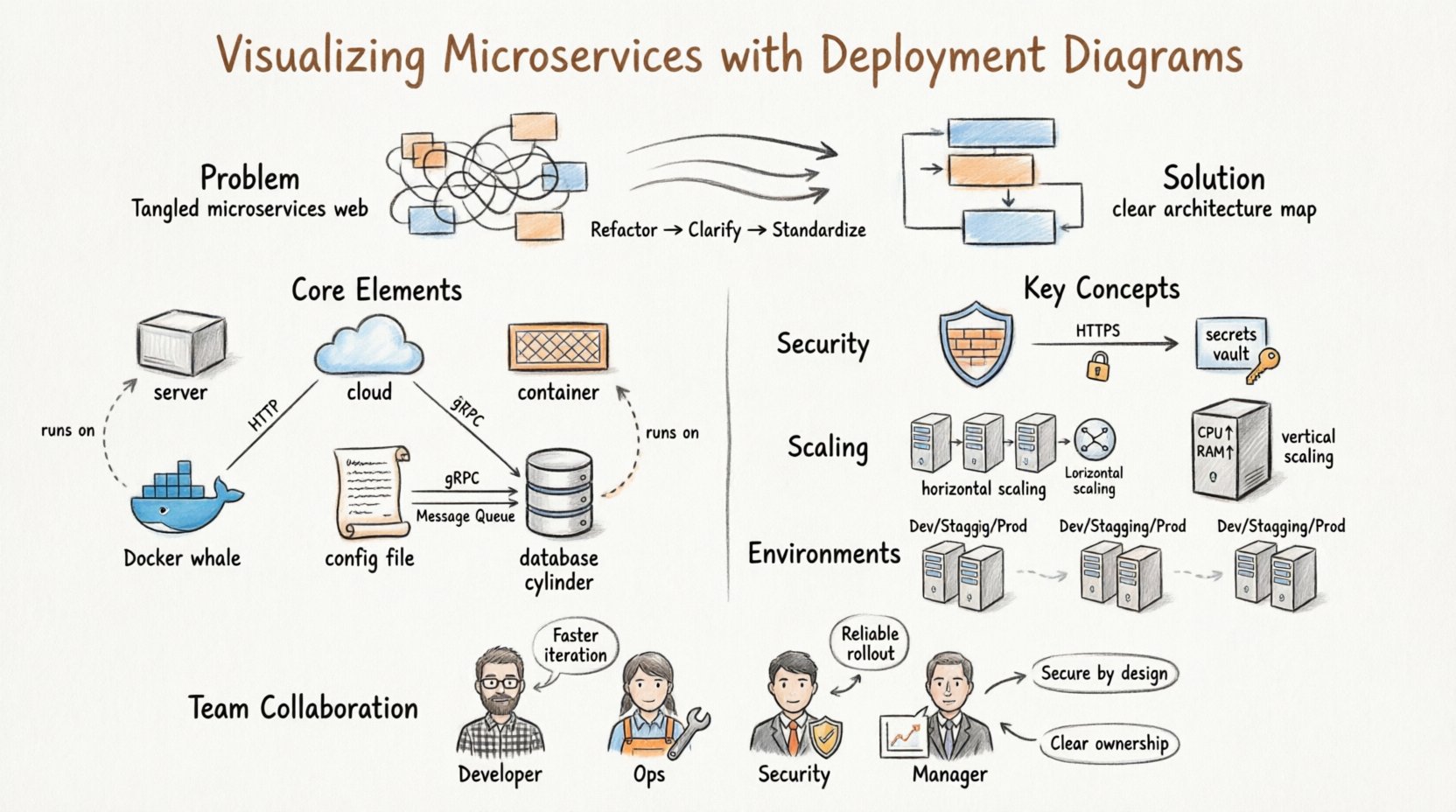
The Architecture Challenge: Why Complexity Grows 🧩
When a system consists of a single executable file, mapping its behavior to hardware is straightforward. You install the file on a server, and it runs. However, microservices decompose an application into loosely coupled, independently deployable units. Each unit may have different resource requirements, language dependencies, and scaling needs.
Without a structured visualization method, several issues arise:
- Network Ambiguity: Engineers struggle to determine how Service A reaches Service B through firewalls or load balancers.
- Resource Contention: It becomes difficult to identify which nodes are over-provisioned or under-utilized.
- Deployment Failures: Without a clear map of dependencies, deploying a new version of a service can inadvertently break connectivity for dependent services.
- Onboarding Friction: New team members face a steep learning curve when trying to understand the physical layout of the system.
A deployment diagram addresses these issues by abstracting the physical infrastructure while retaining the logical connections necessary for operation. It acts as a contract between the software logic and the hardware reality.
What is a Deployment Diagram? 📐
A deployment diagram is a type of UML (Unified Modeling Language) artifact that illustrates the physical architecture of a system. It depicts the hardware nodes, the software artifacts running on them, and the communication paths between them. Unlike a class diagram, which focuses on code structure, or a sequence diagram, which focuses on interaction over time, the deployment diagram focuses on topology.
In the context of microservices, this diagram is particularly vital because it separates the logical service definition from its physical instantiation. A single service, such as an authentication module, might exist as a logical concept but be deployed across three different container instances for redundancy. The deployment diagram captures this multiplicity.
Core Components of Deployment Diagrams 🧱
To create an effective visualization, one must understand the standard symbols and elements used to construct the diagram. These elements remain consistent regardless of the specific diagramming tool or notation style used.
1. Nodes (Hardware and Virtual) 🖥️
Nodes represent the physical or virtual computing resources where software runs. They are typically depicted as 3D cubes or rectangular boxes with a folded corner. In a microservices environment, nodes can take several forms:
- Compute Instances: Virtual machines or physical servers provisioned by a cloud provider.
- Container Hosts: Machines running a container runtime engine that manages isolated environments.
- Orchestration Engines: Cluster management systems that schedule and manage the lifecycle of containers across multiple hosts.
- External Systems: Legacy databases, third-party APIs, or on-premise servers that interact with the microservices.
2. Artifacts (Software Components) 📦
Artifacts represent the deployable units of software. These are the files or binaries that are installed onto a node. In a microservices architecture, artifacts include:
- Application Archives: JAR files, Docker images, or executable binaries.
- Configuration Files: YAML manifests, environment variables, or secrets stored securely.
- Database Schemas: Scripts or data structures stored within database nodes.
- Libraries: Shared dependencies required for the application to function.
3. Communication Paths (Connections) 🔄
Lines connecting nodes and artifacts represent the flow of data. These lines should be labeled to indicate the protocol or communication method used. Common connection types include:
- HTTP/REST: Standard web requests used for API interactions.
- gRPC: High-performance RPC framework often used in service-to-service communication.
- Message Queues: Asynchronous communication via brokers like Kafka or RabbitMQ.
- TCP/IP: Low-level network protocols for database connections or custom sockets.
4. Deployment Relationships 📎
These relationships indicate that an artifact is deployed onto a specific node. This is distinct from a communication path. A communication path shows data flow; a deployment relationship shows physical hosting.
Mapping Microservices to Nodes 🔄
The core task in creating a deployment diagram for microservices is accurately mapping logical services to physical nodes. This process requires careful consideration of resource allocation, fault tolerance, and network latency.
Single Node vs. Distributed Deployment
Not all services require multiple instances. The decision to deploy a service to a single node or distribute it across a cluster depends on availability requirements.
| Deployment Strategy | Best Use Case | Pros | Cons |
|---|---|---|---|
| Single Instance | Internal tools, low-traffic services | Lower cost, simpler network configuration | Single point of failure |
| Active-Active Cluster | Critical user-facing services | High availability, load balancing | Higher cost, complex state management |
| Stateless Placement | API gateways, processing workers | Easy scaling, quick restarts | Cannot store local session data |
| Stateful Placement | Databases, caches, message queues | Data persistence, high performance | Complex replication, backup requirements |
Grouping and Clustering
When visualizing large systems, individual nodes can clutter the diagram. Grouping nodes into clusters or zones helps simplify the view. For example, all compute instances belonging to the “Payment Service” can be grouped together, even if they are physically distributed across different availability zones.
Using stereotypes or boundary boxes allows you to define these groups. This abstraction reduces cognitive load when reviewing the system at a high level. It also helps in identifying which services share the same infrastructure resources.
Security and Network Flows 🔒
Security is a primary concern in microservices architectures. A deployment diagram is not just about connectivity; it is also about boundaries. Visualizing security controls helps identify potential vulnerabilities in the infrastructure.
Firewalls and Gateways
Firewalls act as barriers between network zones. In a deployment diagram, these are often represented as cylinders or specific shapes placed between nodes. It is crucial to show:
- Which zones are public-facing versus internal.
- Where the API gateway sits in relation to the backend services.
- How external clients authenticate before reaching the core system.
Encryption and Protocols
Communication paths should indicate encryption status. For instance, a line between two nodes might be labeled “HTTPS” or “TLS 1.3”. If a connection is unencrypted, it should be marked as “HTTP” or “Internal Only”. This visual cue prompts security audits and ensures compliance with data protection standards.
Secrets and Configuration Management
While the diagram does not show the actual secrets, it should indicate where secrets are managed. A dedicated node or artifact representing a secrets manager or configuration service should be included. This clarifies how sensitive data is injected into the deployment process without being hardcoded into the application artifacts.
Scalability and Resource Allocation 📈
One of the main advantages of microservices is the ability to scale specific components independently. A deployment diagram facilitates this by showing resource constraints and scaling triggers.
Horizontal vs. Vertical Scaling
The diagram should reflect the scaling strategy. Horizontal scaling involves adding more nodes to the cluster. Vertical scaling involves increasing the capacity of existing nodes. The visual representation helps operations teams understand the limits of the current setup.
- Horizontal Scaling: Shown by multiple identical nodes connected to a load balancer. This indicates that traffic can be distributed evenly.
- Vertical Scaling: Shown by a single node with labels indicating CPU, Memory, and Disk capacity. This indicates that performance depends on the size of the instance.
Resource Annotations
To make the diagram actionable, include resource annotations on the nodes. These can be:
- CPU Cores: The processing power available.
- Memory (RAM): The capacity for data caching and runtime operations.
- Storage Type: SSD, HDD, or Network Attached Storage.
- Network Bandwidth: The speed of data transfer between nodes.
These annotations help capacity planning. If a service is experiencing latency, the diagram allows the team to check if the node’s network bandwidth is a bottleneck.
Integration with CI/CD Pipelines 🚀
A deployment diagram is not a static document; it evolves alongside the software delivery pipeline. Continuous Integration and Continuous Deployment (CI/CD) processes rely on the definitions established in the architecture.
Environment Mapping
Most systems have multiple environments: Development, Staging, and Production. Each environment has a different deployment topology. The diagram should ideally distinguish between these or be maintained as separate views.
- Development: Often uses a single node with all services running locally to minimize cost.
- Staging: Mirrors production but with reduced capacity to test performance.
- Production: The full-scale, redundant architecture with high availability.
Automated Validation
In mature DevOps environments, the deployment diagram can be linked to infrastructure-as-code (IaC) files. When the diagram is updated, the IaC scripts should be reviewed to ensure they match the visual model. This ensures that the code deployed matches the intended architecture.
Drift Detection
Over time, manual changes in the cloud console can cause the actual infrastructure to drift away from the documented diagram. Regular audits comparing the live infrastructure against the deployment diagram are necessary. This process identifies unauthorized changes and ensures compliance with the architectural standards.
Common Pitfalls to Avoid ⚠️
Creating deployment diagrams is a skill that improves with practice. However, there are common mistakes that reduce the value of the documentation.
1. Over-Complication
Attempting to show every single server in a massive cluster can make the diagram unreadable. Use aggregation. Group servers into a “Cluster” node rather than drawing 50 individual cubes. This maintains clarity while preserving the logical structure.
2. Outdated Information
An outdated diagram is worse than no diagram. If a service moves to a new node or a firewall rule changes, the diagram must be updated immediately. In a microservices environment, changes happen frequently. Assign ownership of the diagram to a specific team or individual to ensure maintenance.
3. Ignoring Network Latency
Physical distance matters. A diagram that shows two services on the same node might imply zero latency, whereas in reality, they might be in different regions. When possible, indicate the geographical location or region of the nodes, especially for global applications.
4. Mixing Logical and Physical Views
Do not confuse a logical component diagram with a deployment diagram. A logical diagram shows that Service A calls Service B. A deployment diagram shows that Service A is running on Node X and connects to Node Y via Port 8080. Keep the views distinct to avoid confusion.
Collaboration Across Teams 🤝
A deployment diagram is a communication tool that bridges the gap between different roles within an organization.
For Developers
Developers use the diagram to understand where their code runs. It helps them identify which services they depend on and where to send logs or metrics. It clarifies the boundaries of their ownership.
For Operations Engineers
Operations teams use the diagram for incident management. When a service goes down, the diagram helps them trace the failure path. It shows which nodes are critical and which are backup.
For Security Teams
Security professionals use the diagram to audit network exposure. They can identify which nodes are exposed to the public internet and ensure that sensitive data flows are encrypted. It serves as a baseline for penetration testing.
For Management
Managers use the diagram to understand infrastructure costs. By seeing the number of nodes and their resource allocations, they can estimate cloud spend and plan budgets for scaling.
Evolution and Maintenance 🔄
The lifecycle of a deployment diagram mirrors the lifecycle of the software it represents. It requires a strategy for versioning and change management.
Version Control
Treat the diagram file like code. Store it in a version control system. This allows teams to track changes over time and revert if a change introduces errors. Commit messages should explain why a node was added or a connection was removed.
Automated Generation
Where possible, generate the diagram from configuration files. If the infrastructure is defined in code, scripts can parse that code to render the diagram automatically. This reduces the risk of human error and keeps the documentation in sync with the environment.
Review Cycles
Schedule regular reviews of the architecture. During sprint retrospectives or quarterly planning, review the deployment diagram. Ask questions like: “Do we still need this node?” or “Is this connection still necessary?” This practice prevents technical debt from accumulating in the infrastructure design.
Building a Shared Understanding 🧠
Ultimately, the value of a deployment diagram lies in the shared understanding it fosters. In complex microservices environments, assumptions are dangerous. One team might assume a service is stateless, while another assumes it stores session data locally. The diagram clarifies these assumptions.
By visualizing the system, teams can simulate changes before implementing them. They can ask, “If we add this new database, where does it fit?” and answer by updating the diagram. This proactive approach reduces the risk of production incidents.
As systems grow, the need for clear visualization increases. A well-structured deployment diagram is an investment in operational stability. It reduces the time spent troubleshooting, lowers the cost of onboarding new engineers, and provides a clear roadmap for future scaling. In a world where complexity is constant, clarity is the most valuable asset.
