


In the fast-paced ecosystem of modern software development, the gap between code and production is often bridged by complex infrastructure. Deployment diagrams serve as the architectural blueprint that maps this journey. They are not merely static drawings; they are dynamic communication tools that align development and operations teams. By visualizing the physical hardware, software components, and network configurations, these diagrams provide clarity in an environment that frequently changes.
This guide explores the critical role of deployment diagrams in enabling DevOps and Continuous Delivery (CD). We will examine how visualizing infrastructure supports automation, reduces errors, and enhances collaboration without relying on specific vendor tools.
🏗️ Understanding the Deployment Diagram
A deployment diagram is a type of Unified Modeling Language (UML) diagram that describes the physical architecture of a system. It shows the hardware nodes (such as servers, workstations, or cloud instances) and the software artifacts (such as executables, libraries, or database schemas) deployed on them.
Unlike a class diagram that focuses on code structure, a deployment diagram focuses on execution environment. It answers questions like:
- Where does the application run?
- How do different nodes communicate?
- What dependencies exist between services?
- How is load distributed across the infrastructure?
In the context of DevOps, this visualization is essential. It moves the conversation from abstract code to concrete infrastructure. When teams can see the topology, they can better understand the impact of changes.
🚀 The Bridge Between Code and Infrastructure
DevOps aims to shorten the systems development life cycle and provide continuous delivery with high software quality. One of the biggest challenges in this model is the disconnect between developers who write code and operations teams who manage the servers. Deployment diagrams act as a common language.
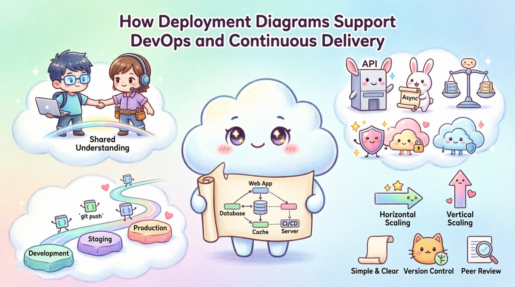
1. Shared Understanding 🤝
When a deployment diagram is maintained, both sides of the house share a single source of truth. Developers understand the constraints of the production environment. Operations teams understand the requirements of the application. This shared understanding reduces friction during handoffs.
- Developers see how their microservices connect to databases and caches.
- Operations see where the compute resources are allocated.
- Architects verify that the topology matches security and scalability requirements.
2. Infrastructure as Code (IaC) Alignment 📝
Modern practices rely on Infrastructure as Code. The deployment diagram should reflect the state of the IaC definitions. If the diagram shows three nodes, the code should provision three nodes. This alignment ensures that the visual representation matches the reality.
When the diagram drifts from the code, it signals a need for an update. This continuous synchronization is a hallmark of a mature DevOps culture.
⚙️ Visualizing the Pipeline
Continuous Delivery requires a reliable pipeline that moves code from development to production. Deployment diagrams help map where the code flows. They illustrate the stages of the pipeline and the environment boundaries.
Environment Stages
Typically, environments progress from development to staging and finally to production. A deployment diagram clarifies the differences between these stages.
| Environment | Diagram Focus | Purpose |
|---|---|---|
| Development | Local Nodes | Individual testing and iteration. |
| Staging | Replicated Prod | Integration testing in a production-like setting. |
| Production | Full Scale | Live traffic handling and user access. |
By visualizing these stages, teams can ensure that testing in staging accurately reflects the production topology. This reduces the risk of deployment failures caused by environment discrepancies.
3. Integration Points 🔗
Deployment diagrams highlight integration points between services. In a microservices architecture, these points are critical. The diagram shows which services communicate over the network and which rely on shared storage.
- API Gateways: Show where external traffic enters the system.
- Message Queues: Indicate asynchronous communication paths.
- Load Balancers: Demonstrate how traffic is distributed.
Understanding these connections helps in planning for resilience. If a specific integration point fails, the diagram helps identify the impact on the rest of the system.
🛠️ Collaboration and Communication
DevOps is as much about culture as it is about technology. Deployment diagrams facilitate collaboration by making the system architecture visible to all stakeholders.
1. Reducing Silos 🧱
Silos occur when teams work in isolation without understanding the broader system. A deployment diagram breaks down these walls. When a new team member joins, the diagram provides a quick overview of the infrastructure.
- Onboarding: New engineers can learn the system layout in hours, not weeks.
- On-call Support: Engineers on rotation can quickly identify where issues originate.
- Planning: Product managers can see how technical debt impacts infrastructure.
2. Incident Management 🚨
When an incident occurs, time is critical. Deployment diagrams allow engineers to trace the path of data and requests. This visual aid speeds up root cause analysis.
For example, if a database is slow, the diagram helps identify which application nodes connect to it. This allows for targeted troubleshooting rather than a broad scan of the entire network.
📈 Scaling and Capacity Planning
As applications grow, infrastructure must scale. Deployment diagrams are vital for capacity planning. They show the current utilization and potential bottlenecks.
1. Identifying Bottlenecks 🔍
A well-drawn diagram highlights dependencies that might limit scaling. For instance, a single database node serving multiple application servers becomes a choke point. The diagram makes this obvious.
- Vertical Scaling: Shows if a node can handle more load by adding resources.
- Horizontal Scaling: Shows if new nodes can be added to the cluster.
2. Cost Optimization 💰
Cloud infrastructure costs money. Deployment diagrams help teams understand where resources are allocated. This visibility allows for optimization.
If a diagram shows underutilized nodes, operations can consolidate services. If a diagram shows redundant paths, teams can remove unnecessary links. This data-driven approach to infrastructure management saves significant resources.
🛡️ Security and Compliance
Security is a top priority in DevOps. Deployment diagrams play a role in maintaining security standards and compliance requirements.
1. Network Segmentation 🌐
Diagrams illustrate how the network is segmented. They show which nodes are exposed to the public internet and which are internal. This is crucial for implementing firewalls and access controls.
- DMZ Zones: Show where public-facing services reside.
- Private Subnets: Indicate where sensitive data is stored.
2. Audit Trails 🔒
Compliance audits often require proof of infrastructure configuration. A deployment diagram serves as documentation for these audits. It proves that the system is configured according to security policies.
If a regulation requires data encryption at rest, the diagram can identify the storage nodes where this must be enabled. This ensures that security measures are applied where they are needed most.
🔄 Integrating into CI/CD Workflows
Continuous Integration and Continuous Deployment workflows automate the build and release process. Deployment diagrams can be integrated into these workflows to ensure consistency.
1. Automated Verification 🤖
Tools can verify that the deployed infrastructure matches the diagram. If the diagram specifies a specific number of nodes, the pipeline can check that the environment provision matches this count.
- Drift Detection: Alerts teams if the actual infrastructure differs from the diagram.
- Validation: Ensures that new deployments do not violate architectural rules.
2. Change Management 📝
Every change to the infrastructure should update the diagram. This practice ensures that documentation remains current. It also creates a history of how the system evolved over time.
When a team plans a major refactor, the diagram helps assess the risk. It shows which services depend on the components being changed. This prevents unintended side effects.
📋 Best Practices for Diagramming
To get the most out of deployment diagrams, teams should follow specific best practices. This ensures the diagrams remain useful and accurate.
- Keep it Simple: Avoid clutter. Show only the essential nodes and connections.
- Use Standard Symbols: Follow UML conventions so that anyone can read the diagram.
- Version Control: Store diagrams in the same repository as the code.
- Review Regularly: Update diagrams during sprint planning or architecture reviews.
- Focus on Logic: Prioritize logical flow over physical hardware details unless hardware is critical.
🚫 Common Pitfalls to Avoid
Even with good intentions, teams can make mistakes when creating deployment diagrams. Being aware of these pitfalls helps maintain quality.
1. Outdated Diagrams 📉
The most common issue is a diagram that no longer reflects reality. If the infrastructure changes and the diagram does not, it becomes misleading.
- Solution: Treat diagram updates as part of the Definition of Done for infrastructure changes.
2. Over-Engineering 🏗️
Diagrams can become too complex, showing every single server and connection. This makes them hard to read.
- Solution: Use abstraction. Group similar servers into clusters or nodes.
3. Ignoring Security 🛡️
Diagrams often focus on functionality and ignore security boundaries.
- Solution: Include firewalls, load balancers, and encryption zones in the diagram.
🧩 Conclusion
Deployment diagrams are more than just pictures; they are strategic assets in a DevOps environment. They provide the visibility needed to manage complex infrastructure, facilitate collaboration between teams, and ensure that continuous delivery pipelines run smoothly.
By maintaining accurate diagrams, teams can reduce deployment errors, improve security posture, and scale their systems efficiently. The effort invested in diagramming pays off in reduced downtime and faster problem resolution. In an era where speed and reliability are paramount, the deployment diagram remains a foundational tool for success.
Remember, the goal is not to create a perfect drawing, but to create a useful map. As your system evolves, your diagram should evolve with it. This living documentation supports the continuous delivery of high-quality software.

