


Component diagrams serve as the backbone of software architecture documentation. They provide a high-level view of the system’s structure, showing how different modules interact without getting bogged down in implementation details. However, over time, these diagrams often become sources of confusion rather than clarity. When a diagram looks messy, it signals deeper issues in design, communication, or maintenance processes. This guide explores the specific reasons why component diagrams degrade in quality and provides actionable strategies to restore order and precision.
Understanding the Purpose of Component Diagrams 🏗️
Before diagnosing problems, it is essential to understand the intended function of a component diagram. These visual representations map out the physical or logical building blocks of a software system. Each box represents a distinct component, encapsulating functionality and exposing interfaces. The lines connecting them illustrate dependencies, data flows, or relationships.
When executed correctly, a component diagram allows stakeholders to grasp the system’s topology at a glance. It helps developers understand where changes might impact other parts of the system. It assists architects in identifying bottlenecks or single points of failure. Yet, when the visual output becomes cluttered, these benefits vanish. The diagram ceases to be a map and becomes a maze.
Common Symptoms of a Messy Diagram 🧐
Recognizing the signs of a poorly constructed diagram is the first step toward improvement. You do not need to be a graphic designer to spot issues. The following characteristics indicate that the visual model needs significant attention:
- Overlapping Boxes: Components are drawn so closely together that their labels are unreadable or their boundaries are ambiguous.
- Crossing Lines: Dependency arrows crisscross the canvas excessively, creating a “hairball” effect that obscures the flow of logic.
- Inconsistent Naming: Some components use full technical names while others use abbreviations, making it difficult to search or understand.
- Mixed Granularity: A single component might represent a microservice in one area and a specific function in another, breaking the logical consistency.
- Missing Interfaces: Connections are drawn directly to internal elements rather than through defined interface boundaries.
- Excessive Detail: The diagram attempts to show every variable or method, turning a high-level architecture view into a code listing.
Root Cause Analysis: Why Clutter Happens 🧠
Visual messiness is rarely accidental. It usually stems from specific design decisions or workflow habits. By understanding the root causes, you can prevent recurrence.
1. Mixing Abstraction Levels
The most frequent cause of confusion is the failure to maintain a consistent level of abstraction. A diagram intended to show system boundaries often ends up including internal logic details. For example, a component representing a “Payment Service” might have lines connecting to specific database tables within that service. This violates the encapsulation principle and forces the reader to navigate implementation details that belong in a sequence or class diagram.
When abstraction levels mix, the diagram loses its purpose. It attempts to serve too many audiences simultaneously. Architects need the macro view, while engineers need the micro view. Combining them results in a cluttered middle ground that satisfies neither.
2. Lack of Grouping and Subsystems
Without clear boundaries, components float freely. Good design relies on grouping related components into subsystems or packages. If you have twenty distinct components but no logical containers, the viewer must mentally group them as they scan the page. This increases cognitive load significantly. Grouping reduces the number of items to process and highlights the relationships between major blocks of functionality.
3. Poor Naming Conventions
Names act as the primary navigation tool in a diagram. If a component is labeled “Module A” or “Component 1,” the diagram requires a separate legend or document to understand its function. Conversely, if names are too long, such as “UserAuthenticationAndSessionManagementComponent,” the box becomes unmanageable. Consistency is key. Every name should follow a standard pattern that balances brevity with clarity.
4. Over-Dependency Mapping
It is tempting to draw every single connection to show completeness. However, not all dependencies are equally important for a high-level overview. Showing a direct link between a UI component and a logging utility might be technically correct but visually distracting. Focus on the critical paths that define the system’s architecture. Secondary dependencies can be documented elsewhere.
The Cost of Poor Visualization 💸
A messy component diagram is not just an aesthetic issue; it carries tangible costs for the organization. When the documentation does not match the reality or is hard to read, the impact ripples through the development lifecycle.
- Slower Onboarding: New developers spend days deciphering the diagram instead of writing code. This delays their time-to-productivity.
- Integration Errors: If dependencies are unclear, developers may assume a component is independent when it relies on a specific service. This leads to runtime failures.
- Refactoring Hesitation: Teams become afraid to change the system because they cannot trust the diagram to predict side effects.
- Communication Breakdowns: Stakeholders who are not technical may feel alienated by a diagram that looks like a complex circuit board with no clear logic.
Symptom vs. Root Cause Comparison 📊
To assist in diagnosing your specific situation, refer to the table below. It maps common visual symptoms to their underlying technical causes.
| Visual Symptom | Root Cause | Impact on Clarity |
|---|---|---|
| Arrows crossing everywhere | Lack of logical grouping or layout planning | High: Flow is impossible to trace |
| Labels cut off or hidden | Boxes are too small for the text | Medium: Requires zooming or guessing |
| Too many lines from one box | Component is doing too much (God Object) | High: Indicates design flaw |
| Inconsistent line styles | Manual editing without style guide | Low: Confusing but manageable |
| Empty space vs. crowded clusters | Manual placement without auto-layout | Medium: Hard to scan efficiently |
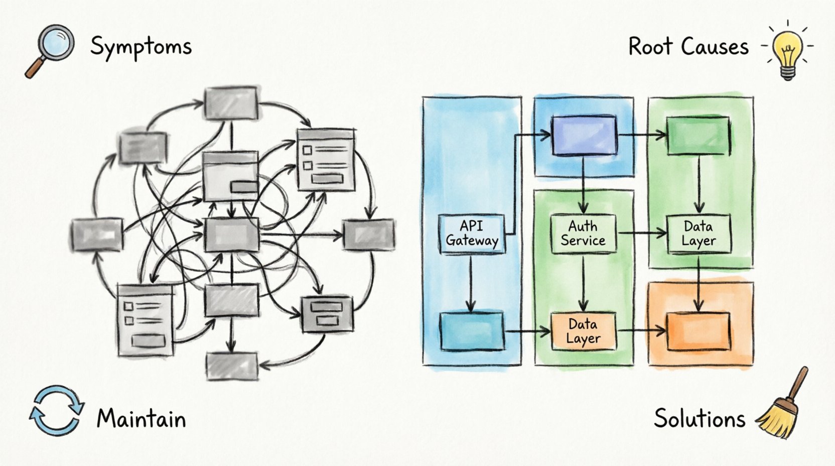
Structural Strategies for Cleanliness 🧹
Once you understand the problems, you can apply specific strategies to fix them. The goal is to create a diagram that communicates intent immediately.
1. Define Clear Boundaries and Subsystems
Start by organizing components into larger containers. Use grouping boxes to represent subsystems, layers, or deployment zones. For example, place all user-facing components in a “Presentation Layer” box. Group all database access components in a “Data Layer” box. This reduces the number of visible elements from dozens to a handful of major blocks.
When drawing lines, ensure they cross the boundaries of these groups. This visual cue reinforces the architectural layering and makes the diagram easier to scan vertically or horizontally.
2. Enforce Interface Contracts
Components should interact through defined interfaces. In your diagram, represent interfaces as lollipop symbols or named boxes attached to the component. This separates the implementation from the contract. When you see a connection, you know it is using a stable interface, not an internal variable.
This practice also helps manage complexity. If a component changes internally but keeps the same interface, the diagram remains valid. This reduces the frequency of diagram updates and keeps the documentation stable.
3. Manage Connection Density
Not every line needs to be drawn. Prioritize the relationships that define the system’s flow. If Component A calls Component B, and B calls C, show the direct dependency if it is critical. If A depends on B, but B is a standard library, you might omit the line to reduce noise.
Use different line styles to denote relationship types. A solid line might indicate a strong dependency, while a dashed line indicates a weak or optional one. This adds semantic value without adding visual clutter.
4. Standardize Naming Conventions
Establish a naming rule and stick to it. A good convention often follows a pattern like [Function][Type] or [Domain][Service]. For example, use “OrderService” instead of “OrderHandlingModule”. Keep names under a character limit that fits comfortably in a standard box size.
Avoid abbreviations unless they are industry-standard. If you must use them, define them in a legend. Consistency allows the reader to learn the pattern and predict what a new label means without reading the description.
Reviewing Your Work Before Sharing 📝
Before publishing a diagram to a team or repository, run a checklist review. This ensures the document meets quality standards and serves its intended purpose.
- Abstraction Check: Does this diagram show only the intended level of detail? Remove any internal logic details.
- Readability Test: Print the diagram on paper. Can you read the smallest text? Are the lines distinguishable?
- Connection Audit: Are all connections necessary? Remove redundant or implied links.
- Consistency Scan: Do all components use the same shape and style? Do all interfaces follow the same notation?
- Context Verification: Is there a legend or key explaining the symbols used? Is the diagram versioned?
- Audience Alignment: Does this diagram make sense to the target audience? Does a new hire understand the flow?
Long-Term Maintenance Practices 🔄
A clean diagram today does not guarantee a clean diagram tomorrow. Software evolves, and so does the documentation. To prevent future messiness, integrate diagram maintenance into your development workflow.
1. Synchronize with Code Changes
Whenever a major architectural change occurs, the diagram must be updated. Treat the diagram as code. If you refactor a module, update the component box. If you introduce a new service, add the box and connections. Delaying updates leads to divergence, where the diagram no longer reflects reality.
2. Version Control Integration
Store your diagram files in the same version control system as your code. This allows you to track changes over time. If a diagram becomes messy, you can revert to a previous version or see what caused the change. It also facilitates collaboration, allowing multiple architects to review and merge updates.
3. Regular Cleanup Cycles
Schedule periodic reviews of your architecture documentation. Set a reminder to audit diagrams every quarter. During these reviews, remove deprecated components. Consolidate redundant boxes. Re-layout the diagram to ensure spacing is logical. Treat this as part of the technical debt reduction process.
4. Enforce Style Guides
Define a style guide for your documentation. Specify font sizes, box colors, line weights, and arrow styles. If you use specific tools, configure the settings to enforce these standards automatically. This reduces the cognitive load on the creator and ensures the output looks uniform across different diagrams.
Conclusion on Visual Integrity 🛡️
Maintaining clean component diagrams requires discipline and consistent effort. It is not about making the diagram look pretty; it is about ensuring the information is accessible and accurate. By avoiding common pitfalls like mixed abstraction levels and excessive detail, you preserve the value of the documentation.
When a diagram is clear, it becomes a tool for decision-making rather than a source of confusion. It empowers teams to understand the system, predict impacts, and communicate effectively. Investing time in troubleshooting and cleaning up these visuals yields long-term returns in reduced errors and faster development cycles.
Start by auditing your current diagrams against the checklist provided. Identify the root causes of the clutter. Apply the structural strategies to reorganize the content. Commit to the maintenance practices to keep the documentation fresh. With these steps, your component diagrams will transform from sources of confusion into reliable guides for your architecture.

