


Software architecture is the backbone of any successful digital product. At the heart of this architecture lies the component diagram, a critical tool for visualizing the structural organization of a system. However, creating effective diagrams is often more difficult than it appears. Many teams struggle with clarity, leading to confusion during development and maintenance.
A well-crafted component diagram serves as a contract between architects, developers, and stakeholders. It defines boundaries, dependencies, and interactions without getting bogged down in implementation details. When done correctly, it reduces technical debt and accelerates onboarding. When done poorly, it becomes a source of ambiguity that hinders progress.
This guide explores seven frequent errors made during the creation of component diagrams. We will examine the root causes of these issues and provide actionable strategies to correct them. By understanding these pitfalls, you can ensure your system documentation remains clear, scalable, and useful throughout the lifecycle of your project.
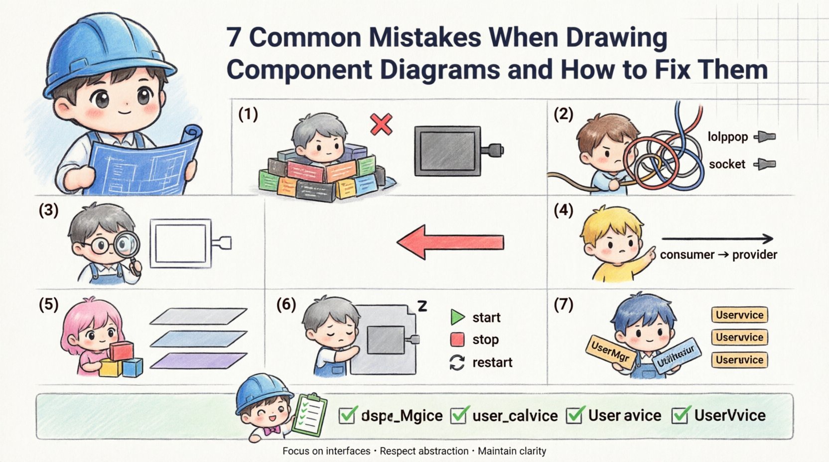
1. Focusing Too Much on Implementation Details 🧩
One of the most prevalent errors is treating the component diagram as a class diagram or a detailed design document. Component diagrams are meant to represent the high-level building blocks of a system, not the internal logic of those blocks.
When you include specific methods, variables, or algorithmic steps inside a component box, the diagram becomes cluttered. This violates the principle of abstraction. The purpose of a component is to define a unit of implementation that can be replaced without affecting other parts of the system. If the internal state is visible, it suggests a tight coupling that should not exist.
Why this matters:
Readability: Stakeholders cannot see the big picture when lost in syntax details.
Maintainability: Every code change requires an update to the diagram, leading to documentation rot.
Flexibility: It locks the team into a specific implementation strategy too early.
The Fix:
Resist the urge to list every function. Instead, focus on what the component provides and requires. Use interfaces to define the contract. A component should be a black box. If a developer needs to know how a feature works internally, they should look at the code, not the architectural diagram. Keep the visual language consistent by using standard icons for components rather than custom shapes.
2. Ignoring Interfaces and Ports 🚦
Interfaces are the lifelines of component diagrams. They define how components communicate with each other. A common mistake is drawing connectors between components without explicitly showing the interfaces they use. This makes the relationship ambiguous.
Without ports and lollipop notation, it is unclear whether a component is providing a service or consuming one. This ambiguity leads to integration errors. Developers might assume a connection exists when it does not, or they might implement the wrong protocol.
Why this matters:
Integration Errors: Mismatched expectations between services.
Dependency Confusion: Hard to trace which component relies on which.
Testing Issues: Mocking becomes difficult without clear interface definitions.
The Fix:
Always explicitly define provided and required interfaces. Use the “lollipop” notation for provided interfaces and the “socket” notation for required interfaces. Label every interface clearly with its name and version if applicable. This visual distinction clarifies the flow of data and control. Ensure that every connection line terminates at an interface, not directly at the component body. This enforces a strict contract-based architecture.
3. Showing Internal Logic Inside Components 🔍
Related to the first mistake, but distinct in its impact, is the inclusion of internal workflows or logic flows within a single component box. A component represents a deployable unit. It should not contain sub-diagrams or flowcharts unless those are nested at a significantly lower level of abstraction.
When you draw internal logic, you confuse the reader about the scope of the component. Is this a logical container or a physical deployment node? Mixing these concepts creates a hybrid diagram that satisfies neither purpose. It blurs the line between logical design and physical deployment.
Why this matters:
Scope Creep: Developers might implement internal logic changes without updating the diagram.
Deployment Confusion: It becomes unclear what constitutes a deployable artifact.
Over-Engineering: You spend time drawing logic that changes frequently.
The Fix:
Keep the interior of the component box empty or populated only with the component name and perhaps a brief description of its responsibility. If you need to show internal logic, create a separate diagram at a lower level. Reference that diagram using a hyperlink or a note if necessary. Maintain the component diagram as a map, not a manual. This separation of concerns keeps the high-level view clean and stable.
4. Overlooking Dependency Direction ⬆️⬇️
Arrows in component diagrams represent dependencies. A frequent error is drawing lines without arrowheads or using arrowheads that point in the wrong direction. In system design, directionality implies control flow and dependency ownership. A component that depends on another should have an arrow pointing towards the provider.
Incorrect directionality suggests the wrong component is responsible for the logic. It can lead to circular dependencies, where Component A depends on B, and B depends on A. This is a major architectural anti-pattern that causes runtime errors and compilation failures.
Why this matters:
Circular Dependencies: Creates loops that prevent modular loading.
Build Failures: Compilation order becomes unpredictable.
Refactoring Risks: Changing one component breaks others unexpectedly.
The Fix:
Standardize your arrow notation. Use solid lines for usage dependencies and dashed lines for interface dependencies. Ensure every arrow points from the dependent component to the provider. If you see a cycle, revisit your design. You may need to introduce an abstraction layer or a shared interface to break the loop. Regularly validate your diagram against your codebase to ensure the dependencies match reality.
5. Mixing Layers Without Distinction 🧱
Systems are often layered, such as Presentation, Application, and Data layers. A common mistake is drawing all components on a single plane without visual separation. This makes it difficult to understand the flow of data across the system boundaries.
When layers are mixed, it becomes hard to identify where data enters the system and where it exits. It also obscures the separation of concerns. For example, UI components should not directly access database components without going through the application layer. Mixing them suggests a violation of architectural patterns.
Why this matters:
Tight Coupling: UI logic leaks into data access logic.
Scalability Issues: You cannot scale one layer independently.
Security Risks: Direct data access bypasses validation layers.
The Fix:
Use swimlanes, rectangles, or background shading to visually separate layers. Clearly label each zone. Ensure that connections only flow between adjacent layers unless there is a specific exception justified by the design. This visual separation reinforces the logical separation of the architecture. It helps stakeholders understand the boundaries of responsibility for each team or module.
6. Ignoring Component Lifecycle States 🔄
Components are not static; they have states. They start, stop, recover, and fail. A mistake in diagramming is treating components as always-on entities without acknowledging their lifecycle. While you do not need a state machine diagram for every component, you should indicate critical states where relevant.
If a component has a complex initialization process or requires specific health checks, the diagram should reflect this. Ignoring lifecycle can lead to deployment failures where a component is expected to be ready before its dependencies are initialized.
Why this matters:
Startup Failures: Services crash due to dependency ordering.
Recovery Issues: No clear path for recovery from failure states.
Operational Confusion: Operations teams do not know how to manage the component.
The Fix:
Add notes or stereotypes to components that have specific lifecycle requirements. Use icons to indicate restartability or persistence. If the diagram is used for DevOps, include information about deployment configurations. Ensure that the diagram supports the operational reality of the system. This bridges the gap between design and operations.
7. Inconsistent Naming Conventions 🏷️
Clarity is king in documentation. Using vague names like “Component 1” or “Module A” makes the diagram useless for future developers. Inconsistent naming—sometimes using nouns, sometimes verbs, sometimes abbreviations—creates cognitive load. Readers must constantly guess the meaning of the labels.
Names should be descriptive and consistent with the domain language (Ubiquitous Language). If the business calls it “Order Processing,” the component should not be named “OrderMgr” or “ProcSys.” Inconsistency leads to miscommunication between technical and non-technical stakeholders.
Why this matters:
Onboarding Time: New hires spend too long deciphering labels.
Searchability: Hard to find components in a large system.
Domain Alignment: Disconnect between business goals and technical implementation.
The Fix:
Establish a naming standard at the start of the project. Define rules for abbreviations, capitalization, and suffixes. Use domain terms whenever possible. Review the diagram periodically to ensure names remain accurate as the system evolves. Consistency builds trust in the documentation.
Quick Reference: Mistakes and Fixes Table 📊
Mistake | Impact | Recommended Fix |
|---|---|---|
Too much detail | Cluttered, hard to read | Focus on interfaces, hide implementation |
Ignoring interfaces | Ambiguous connections | Use lollipop/socket notation |
Internal logic shown | Scope confusion | Keep interior empty, use separate diagrams |
Wrong arrow direction | Circular dependencies | Point from consumer to provider |
Mixing layers | Tight coupling | Use swimlanes for separation |
Ignoring lifecycle | Startup/ops failures | Add lifecycle notes or stereotypes |
Inconsistent naming | Cognitive load | Enforce domain language standards |
Best Practices for Maintaining Diagrams 📝
Once you have corrected the common mistakes, maintaining the integrity of your diagrams becomes a priority. Documentation should not be a one-time task. It requires a culture of continuous improvement.
Here are strategies to keep your component diagrams accurate over time:
Automate where possible: Use tools that can generate diagrams from code annotations. This reduces the gap between code and documentation.
Version Control: Treat diagrams as code. Store them in the same repository as the source code. This ensures changes to the architecture are reviewed alongside code changes.
Regular Reviews: Include diagram updates in your definition of done for new features. If the code changes, the diagram must change.
Stakeholder Feedback: Ask developers and architects to validate the diagrams regularly. They are the ones who use them to understand the system.
Frequently Asked Questions ❓
What is the difference between a Component Diagram and a Class Diagram?
A class diagram details the internal structure of a system, including attributes and methods of individual classes. A component diagram abstracts these details to show high-level building blocks. Components group classes together based on functionality or deployment boundaries. Use class diagrams for detailed design and component diagrams for system architecture.
How many components should a diagram have?
There is no fixed number, but the diagram should be readable at a glance. If you have more than 15 to 20 components, consider breaking the diagram into sub-diagrams or using a zoom-out view. The goal is to show relationships without overwhelming the viewer.
Can I use component diagrams for microservices?
Yes, component diagrams are highly effective for microservices architecture. Each microservice can be treated as a component. The diagram helps visualize the communication protocols and data flow between services. Ensure you clearly mark the boundaries and the APIs exposed by each service.
What is the best way to represent third-party libraries?
Represent third-party libraries as external components. Use a dashed boundary or a specific stereotype to indicate they are external dependencies. Show the interfaces your system consumes from them. This helps in dependency management and security auditing.
Do I need to update the diagram for every bug fix?
No. Bug fixes usually do not change the architectural structure. Update the diagram when there are changes to the system boundaries, new components, removal of components, or changes in dependencies. Minor logic changes do not warrant a diagram update.
By adhering to these guidelines and avoiding the common pitfalls outlined above, you can create component diagrams that serve as reliable blueprints for your software. These diagrams will not only aid in development but also facilitate better communication across your organization. Clear architecture leads to better software.
Final Thoughts on Architectural Clarity 🧭
The quality of your software is often a reflection of the quality of its design. Component diagrams are a vital part of that design process. They force you to think about boundaries, contracts, and interactions before writing a single line of code. When you avoid the mistakes detailed in this guide, you invest in a system that is easier to understand, easier to change, and easier to maintain.
Remember that diagrams are living documents. They evolve with the system. Treat them with the same care as your source code. Prioritize clarity over completeness. A simple, accurate diagram is worth more than a complex, detailed one that no one reads. Focus on the structure, respect the abstractions, and ensure every connection has a purpose. This approach will lead to robust and resilient software systems.

