System integration involves connecting different computing systems and software applications physically or functionally to act as a coordinated whole. In complex environments, the architecture of how software interacts with hardware, networks, and services is often opaque. This is where a deployment diagram becomes essential. It provides a static view of the physical architecture of a system, detailing how software artifacts are mapped to hardware nodes.
Without a clear map of the infrastructure, integration efforts can suffer from miscommunication, resource conflicts, and unexpected bottlenecks. A deployment diagram clarifies the physical topology, ensuring that every component has a designated home. This guide explores the mechanics, benefits, and strategic application of deployment diagrams within the context of large-scale system integration.
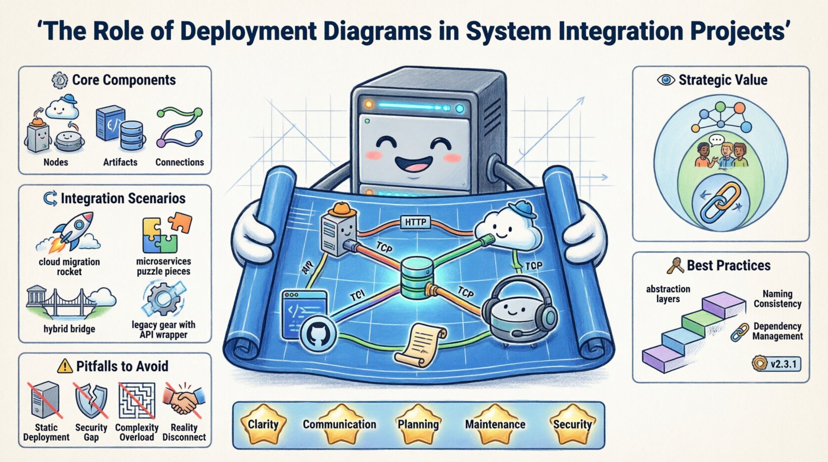
🧩 Understanding the Core Components
To utilize deployment diagrams effectively, one must understand the fundamental building blocks they represent. These diagrams are not merely drawings; they are technical specifications that guide the deployment pipeline.
1. Nodes (Processing Resources)
- Computational Nodes: Represent physical or virtual computers capable of executing software. This includes servers, workstations, and mainframes.
- Execution Environments: Specific software environments running on nodes, such as application containers, virtual machines, or operating system shells.
- Communication Nodes: Devices dedicated to routing traffic, such as routers, switches, and firewalls.
2. Artifacts (Deployable Units)
- Software Components: Compiled binaries, libraries, or scripts that perform specific functions.
- Configuration Files: Settings that define how the software behaves in a specific environment.
- Databases: Persistent storage systems installed on specific nodes.
- Interfaces: APIs or gateways that facilitate data exchange between distinct systems.
3. Connections (Communication Paths)
- Physical Links: Represented by lines indicating network cables or direct connections.
- Protocol Specifications: Labels on lines indicating the communication standard, such as HTTP, TCP/IP, or REST.
- Dependencies: Relationships showing that one node relies on another to function correctly.
🔍 The Strategic Value in Integration Projects
System integration is rarely a simple plug-and-play process. It often involves merging legacy infrastructure with modern cloud services, or connecting disparate departments with different technical standards. Deployment diagrams serve as the single source of truth for these complex mappings.
Visualizing Topology
When multiple teams work on different subsystems, it is easy to lose track of how they fit together. A deployment diagram visualizes the entire topology. This helps architects identify:
- Single Points of Failure: Nodes that, if taken down, break the entire chain.
- Network Latency: The physical distance between nodes that might impact performance.
- Resource Allocation: Whether specific hardware nodes are overloaded or underutilized.
Facilitating Cross-Team Communication
Development teams, operations teams, and security teams often speak different languages. A deployment diagram acts as a universal language.
- Developers: See where their code runs and what dependencies exist.
- Operations: Understand hardware requirements and network configurations.
- Security: Identify where sensitive data resides and how it is transmitted.
Planning for Scalability
Integration projects often start small but must grow. Deployment diagrams allow teams to simulate scaling strategies before implementation. By visualizing the addition of new nodes or the replication of services, architects can predict resource needs.
🔄 Integration Scenarios and Diagram Application
Different integration contexts require different levels of detail in deployment diagrams. Below is a breakdown of how these diagrams apply to common integration scenarios.
| Scenario | Diagram Focus | Key Benefit |
|---|---|---|
| Cloud Migration | Mapping on-prem servers to cloud instances | Ensures no data loss during transition |
| Microservices | Container orchestration and service mesh | Clarifies service discovery and communication |
| Hybrid Environments | Linking physical and virtual nodes | Highlights latency and security boundaries |
| Legacy Modernization | Wrapping old systems with new APIs | Protects existing investment while enabling new features |
🛠️ Best Practices for Creating Effective Diagrams
Creating a deployment diagram is an art that requires balance. Too much detail obscures the big picture; too little detail makes the diagram useless. Adhering to established best practices ensures the diagram remains a valuable asset throughout the project lifecycle.
1. Maintain Abstraction Levels
- High Level: Focus on data centers, regions, and major clusters. Useful for executive stakeholders.
- Low Level: Focus on individual servers, container pods, and specific ports. Useful for engineers deploying the system.
- Tip: Do not mix high-level and low-level views in the same diagram unless necessary. Use separate diagrams for clarity.
2. Use Standard Naming Conventions
- Consistent naming prevents confusion. For example, always label database nodes as
DBand web servers asAPP. - Avoid generic names like
Server1. Instead, use functional names likePayment-Processor-Node. - This becomes critical when multiple teams are reviewing the same architecture.
3. Document Dependencies Explicitly
- Integration often breaks due to hidden dependencies. Clearly mark which nodes depend on external services.
- Indicate authentication mechanisms on connection lines where security is a concern.
- Mark asynchronous vs. synchronous communication paths to manage expectations regarding response times.
4. Version Control the Diagrams
- Just like code, architecture diagrams change. Treat them as versioned artifacts.
- Document the date and the specific integration phase associated with the diagram version.
- This history helps in auditing changes and troubleshooting issues introduced during updates.
⚠️ Common Pitfalls to Avoid
Even experienced architects can fall into traps when creating deployment diagrams. Recognizing these pitfalls early can save significant time during the integration phase.
Pitfall 1: The “Static” Trap
- Deployment diagrams are static, but systems are dynamic. Failing to account for dynamic scaling can lead to confusion.
- Solution: Add notes or legends indicating auto-scaling groups or load balancer behaviors.
Pitfall 2: Ignoring Security Boundaries
- Not showing firewalls or security groups leaves gaps in the security plan.
- Solution: Use distinct shapes or shading to represent trusted and untrusted zones.
Pitfall 3: Over-Complexity
- Trying to show every single server in a large cluster makes the diagram unreadable.
- Solution: Use aggregation. Group multiple similar servers into a single logical node labeled with the count (e.g.,
Web Cluster [5]).
Pitfall 4: Disconnecting from Reality
- Diagrams often drift away from the actual running system as changes occur.
- Solution: Integrate diagram updates into the CI/CD process. Require the diagram to be updated alongside infrastructure-as-code changes.
📈 Integration Workflow and Lifecycle
Deployment diagrams are not created in a vacuum. They play a specific role in the broader software development lifecycle, particularly during the integration and deployment phases.
Phase 1: Design and Planning
- Architects draft the initial deployment model.
- Stakeholders review the diagram for feasibility.
- Cost estimates are generated based on the hardware nodes shown.
Phase 2: Development and Testing
- Developers use the diagram to set up local environments that mimic production.
- QA teams verify that the integration points match the diagram specifications.
- Performance testing identifies bottlenecks between nodes.
Phase 3: Deployment and Operations
- Operations teams use the diagram to configure the actual infrastructure.
- Monitoring tools are aligned with the nodes defined in the diagram.
- Incident response plans reference the diagram to locate failures quickly.
🔗 Handling Heterogeneous Systems
One of the most challenging aspects of system integration is dealing with heterogeneous systems. This means connecting platforms that use different operating systems, programming languages, or hardware architectures. Deployment diagrams are the primary tool for managing this complexity.
Mapping Legacy to Modern
- Legacy Systems: Often run on mainframes or older UNIX systems. They may require specific middleware to communicate with modern web services.
- Modern Systems: Typically run on Linux containers or serverless functions.
- The Bridge: The diagram must clearly show the middleware nodes (e.g., API Gateways, Message Queues) that facilitate translation between the two worlds.
Data Consistency Across Nodes
- Different nodes may store data differently. A deployment diagram helps visualize where data replication occurs.
- It highlights the paths data takes between storage nodes, ensuring that consistency protocols are understood by all teams.
📉 Performance and Bottleneck Analysis
A deployment diagram is a powerful tool for performance analysis. By visualizing the flow of data, teams can predict where delays will occur.
Network Bandwidth
- Thick lines on a diagram can represent high-bandwidth connections, while thin lines represent low-bandwidth links.
- This visual cue helps identify potential bottlenecks before they cause system slowdowns.
Processing Power Distribution
- Nodes with heavy processing loads should be clearly labeled.
- Integrators can see if a single node is tasked with too many artifacts, indicating a need for load balancing.
Latency Considerations
- Geographic distance between nodes impacts latency. A diagram can include geographic regions.
- For global systems, this is crucial for ensuring data sovereignty compliance and user experience.
🧭 Security and Compliance Mapping
In modern integration projects, security is not an afterthought. It is a foundational requirement. Deployment diagrams assist in mapping security controls to physical infrastructure.
- Zone Segmentation: Clearly mark DMZs (Demilitarized Zones), internal networks, and public networks.
- Encryption Points: Indicate where data is encrypted in transit between nodes.
- Access Control: Show which nodes require authentication to access specific artifacts.
Compliance audits often require proof of how data flows through the system. A detailed deployment diagram serves as this evidence, showing that data does not traverse unauthorized paths.
🚀 Future-Proofing the Architecture
Technology evolves rapidly. A deployment diagram created today may be obsolete in a few years. To future-proof the architecture:
- Abstract Hardware: Use logical nodes rather than specific server models. This allows hardware replacement without changing the diagram.
- Standard Interfaces: Focus on the interfaces between nodes rather than the internal implementation details.
- Modularity: Design nodes to be replaceable. If a specific service fails, the diagram should show how easily it can be swapped out.
🤝 Collaborative Review Processes
Creating a deployment diagram is often a team effort. Establishing a review process ensures accuracy and buy-in.
- Walkthroughs: Conduct formal reviews where stakeholders trace data paths on the diagram.
- Feedback Loops: Allow operations staff to annotate diagrams with real-world constraints (e.g., “This port is blocked by firewall policy”).
- Living Documents: Treat the diagram as a living document that evolves with the project. Do not let it become a static artifact locked in a folder.
📋 Summary of Key Takeaways
- Clarity: Deployment diagrams remove ambiguity from complex physical architectures.
- Communication: They bridge the gap between technical and non-technical stakeholders.
- Planning: They enable proactive identification of risks and bottlenecks.
- Maintenance: They serve as a reference point for system updates and troubleshooting.
- Security: They provide a visual map for implementing security controls.
System integration is a complex endeavor that requires precision and foresight. A deployment diagram is not just a drawing; it is a blueprint for success. By investing time in creating accurate, maintained, and clear deployment diagrams, organizations ensure that their integration projects are built on a solid foundation. This approach reduces risk, improves collaboration, and leads to more resilient systems.
")
