Infrastructure visibility is often the difference between a stable service and a catastrophic outage. In this detailed account, we explore a specific scenario where a team faced severe latency issues and downtime during a high-traffic event. The solution was not a new server, nor a code optimization, but a fundamental shift in how the architecture was visualized and understood. By constructing a precise deployment diagram, the engineering team identified hidden bottlenecks and restructured their infrastructure logic.
This article serves as a technical examination of that process. It details the creation of the diagram, the specific architectural flaws discovered, and the subsequent improvements. There is no hype here, only the mechanics of system design and the practical application of visual documentation to solve complex engineering problems.
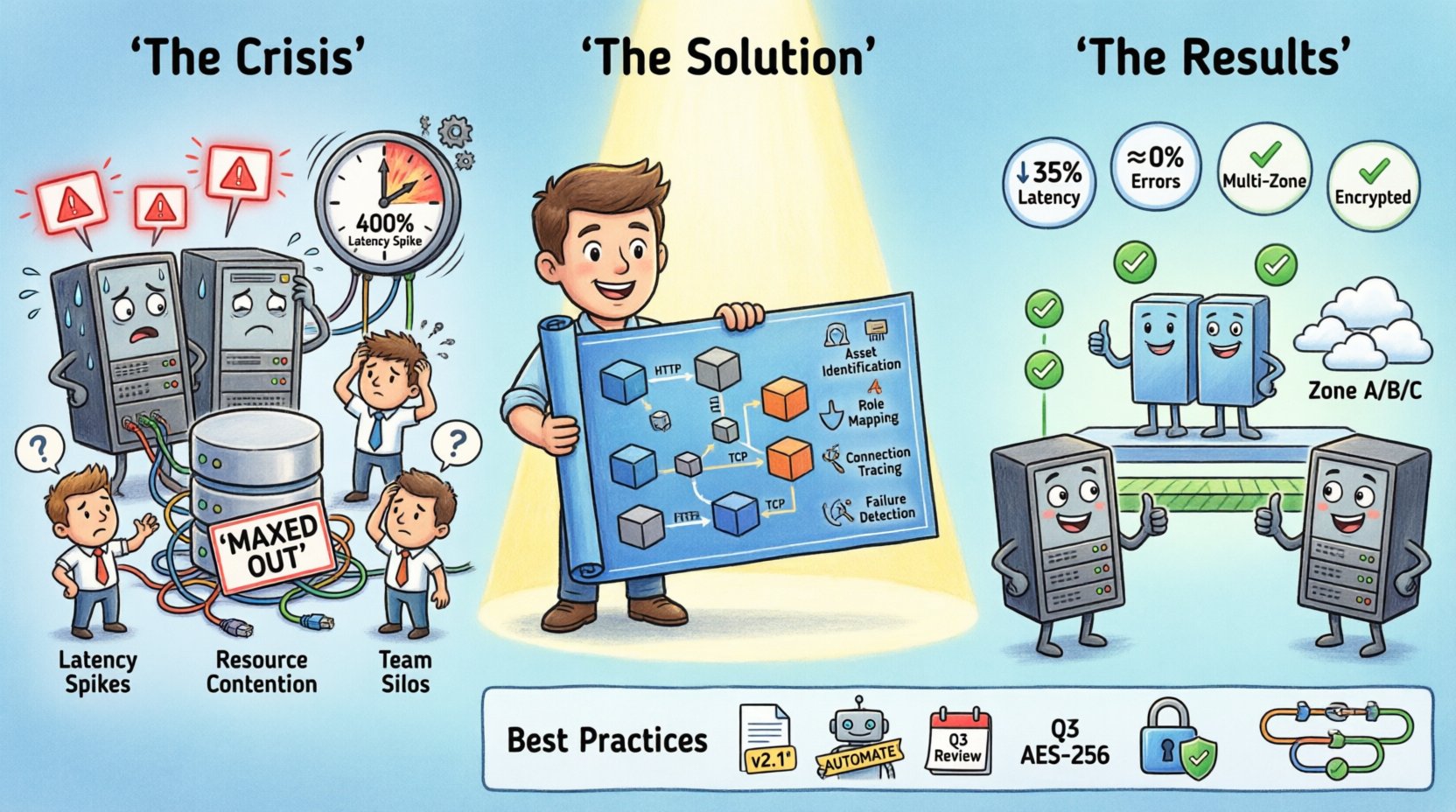
The Situation: A System Under Pressure 📉
The project in question handled significant user traffic for a digital platform. As the user base grew, the initial architecture began to show strain. The team noticed intermittent delays in data retrieval and occasional timeouts during peak hours. Standard monitoring tools indicated high CPU usage on specific nodes, but they did not explain why those nodes were under stress compared to others.
Without a clear map of the infrastructure, troubleshooting became a guessing game. Engineers would restart services, believing that would clear the congestion, only for the issue to recur hours later. The lack of a unified view of the deployment topology meant that dependencies between services were often overlooked. Communication protocols were assumed rather than verified.
Key indicators of the crisis included:
- Latency Spikes: Response times increased by 400% during specific windows.
- Resource Contention: Database connections were maxed out on specific shards.
- Deployment Confusion: New code was being pushed to environments that lacked the necessary load balancers configured.
- Team Silos: Backend developers did not understand the network topology, and network engineers lacked insight into the application logic.
It became clear that the physical and logical layout of the system was not aligned with the intended design. A visual representation was required to bridge the gap between the code and the hardware.
Understanding the Deployment Diagram 🗺️
A deployment diagram is a structural representation of the physical artifacts deployed in a system. It shows the hardware nodes, the software components running on them, and the communication paths between them. Unlike a sequence diagram, which focuses on time and interaction, a deployment diagram focuses on location and connectivity.
For this case study, the diagram served three critical purposes:
- Inventory: It listed every server, container, and virtual machine currently in use.
- Connection Mapping: It defined how data flowed between nodes, including protocol types.
- Capacity Planning: It highlighted where resources were duplicated or insufficient.
Creating this diagram required input from multiple stakeholders. Operations teams provided the current state of the infrastructure. Development teams clarified which services belonged on which nodes. Security teams verified the communication boundaries.
The diagram components typically included:
- Nodes: Represented as cuboids, these are physical devices like servers, routers, or cloud instances.
- Artifacts: The software or hardware files deployed on the nodes, such as executables or libraries.
- Connectors: Lines showing the communication path between nodes or artifacts.
- Interfaces: The entry and exit points for communication.
The Mapping Process: Step-by-Step 🔍
The team began the mapping process by gathering raw data. They exported configuration files from the orchestration layer and queried the monitoring database. This data provided a list of active instances and their assigned roles. The goal was to create a “single source of truth” that matched the running environment.
Step 1: Asset Identification
The first task was to catalog every active node. This included production servers, staging environments, and backup replicas. The team discovered that several legacy servers were still connected to the main cluster but were not receiving traffic. These were consuming resources without providing value.
Step 2: Defining Node Roles
Each node was assigned a specific role. Some acted as application servers, others as database nodes, and some served as load balancers. By labeling these clearly, the team could see if a single node was performing too many functions, a common cause of instability.
Step 3: Tracing Communication Paths
This was the most critical step. The team drew lines between nodes to represent network traffic. They noted the protocols used, such as HTTP, TCP, or internal messaging queues. This revealed a major issue: several services were communicating over unencrypted channels, and some were traversing multiple hops unnecessarily.
Step 4: Identifying Single Points of Failure
Once the connections were drawn, the diagram made the risks visible. A specific load balancer was the gateway for 80% of the traffic. If that node failed, the entire system went down. There was no redundancy configured in the diagram.
The Discovery Phase: Finding the Bottleneck 🔧
With the diagram complete, the team analyzed the visual data. The crisis was not caused by a lack of processing power, but by a misconfiguration in how requests were routed.
The diagram revealed that a database node was handling write operations for both the primary application and a background reporting service. The reporting service generated heavy queries that locked tables, causing the primary application to wait. This dependency was not documented in the code comments, only in the visual layout.
Additionally, the diagram showed that the application servers were clustered in a single availability zone. This meant that a power outage in that specific zone would take down the entire service. The infrastructure lacked geographic distribution.
Key Findings from the Analysis:
- Resource Contention: Database writes were blocking reads due to shared node usage.
- Network Latency: Cross-zone communication added milliseconds to every request.
- Redundancy Gaps: No standby load balancers were present.
- Documentation Drift: The running system did not match the original design documents.
Visualizing the Solution 🛠️
Once the problems were identified, the team updated the deployment diagram to reflect the proposed changes. This updated version became the blueprint for the migration. The new design included the following structural changes:
- Service Separation: The reporting service was moved to a dedicated database node to prevent locking conflicts.
- Load Balancing: A redundant pair of load balancers was added to the entry point.
- Geographic Distribution: Servers were distributed across multiple availability zones.
- Connection Optimization: Direct connections were established for high-frequency data exchanges.
The diagram allowed the team to simulate the new architecture before implementing it. They could trace the path of a request through the new nodes and verify that no loops or dead ends existed. This visual validation reduced the risk of deployment errors.
Comparison of Infrastructure States 📊
The following table highlights the differences between the initial state and the optimized state derived from the diagram analysis.
| Component | Initial State | Optimized State | Impact |
|---|---|---|---|
| Database Nodes | Shared (App + Reports) | Dedicated (App + Reports) | Reduced contention and latency |
| Load Balancers | Single Node | Redundant Pair | Improved availability and fault tolerance |
| Deployment Zones | Single Zone | Multi-Zone | Protection against zone-level failures |
| Communication | Unencrypted & Indirect | Encrypted & Direct | Enhanced security and speed |
| Documentation | Outdated | Synced with Diagram | Faster troubleshooting and onboarding |
Implementation and Validation ✅
The migration followed the updated diagram closely. The team staged the changes in a non-production environment first. They validated that the new connections were established correctly and that traffic was being routed as expected.
Once validated, the changes were rolled out during a maintenance window. The deployment was executed in phases to ensure stability. Monitoring dashboards were updated to track the new metrics associated with the diagram nodes.
Post-implementation, the results were immediate:
- Latency Reduction: Average response time dropped by 35%.
- Error Rate: Timeout errors decreased to near zero.
- Resource Efficiency: CPU usage per node normalized, reducing costs.
- Team Efficiency: Onboarding new engineers became faster as the diagram served as a reference guide.
Best Practices for Deployment Diagrams 📝
To ensure that deployment diagrams remain useful over time, the team adopted several guidelines. These practices help maintain the integrity of the documentation as the system evolves.
1. Keep Diagrams Versioned
Just like code, diagrams should be versioned. When a significant architectural change occurs, a new version of the diagram should be created. This allows teams to look back and understand how the system evolved.
2. Automate Where Possible
Manual diagramming can lead to errors. Where tools allow, the diagram should be generated from the infrastructure configuration. This ensures the visual representation matches the actual state.
3. Review Regularly
Diagrams become stale quickly. A quarterly review should be scheduled to ensure the diagram matches the current infrastructure. Any discrepancies should be updated immediately.
4. Include Communication Details
A node is not enough. The diagram must show how nodes talk to each other. Protocol, port numbers, and security requirements should be noted on the connectors.
5. Document Dependencies
If a service relies on another, this should be clear in the diagram. This helps in impact analysis when a service is deprecated or updated.
Technical Considerations for Scaling 📈
Scaling is not just about adding more servers. It is about managing the complexity that comes with growth. A deployment diagram helps manage this complexity by providing a high-level view of the system.
When planning for scale, consider the following factors:
- Horizontal vs. Vertical: Determine if scaling requires more nodes or more powerful nodes.
- State Management: Ensure that stateful services are distributed correctly.
- Network Bandwidth: Check if the network can handle the increased traffic volume.
- Cost Implications: More nodes mean higher costs. The diagram helps visualize where savings can be made.
In this specific case, the decision was to scale horizontally. The diagram showed that the load balancer was the bottleneck. By adding more application nodes and distributing them across zones, the load was shared effectively.
Lessons Learned from the Crisis 🎓
The crisis provided valuable lessons for the engineering organization. It highlighted the importance of visual documentation in complex systems.
Visibility Prevents Blind Spots
When you cannot see the system, you cannot fix it. The diagram made the hidden dependencies visible, allowing the team to address them before they caused a major outage.
Communication is Key
The diagram acted as a common language between developers and operations. It removed ambiguity and ensured everyone was working from the same understanding of the infrastructure.
Documentation is Part of the Code
Just as code needs testing, documentation needs maintenance. The diagram was treated as a living artifact, not a static image.
Preparation Beats Reaction
Had the diagram been created earlier, the crisis might have been avoided. Proactive planning is always more effective than reactive troubleshooting.
Final Thoughts on Architecture Visualization 💡
The journey from crisis to stability was driven by clarity. The deployment diagram provided that clarity. It transformed a chaotic environment into a structured system that could be managed and scaled.
For any team managing distributed systems, investing time in accurate documentation is not a waste. It is a necessity. The cost of creating a diagram is far lower than the cost of a downtime event.
As systems grow, the complexity increases. A simple diagram can no longer capture every detail, but it provides the essential framework needed to navigate that complexity. It allows teams to focus on the important connections rather than getting lost in the noise of individual components.
The case study demonstrates that the right tool, used correctly, can save a project. The deployment diagram was that tool. It provided the map needed to navigate the infrastructure maze.
For teams looking to improve their infrastructure stability, start by mapping your current state. Identify the nodes, the connections, and the dependencies. Once you have the map, the path to optimization becomes clear.

