


A component diagram represents the physical or logical components of a system. It provides a high-level view of how software parts interact. This guide details the symbols, rules, and practical tips for creating clear, effective diagrams.
Introduction to Component Modeling 🏗️
Component diagrams focus on the structure of a system at a level higher than class diagrams. They show how different modules or subsystems are organized. This view helps developers understand the physical deployment and logical dependencies of the software architecture.
Key benefits include:
- Visualizing system organization
- Defining interface contracts
- Tracking dependencies between modules
- Supporting high-level design documentation
When creating these diagrams, the goal is clarity. Avoid showing every single class. Focus on the major building blocks that make up the application.
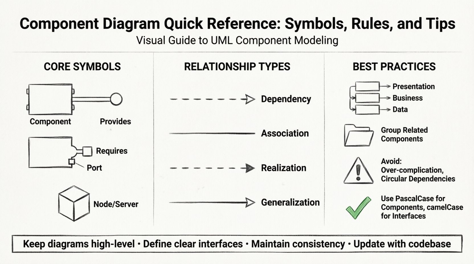
Core Symbols and Notation 🔣
Understanding the standard symbols is the first step. These elements define the visual language of the diagram.
1. Component Icon
The primary symbol is a rectangle with two tabs on the left side. This shape represents a modular part of the system. Inside the rectangle, you place the name of the component.
- Shape: Rectangle with two tabs on the left.
- Label: Component name in bold.
- Stereotype: You can add a label like <
> above the name.
2. Interface
Interfaces define the behavior a component provides or requires. They are crucial for decoupling implementation from usage.
- Provided Interface: A “lollipop” shape attached to the component. It indicates functionality the component offers.
- Required Interface: A “socket” shape attached to the component. It indicates functionality the component needs from another.
3. Ports
Ports are points of interaction for components. They are often used when a component has multiple connections to different systems.
- Symbol: Small rectangles on the border of a component.
- Usage: Indicates where external connections enter or leave.
4. Nodes
While component diagrams focus on software, they often relate to deployment. Nodes represent physical hardware or execution environments.
- Symbol: 3D cube shape.
- Label: Name of the server, device, or environment.
| Symbol | Name | Meaning |
|---|---|---|
| Rect with tabs | Component | A modular part of the system |
| Lollipop | Provided Interface | Functionality offered by the component |
| Socket | Required Interface | Functionality needed by the component |
| 3D Cube | Node | Physical hardware or environment |
| Open Rectangle | Package | Grouping of elements |
Interface and Port Concepts 🔌
Interfaces are the bridge between components. They ensure that components communicate without knowing the internal details of each other.
Provided Interfaces
A component provides an interface when it implements specific functionality. Other components can use this interface to interact with the system.
- Use a circle (lollipop) to denote the interface.
- Connect the interface to the component line.
- Label the interface with the specific operations available.
Required Interfaces
A component requires an interface when it depends on external functionality. This creates a dependency.
- Use a half-circle (socket) to denote the interface.
- Connect the socket to the component line.
- Label the interface with the operations needed.
Using Ports
Ports refine the concept of interfaces. They allow you to group multiple interfaces under a single access point.
- Place a port on the edge of the component.
- Connect lines to the port rather than the component body.
- This keeps the diagram cleaner when many connections exist.
Relationships and Dependencies 🔄
Connecting components correctly is vital for understanding system flow. Different lines represent different types of interactions.
Dependency
A dependency indicates that one component relies on another. If the supplier changes, the client may break.
- Style: Dashed line with an open arrow.
- Direction: Points from the client to the supplier.
- Usage: Use for interface usage or simple references.
Association
An association represents a structural relationship. It implies a direct connection between two components.
- Style: Solid line.
- Usage: Use when components are part of a larger whole or share data directly.
Realization
Realization occurs when a component implements an interface or a specification.
- Style: Dashed line with a solid arrow head.
- Direction: Points from the implementer to the interface.
Generalization
Generalization represents inheritance. One component is a specialized version of another.
- Style: Solid line with a hollow triangle arrow.
- Direction: Points from the subclass to the superclass.
| Relationship | Line Style | Arrow Type | Purpose |
|---|---|---|---|
| Dependency | Dashed | Open Arrow | Usage or reliance |
| Association | Solid | None | Direct connection |
| Realization | Dashed | Solid Triangle | Implementation |
| Generalization | Solid | Hollow Triangle | Inheritance |
Structural Rules and Conventions 📏
Consistency makes diagrams readable. Follow these conventions to maintain quality.
Naming Conventions
- Use PascalCase for component names (e.g., PaymentService).
- Use camelCase for interface names (e.g., paymentInterface).
- Keep names descriptive. Avoid abbreviations unless they are industry standard.
Grouping and Packages
- Use packages to group related components.
- Label packages clearly (e.g., Core, UI, Data).
- Keep the diagram from becoming too crowded by nesting components into packages.
Layering
Organize components logically by layer. This helps in understanding the flow of data.
- Place presentation components at the top.
- Place business logic in the middle.
- Place data access at the bottom.
Common Mistakes to Avoid ⚠️
Even experienced architects make errors. Watch out for these common pitfalls.
- Over-complication: Do not draw every single class. A component diagram is high-level. If you see classes, you are likely in a class diagram.
- Missing Interfaces: Do not connect components directly without interfaces. This couples them too tightly.
- Inconsistent Naming: Ensure all names match the codebase or documentation. Mismatched names cause confusion.
- Circular Dependencies: Avoid loops where Component A depends on B, and B depends on A. This indicates a design flaw.
- Ignoring Ports: If a component connects to many things, use ports to keep the layout clean.
Documentation and Maintenance 📝
A diagram is only useful if it stays up to date. Treat it as living documentation.
Version Control
- Store diagram files in your version control system.
- Update the diagram when the architecture changes.
- Document changes in the commit message.
Cross-Referencing
- Link component diagrams to class diagrams for detailed views.
- Link to deployment diagrams for physical context.
- Ensure the component names match exactly across all diagrams.
Review Process
- Have peers review the diagram for clarity.
- Check if the interfaces match the actual API contracts.
- Ensure the dependencies reflect the actual build order.
Advanced Considerations 🧠
For complex systems, standard symbols might need adjustment.
Composite Components
Sometimes a component contains other components. This is called a composite structure.
- Draw a larger component box.
- Place smaller components inside it.
- Indicate internal connections without connecting to the outside.
Interfaces in Packages
You can group interfaces into packages to organize large systems.
- Create a package for all service interfaces.
- Create a package for all data interfaces.
- Reference these packages in your component diagram.
Best Practices for Documentation 📋
Following these tips ensures your diagram serves its purpose effectively.
- Start with the Big Picture: Define the main components first. Add details later.
- Use White Space: Do not crowd elements. Use spacing to group related items.
- Limit Connections: If a component has too many lines, consider splitting it into sub-components.
- Consistent Orientation: Align components in rows or columns to guide the eye.
- Legend: If you use non-standard symbols, include a legend.
Summary of Key Takeaways 🎯
- Use standard symbols for components, interfaces, and ports.
- Define clear interfaces to reduce coupling.
- Use dashed lines for dependencies and solid lines for associations.
- Keep the diagram high-level; avoid showing individual classes.
- Maintain consistency in naming and structure.
- Regularly update diagrams to match the codebase.
By adhering to these guidelines, you create diagrams that communicate architecture clearly. This leads to better collaboration and fewer errors during development.

