Creating a component diagram is a fundamental task in software engineering education. It serves as the blueprint for system architecture, illustrating how different parts of a software solution interact. For students and researchers, mastering this visual representation is critical for demonstrating technical competence. This guide outlines the essential rules and standards for creating professional-grade component diagrams within an academic context.
Understanding the Foundation of Component Diagrams 🧠
A component diagram is a type of structural diagram in the Unified Modeling Language (UML). It describes the organization and wiring of the physical or logical components of a system. Unlike a class diagram, which focuses on data structures and methods, the component diagram abstracts these details to show high-level modules. In academic projects, this abstraction helps evaluators understand the system’s modularity and design philosophy.
When constructing these diagrams, the primary goal is clarity. A diagram that confuses the reader fails its purpose. It must communicate the boundaries of responsibilities, the interfaces exposed by components, and the dependencies between them.
Key Elements Defined
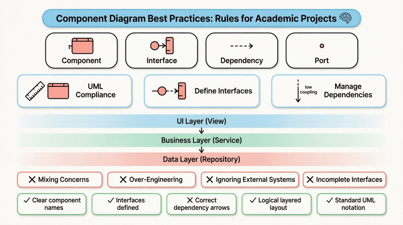
- Component: A modular, replaceable part of a system. It encapsulates functionality and exposes interfaces.
- Interface: A contract defining a set of operations that a component provides or requires. It is the point of interaction.
- Dependency: A relationship where one component relies on another to function. This is often shown as a dashed arrow.
- Port: A specific interaction point on a component where connections are made.
Structural Rules and Standards 📐
Academic projects are often graded based on adherence to industry standards. Deviating from UML conventions can lead to confusion and lower marks. The following rules ensure your diagrams are technically accurate and professionally presented.
1. Maintain UML Compliance
Ensure that every symbol used aligns with the official UML specification. A component is typically drawn as a rectangle with two smaller rectangles attached to the side. Using non-standard shapes can suggest a lack of familiarity with the subject matter.
- Shape: Rectangular box with the “lollipop” notation for provided interfaces and the “socket” notation for required interfaces.
- Labeling: Component names should be clear and descriptive. Avoid generic terms like Module1 or PartA.
- Relationships: Use standard arrows for dependencies. Solid lines indicate association, while dashed lines indicate dependency.
2. Define Interfaces Explicitly
One of the most common errors in student diagrams is hiding the interfaces. Components should not be connected directly to other components; they should connect via interfaces. This separation of concerns is a core principle of software design.
When drawing a connection:
- Use a lollipop icon (circle at the end) to show a component provides an interface.
- Use a socket icon (half-circle) to show a component requires an interface.
- Connect the socket of the client to the lollipop of the server.
3. Manage Dependencies Carefully
Dependencies represent the flow of information or control. Too many dependencies indicate high coupling, which is generally considered a design flaw. In your diagram, aim for a structure where components are loosely coupled.
- Directionality: Ensure arrows point from the client (user) to the server (provider).
- Minimization: If Component A depends on Component B, ensure there is a valid reason. If possible, use an interface layer to decouple them further.
- Transitivity: Avoid chains of dependencies. A should not depend on B, which depends on C, which depends on D. Flatten the architecture where possible.
Design Principles for Clarity and Modularity ✨
Beyond syntax, the layout and philosophy of your diagram matter. In an academic setting, you are demonstrating your ability to design systems, not just draw boxes. The following principles guide the visual and logical arrangement of your diagram.
1. Cohesion and Coupling
High cohesion means a component has a single, well-defined responsibility. Low coupling means a component does not rely heavily on the internal details of other components. Your diagram should reflect this balance.
- Grouping: Use packages or folders to group related components. This reduces visual clutter.
- Responsibility: Ensure every component in the diagram has a distinct role. If two components do the same thing, consider merging them.
- Boundaries: Clearly distinguish between the internal logic and the external interface. The diagram should focus on the external view.
2. Layered Architecture
Most academic projects follow a layered architecture (e.g., Presentation, Business Logic, Data Access). Representing this in a component diagram helps evaluators quickly grasp the system’s structure.
| Layer | Function | Diagram Representation |
|---|---|---|
| UI Layer | User Interaction | Components labeled with View or UI |
| Business Layer | Core Logic | Components labeled with Service or Manager |
| Data Layer | Storage & Retrieval | Components labeled with Repository or DB |
3. Consistent Naming Conventions
Consistency aids readability. If you use the suffix -Manager for one class, do not switch to -Controller for a similar function elsewhere unless there is a distinct architectural reason. Use camelCase or PascalCase consistently throughout the diagram.
- Prefixes: Consider using prefixes like API- for web interfaces or DB- for database components.
- Singular vs. Plural: Stick to one convention. Either use UserComponent or UsersComponent, not both.
Common Mistakes to Avoid ⚠️
Evaluators often look for specific errors that indicate a lack of understanding. Avoiding these pitfalls can significantly improve the quality of your submission.
1. Mixing Concerns
Do not draw a component diagram that looks like a flowchart or a class diagram. Avoid showing data flow arrows between components unless they represent dependencies. Do not include method names inside the component boxes; that belongs in a class or sequence diagram.
2. Over-Engineering the Diagram
In academic projects, simplicity is often better than complexity. If your system has ten small components, grouping them into two logical packages might be clearer than showing every single file as a component. Focus on the logical architecture, not the physical file structure.
3. Ignoring External Systems
Your application does not exist in a vacuum. It likely interacts with external services, databases, or legacy systems. These should be represented as components outside your main package, connected via clear dependencies.
4. Incomplete Interfaces
A component that requires an interface must have that interface defined. Do not draw a socket icon without specifying what interface it connects to. This ambiguity makes the diagram incomplete.
Documentation and Maintenance 📝
A diagram is not a static artifact; it is documentation. In academic projects, you may be asked to update your diagram as the project evolves. Proper documentation practices ensure your work remains valid.
1. Version Control for Diagrams
Just like code, diagrams should be versioned. If you change the architecture, document the change. Include a revision history in your project report. Mention what changed, when, and why.
2. Legend and Notation Key
If you use non-standard icons or specific color coding to denote security levels or deployment nodes, include a legend. This ensures that anyone reading your diagram understands the notation immediately.
3. Alignment with Other Models
Your component diagram must align with your class diagrams and use case diagrams. If a component is described in a use case, it should appear in the component diagram. Inconsistencies between diagrams raise questions about the integrity of your design.
Academic Grading Criteria 🏆
Understanding what professors and evaluators look for can help you tailor your diagram to meet expectations. The following table summarizes common grading criteria.
| Criteria | Excellent | Average | Poor |
|---|---|---|---|
| Accuracy | UML syntax is flawless; relationships are correct. | Minor syntax errors; some relationships unclear. | Incorrect symbols; non-standard notation. |
| Completeness | All major subsystems represented; interfaces defined. | Missing some external interfaces; vague grouping. | Major components missing; no interfaces shown. |
| Clarity | Logical layout; easy to follow; consistent naming. | Crowded layout; naming inconsistent. | Confusing arrows; illegible text. |
| Design Quality | Low coupling, high cohesion demonstrated. | Mixed coupling; some cohesion issues. | High coupling; spaghetti architecture. |
Advanced Techniques for Complex Systems 🚀
For more advanced academic projects, such as final year dissertations, you may need to represent more complex scenarios. The following techniques add depth to your diagrams.
1. Deployment Context
While deployment diagrams show hardware, component diagrams can imply deployment. You can use stereotypes to indicate if a component is deployed on a server, a client, or a mobile device. This adds context to the architectural design.
2. Abstract vs. Concrete Components
Differentiate between abstract interfaces and concrete implementations. Use specific notations to show that one component fulfills the contract of another. This demonstrates a deeper understanding of polymorphism and design patterns.
3. Cross-Platform Considerations
If your project supports multiple platforms, show how the components are shared or adapted. For example, a core business logic component might be shared across web and mobile clients, while the UI components are separate.
Final Thoughts on Diagram Creation 💡
Creating a component diagram is an exercise in abstraction. It requires you to look at a complex system and identify the building blocks that make it work. By following the rules outlined in this guide, you ensure that your diagram serves its purpose: communication.
Remember that a diagram is a tool for thinking, not just a deliverable. As you design your system, sketching these components helps you identify flaws before you write code. In an academic setting, this process demonstrates maturity in your engineering approach.
Focus on the relationships between components. The boxes themselves are less important than the lines connecting them. Those lines represent the dependencies that hold the system together. Ensure they are clean, logical, and necessary.
By adhering to these best practices, you produce work that is not only graded well but also stands up to professional scrutiny. Whether you are submitting a thesis or building a portfolio piece, a well-crafted component diagram is a testament to your design skills.
Checklist Before Submission ✅
- Are all components named clearly?
- Are all interfaces provided and required?
- Do the arrows indicate the correct direction of dependency?
- Is the layout logical (e.g., top-down or layered)?
- Are there any dangling connections?
- Does the diagram match the rest of your documentation?
- Is the UML notation standard?
Reviewing your work against this list can catch errors that might otherwise be overlooked. Take the time to ensure every element serves a purpose. This attention to detail is what separates a good academic project from a great one.

