Software systems have grown exponentially in scale and complexity over the last decade. As applications evolve from monolithic structures to distributed architectures, the challenge of understanding the whole system has become a critical bottleneck. Developers and architects often find themselves lost in a sea of code, dependencies, and logic flows. This is where the art of abstraction becomes essential. By stepping back and viewing the system through high-level models, we can manage complexity effectively.
One of the most powerful tools for this purpose is the component diagram. Unlike class diagrams that dive into implementation details, component diagrams focus on the black-box functionality of system parts. They allow teams to communicate architecture without getting bogged down in syntax. This guide explores how to leverage component diagrams to simplify systems, improve communication, and maintain clarity throughout the development lifecycle.
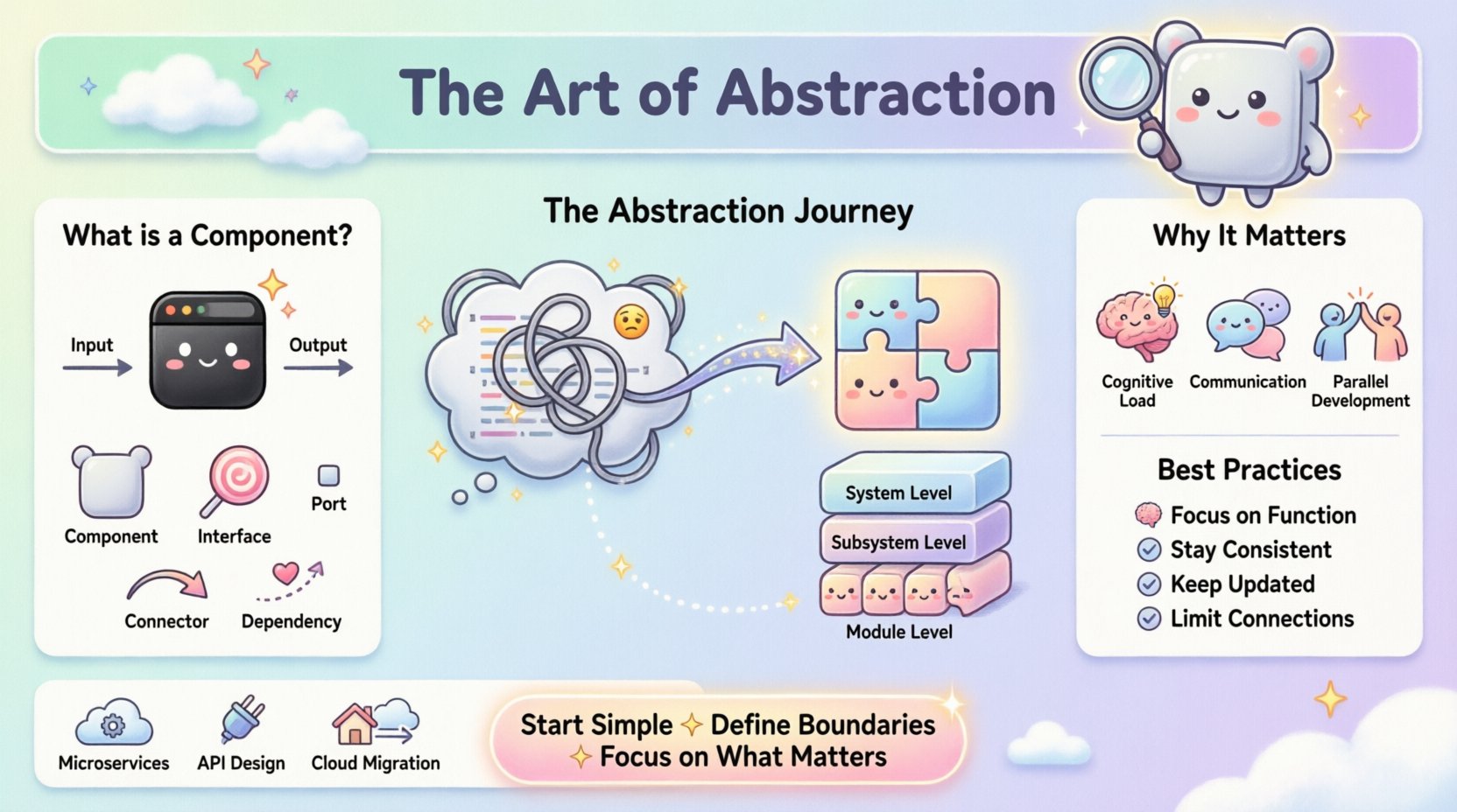
What is a Component Diagram? 🔍
A component diagram is a type of Unified Modeling Language (UML) diagram that depicts the physical or logical structure of a system. It represents a system as a collection of components and the relationships between them. In the context of software engineering, a component is a modular, deployable part of a system that encapsulates a set of related functionalities.
Think of a component as a box. You know what goes in and what comes out, but you do not necessarily need to know the wires inside to use it. This is the core essence of abstraction. When you build a house, you do not need to understand the plumbing behind the wall to use the faucet. Similarly, in software, a component provides services to other parts of the system without exposing its internal code.
Distinguishing Components from Classes
It is crucial to distinguish between a class and a component. While a class is a blueprint for objects in code, a component is a larger unit of composition. A single component can contain many classes, libraries, or even third-party modules.
- Class Diagram: Focuses on data structures, methods, and relationships at the code level.
- Component Diagram: Focuses on modular subsystems, their interfaces, and how they interact.
This distinction allows architects to design at a level appropriate for the stakeholder. Business stakeholders care about capabilities, not variable names. Component diagrams bridge that gap.
Why Abstraction Matters in System Design 🧠
Abstraction is the process of hiding complex implementation details while showing only the essential features of an object or system. In system design, abstraction is not just a convenience; it is a necessity for scalability.
Managing Cognitive Load
The human brain has a limited capacity for processing information at once. When a developer tries to understand a system with thousands of interconnected classes, cognitive overload occurs. This leads to bugs, slow development, and poor decision-making. Component diagrams reduce this load by grouping related logic into manageable chunks.
Facilitating Communication
Technical teams are rarely homogenous. You have backend engineers, frontend developers, QA testers, and project managers. A component diagram serves as a universal language. It allows a backend engineer to understand what data a frontend service expects without reading the API documentation line by line.
Enabling Parallel Development
When components are well-defined with clear interfaces, different teams can work on them simultaneously. Team A can build the authentication module while Team B builds the payment gateway, provided they agree on the interface contract. This abstraction of boundaries enables concurrency in development.
Core Elements of a Component Diagram 🏗️
To create an effective component diagram, one must understand the standard symbols and elements used to represent the system. These elements define the boundaries and interactions of the architecture.
| Element | Visual Representation | Function |
|---|---|---|
| Component | Rectangle with tabs | Represents a modular unit of functionality. |
| Interface | Circle (lollipop) or oval | Defines a set of operations available to other components. |
| Port | Small rectangle on the component | Designates a specific point of interaction. |
| Connector | Line with arrows | Shows the flow of information or control. |
| Dependency | Dashed line with arrow | Indicates that one component requires another to function. |
Understanding these visual cues is the first step toward drawing meaningful diagrams. However, the value lies not in the drawing itself, but in the information it conveys about the system’s structure.
The Role of Interfaces and Contracts 🤝
The most critical aspect of a component diagram is the definition of interfaces. An interface is a contract that specifies what a component does, not how it does it. This separation is the bedrock of maintainable software.
Provided vs. Required Interfaces
Every component has needs and offerings. A component diagram must clearly show both:
- Provided Interfaces: What services does this component offer to the world? For example, a database component provides a
Queryinterface. - Required Interfaces: What services does this component need from others to function? For example, a reporting component requires a
DataAccessinterface.
By explicitly mapping these requirements, architects can identify missing dependencies early in the design phase. This prevents the common scenario where a feature is built but cannot connect to the necessary data sources.
Versioning and Evolution
Interfaces change over time. If a component modifies its interface, all dependent components must be updated. A well-documented component diagram tracks these changes. It acts as a reference point for impact analysis. When a change is proposed, the diagram shows exactly which other parts of the system will be affected.
Granularity Levels in Design 📏
One of the most common challenges in creating component diagrams is determining the right level of detail. This is known as granularity. If the components are too small, the diagram becomes cluttered. If they are too large, it loses its utility.
Choosing the Right Scale
Granularity should depend on the context of the diagram. There is no single “correct” level for every project.
- System Level: High-level view showing major subsystems (e.g., User Management, Billing, Reporting).
- Subsystem Level: Breaking down a subsystem into logical modules (e.g., within Billing: Invoicing, Payments, Refunds).
- Module Level: Detailed view of specific functional blocks (e.g., within Invoicing: Tax Calculation, PDF Generation).
A best practice is to create a hierarchy of diagrams. Start with the high-level view for stakeholders. Drill down into subsystem diagrams for architects. Use module diagrams for developers working on specific areas. This layered approach ensures everyone has the right amount of information.
Best Practices for Creating Effective Diagrams ✅
Creating a diagram is easy; creating a useful one requires discipline. Adhering to established best practices ensures the diagram remains a valuable asset rather than becoming outdated documentation.
1. Focus on Functionality, Not Implementation
Avoid naming components after specific technologies or file structures. Do not name a component “JavaService.java”. Instead, name it “PaymentProcessor”. Technology changes, but business functions remain stable. Focusing on function ensures the diagram remains relevant even if the underlying stack changes.
2. Maintain Consistency
Use consistent naming conventions across all diagrams. If a component is called “UserAuth” in one diagram, it should not be “AuthenticationService” in another. Consistency reduces confusion and speeds up navigation through the documentation.
3. Keep it Updated
A diagram that does not match the code is worse than no diagram at all. It creates a false sense of security. Establish a process where the diagram is updated alongside code changes. Ideally, the diagram should be generated or maintained as part of the continuous integration pipeline.
4. Limit Connections
Too many lines crossing the diagram create “spaghetti” visuals. If a component has too many dependencies, it is a sign that the component is doing too much. Consider splitting it into smaller, more cohesive components. A clean diagram is a reflection of clean architecture.
Common Pitfalls to Avoid ⚠️
Even experienced architects can fall into traps when modeling systems. Being aware of common mistakes helps in maintaining high-quality documentation.
- Over-Engineering: Trying to model every single class as a component. This results in a diagram that is too dense to read. Stick to logical groupings.
- Ignoring Asynchronous Flows: Many modern systems rely on event-driven architectures. Component diagrams often show synchronous calls. Ensure you clearly indicate asynchronous messaging or event streams where applicable.
- Static Snapshots: A component diagram is a static view. Do not try to force it to show dynamic behavior like loops or state changes. Use sequence diagrams for flow logic.
- Isolation from Code: Creating diagrams in a vacuum without input from the developers who write the code. Developers know the reality of the system. Their input ensures accuracy.
Integration with Development Workflows 🔄
Component diagrams should not exist in a separate documentation folder. They must be integrated into the daily workflow of the development team to be effective.
Design-First Approach
For new features, draft the component diagram before writing code. This forces the team to think about dependencies and boundaries early. It is much cheaper to move a box on a diagram than to refactor code after it has been deployed.
Onboarding New Team Members
When a new engineer joins the team, the component diagram is the first resource they should review. It provides a mental map of the system. This reduces the time needed to understand where to place new code or where to look for bugs.
Legacy System Refactoring
Refactoring old systems is difficult because no one remembers the original design intent. Creating component diagrams for legacy systems helps reverse-engineer the architecture. It identifies tightly coupled modules that need to be decoupled for modernization.
Measuring Success 📊
How do you know if your component diagrams are working? There are qualitative and quantitative metrics to consider.
- Clarity: Ask developers if they can explain the system architecture using the diagram. If they can, the abstraction is successful.
- Maintenance Time: Monitor the time taken to onboard new developers. A clear diagram should reduce this time.
- Defect Density: Track bugs related to integration. If components are well-defined, integration errors should decrease.
- Update Frequency: If the diagram is updated frequently, it is being used. If it is ignored, it is not providing value.
Real-World Applications 🌍
Component diagrams are not theoretical constructs; they are used in practical scenarios across various industries.
Microservices Architecture
In microservices, each service is essentially a component. Diagrams help visualize how services communicate via APIs or message queues. They help identify single points of failure and data redundancy.
API Design
When designing an API for third-party developers, a component diagram clarifies which endpoints are available and how they relate. It serves as a visual API specification.
Cloud Migration
Migrating from on-premise to cloud requires mapping current components to cloud services. A diagram helps plan which on-premise modules map to which cloud functions, ensuring nothing is left behind.
Final Thoughts on System Modeling 🚀
The goal of a component diagram is not to create a perfect picture, but to create a useful map. Systems are complex, and abstraction is the tool that makes them navigable. By focusing on interfaces, limiting dependencies, and maintaining clarity, architects can build systems that are robust and adaptable.
Remember that diagrams are living documents. They evolve as the software evolves. The discipline of keeping them updated is just as important as creating them in the first place. When done right, these diagrams become the backbone of technical communication, reducing ambiguity and fostering collaboration across the entire development lifecycle.
Start simple. Define your boundaries. Focus on what matters. The complexity will handle itself.

