


Software architecture relies on clear communication. When development teams, stakeholders, and system designers discuss the internal structure of an application, they need a shared language. This is where the component diagram becomes essential. It provides a high-level view of the system, breaking down complex logic into manageable, deployable units. However, the visual syntax used in these diagrams can be obscure to those unfamiliar with the standards.
Understanding component diagram notation is not merely about drawing rectangles and lines. It is about defining boundaries, interactions, and responsibilities within a system. This guide explores the specific symbols, relationships, and structural conventions that make these diagrams effective tools for technical documentation.
🏗️ The Core Building Blocks
At the heart of any component diagram is the component itself. Unlike a class, which represents a specific unit of code, a component represents a modular part of the system that can be developed and deployed independently. Recognizing the standard notation for these elements is the first step in accurate modeling.
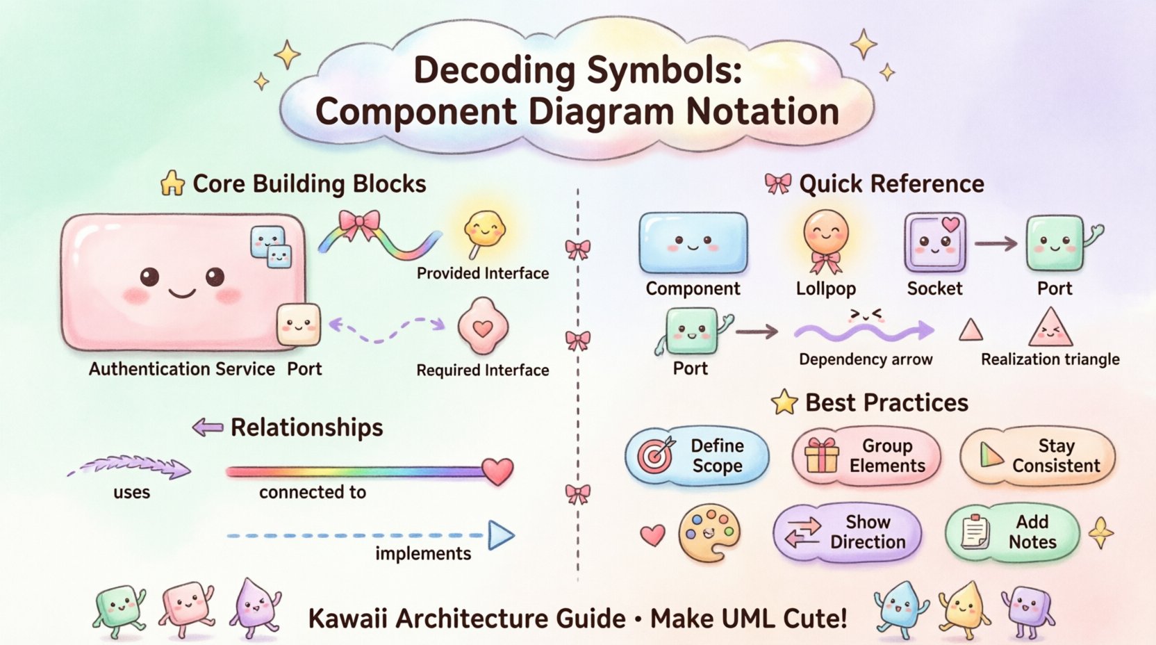
The Component Symbol
The primary symbol for a component is a rectangle with a specific icon in the upper-right corner. This icon consists of two smaller rectangles stacked on top of each other. It serves as a visual shorthand that distinguishes a component from a class or an interface, which have different shapes.
- Rectangle Shape: Represents the container for the software module.
- Icon: The two small rectangles signify that this is a deployable unit.
- Label: The name inside the rectangle identifies the component (e.g., Authentication Service, Payment Gateway).
When modeling a system, it is crucial to label components with nouns that reflect their function. Avoid vague terms like Module or Part. Instead, use specific identifiers that describe the responsibility, such as User Management or Data Repository.
Interfaces and Ports
Components do not exist in isolation. They interact with other components through defined interfaces. The notation for these interactions is critical for understanding how data flows through the architecture without violating encapsulation.
- Provided Interface (Lollipop): A circle connected to the component by a line. This indicates that the component offers a specific service or capability to the outside world.
- Required Interface (Socket): A half-circle or socket shape connected to the component by a line. This indicates that the component needs a specific service to function.
- Port: A small rectangle attached to the edge of the component. Ports act as entry and exit points for interactions, allowing multiple interfaces to be connected to a single component.
Using ports and interfaces correctly ensures that the dependencies between components are explicit. It prevents the model from implying direct access to internal data, which is a common source of fragility in software systems.
🔗 Understanding Relationships
The lines connecting components carry significant semantic weight. They describe the nature of the dependency and the direction of the flow. Misinterpreting these relationships can lead to a flawed understanding of system coupling.
Dependency
A dependency relationship indicates that one component relies on another to function. It is represented by a dashed line with an open arrowhead pointing towards the provider.
- Visual: Dashed line, open arrow.
- Meaning: Changes in the target component may affect the source component.
- Usage: Used when one component calls operations defined in an interface provided by another.
Association
An association represents a structural relationship between components. It implies that instances of one component are connected to instances of another. This is less common in high-level component diagrams but is used when there is a persistent link.
- Visual: Solid line.
- Meaning: A direct link exists between the two units.
- Usage: Often used to show physical connections or data storage links.
Realization
Realization describes an implementation relationship. It occurs when a component implements the contract defined by an interface.
- Visual: Dashed line with a hollow triangle arrowhead pointing to the interface.
- Meaning: The component fulfills the obligations of the interface.
- Usage: Essential for showing how a concrete service satisfies an abstract requirement.
📊 Symbol Reference Table
To aid in quick reference, the following table summarizes the most common notations used in component modeling.
| Symbol | Notation Name | Visual Description | Purpose |
|---|---|---|---|
| 🟦 | Component | Rectangle with icon | Represents a modular unit |
| ⭕ | Provided Interface | Circle (Lollipop) | Service offered to others |
| 🔌 | Required Interface | Socket shape | Service needed by this unit |
| 📤 | Port | Small rectangle on edge | Interaction point |
| ➡️ | Dependency | Dashed line, open arrow | Usage relationship |
| 🔺 | Realization | Dashed line, hollow triangle | Implementation of interface |
🧩 Advanced Notations and Context
While basic symbols cover most scenarios, complex systems require additional notation to convey depth and context. These elements help architects manage scale and clarify deployment structures.
Composite Components
Large systems often require components that contain other components. This is known as a composite component. It allows for a hierarchical view where a high-level component is expanded to show its internal structure.
- Visual: A component rectangle containing other smaller components inside.
- Benefit: Reduces clutter in high-level views while preserving detail in detailed views.
- Strategy: Use this when a component represents a microservice or a major subsystem.
Package Stereotypes
nOrganizing components into packages helps manage complexity. A package is a namespace that groups related elements. In component diagrams, packages are often used to separate different layers of the architecture, such as presentation, business logic, and data access.
- Visual: A rectangle with a tab in the top-left corner.
- Labeling: Use the stereotype notation <
> above the name. - Usage: Group components by domain, layer, or function to improve navigation.
Deployment Nodes
While component diagrams focus on logical structure, they often need to indicate where these components run. Deployment nodes represent the physical or virtual hardware on which the software executes.
- Visual: A 3D cube shape.
- Connection: Components are placed inside or connected to nodes.
- Importance: Helps distinguish between the logical design and the physical infrastructure.
⚠️ Common Pitfalls in Modeling
Even with a clear understanding of symbols, errors frequently occur during the creation of these diagrams. Recognizing these pitfalls helps maintain the integrity of the documentation.
- Over-Complication: Including too many components in a single view. If a diagram requires scrolling or zooming to understand, it is likely too detailed. Break it into multiple diagrams.
- Missing Interfaces: Drawing direct lines between components without using interfaces. This hides the coupling and makes the system harder to refactor.
- Inconsistent Naming: Using different names for the same component across different diagrams. Maintain a controlled vocabulary.
- Ignoring Multiplicity: Failing to indicate how many instances of a component are required. Use notation to specify 1, 1..*, or 0..1 where relevant.
- Confusing Class with Component: A component is a physical unit of deployment. A class is a unit of design. Do not mix them unless specifically modeling the mapping.
🛠️ Best Practices for Clarity
Creating a component diagram is an exercise in abstraction. The goal is to communicate the structure without getting lost in implementation details. Follow these guidelines to ensure your diagrams remain useful.
1. Define the Scope Clearly
Every diagram should have a defined boundary. State what is inside the diagram and what is outside. External systems should be represented as simple boxes or nodes, not detailed components. This keeps the focus on the system being modeled.
2. Group Related Elements
Use packages or swimlanes to group components that share a common responsibility. For example, all components related to security should be grouped together. This visual grouping aids in understanding the domain boundaries.
3. Maintain Consistency
Consistency in notation is vital for readability. If you use a lollipop for provided interfaces in one diagram, do not use a socket in another. Establish a style guide for the project and adhere to it strictly.
4. Focus on Interaction
The value of a component diagram lies in the interactions. Ensure that the arrows and lines clearly indicate the direction of data flow. If a line has no arrow, it may be ambiguous. Prefer explicit directionality.
5. Document the Logic
Notation alone is not enough. Use notes or annotations to explain complex logic. If a component performs a non-standard operation, add a textual note to clarify the behavior. This bridges the gap between the visual model and the code.
🌐 Component Diagrams in System Architecture
The utility of component diagrams extends beyond simple documentation. They are critical assets during the design phase of software development. They serve as a blueprint for developers and a reference for testers.
Facilitating Communication
Stakeholders often lack the technical depth to understand code-level diagrams. A component diagram abstracts the logic into functional blocks. This allows non-technical stakeholders to understand the system’s capabilities and limitations without needing to read the source code.
Supporting Maintenance
When a system evolves, the architecture must change. Component diagrams provide the baseline for understanding the impact of changes. If a developer needs to modify the Payment Processing module, they can look at the diagram to see which other components depend on it.
Guiding Implementation
Developers use these diagrams to determine how to structure their repositories. The components defined in the diagram often map directly to folders, microservices, or libraries in the codebase. This alignment reduces the cognitive load during development.
🔍 Detailed Look at Interface Notation
The interface symbol is perhaps the most misunderstood element in component modeling. It represents a contract, not a physical object. It defines a set of operations that can be called.
When modeling an interface, consider the following nuances:
- Abstract Nature: An interface does not contain data. It only defines behavior. Ensure your diagram reflects this by not listing attributes inside the interface symbol.
- Implementation: Multiple components can implement the same interface. This allows for interchangeable services. For example, a Notification Service might have implementations for Email, SMS, and Push. All implement the Notification Interface.
- Direction: The arrow on a dependency line pointing to an interface means the component uses the interface. The arrow pointing away means the component provides the interface.
Proper use of interfaces decouples the system. If the implementation of a service changes, the components using it do not need to change, provided the interface remains the same. This is a fundamental principle of robust software design.
📝 Final Thoughts on Notation
Mastering the visual language of component diagrams takes practice. It requires a balance between technical accuracy and readability. By adhering to standard notations and avoiding common pitfalls, you create diagrams that serve as reliable references throughout the lifecycle of a project.
Remember that the diagram is a tool for thought, not just a deliverable. It helps you think about the system’s structure before writing code. Use it to challenge your design decisions and to identify potential areas of high coupling or complexity.
As you refine your skills, focus on the semantics of the symbols. Understand what each line and shape implies about the system’s behavior. This depth of understanding will make your architectural documentation more effective and your systems more maintainable.

