


System architecture relies heavily on visual communication. When developers, architects, and stakeholders look at a diagram, they expect to understand the system structure instantly. However, cluttered visuals often lead to misinterpretation, implementation errors, and increased technical debt. A well-crafted component diagram serves as a contract between design and code. It defines boundaries, responsibilities, and interactions without requiring a deep dive into source files.
This guide outlines the essential standards for creating diagrams that are not only technically accurate but also visually accessible. We focus on naming conventions, visual hierarchy, interface definitions, and maintenance strategies. By adhering to these practices, teams can reduce cognitive load and ensure that documentation remains a living asset rather than a forgotten artifact.
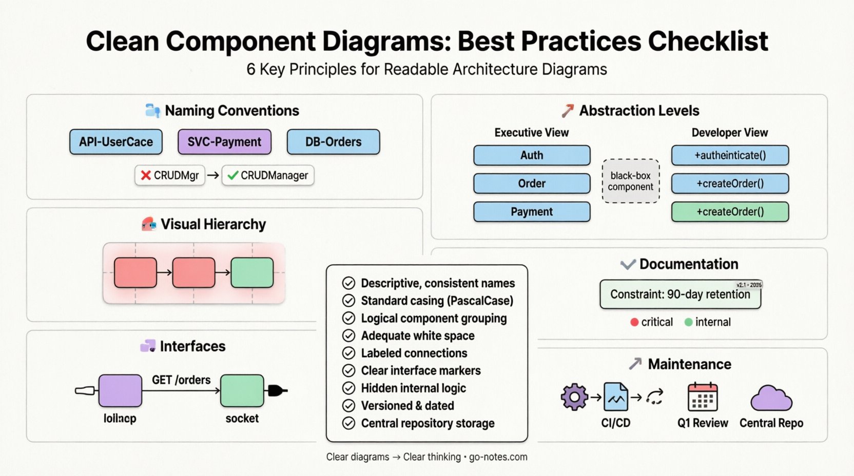
1️⃣ Naming Conventions and Precision 🔤
Names are the primary identifiers within any diagram. If a component name is vague, the entire diagram becomes ambiguous. Precision in naming eliminates the need for constant clarification during code reviews or sprint planning.
1.1 Consistent Prefixes and Suffixes
Use a standardized prefix system to indicate the type or layer of the component. This helps viewers categorize elements instantly without reading detailed descriptions. For example:
- API: Use
API-for external-facing interfaces. - Service: Use
SVC-for internal business logic units. - DB: Use
DB-for persistent storage entities.
Consistency creates a visual rhythm. When a viewer sees a pattern, they understand the context immediately. Inconsistent naming, such as mixing PaymentService with pay_handler, disrupts this rhythm and forces the brain to work harder to decode the meaning.
1.2 Avoid Abbreviations Without Context
While acronyms save space, they are dangerous in a diagram that might be viewed by onboarding engineers or stakeholders from non-technical backgrounds. If you must use an abbreviation, define it in a legend or use the full term in the first instance.
- Bad:
CRUDMgr - Good:
CRUDManager
Clear names reduce the likelihood of misinterpretation. If a name describes the function rather than just the acronym, the diagram becomes self-documenting.
1.3 Case Sensitivity and Spacing
Choose a casing style and stick to it across the entire architecture model. CamelCase, PascalCase, or snake_case are all acceptable, but mixing them creates visual noise.
- Recommendation: Use PascalCase for component names (e.g.,
OrderProcessor). - Recommendation: Use lowercase for interface names if they represent protocols (e.g.,
httpListener).
Uniformity suggests professionalism and discipline. It signals that the diagram is part of a governed system, not a collection of ad-hoc sketches.
2️⃣ Visual Hierarchy and Layout 🎨
A diagram is a map. Just as a map needs clear roads and boundaries, a component diagram needs spatial organization. The placement of elements dictates the flow of information.
2.1 Logical Grouping and Containers
Group related components together to represent logical domains or microservices. Use containers or subgraphs to visually separate concerns. This reduces the “wall of boxes” effect where everything looks equally important.
- Strategy: Place all database-related components in a dedicated area.
- Strategy: Group all user-facing interfaces on the left or top.
Grouping allows the reader to scan the diagram in chunks rather than one by one. It mirrors the mental model of how the system is organized in production.
2.2 Directionality and Flow
Establish a standard direction for data flow. Most systems read from left to right or top to bottom. Align connections to follow this natural reading path.
- Input: Place external triggers on the left.
- Output: Place storage or external services on the right.
When connections crisscross randomly, the diagram becomes a tangled web. Straight lines are easier to trace than curved lines that overlap other elements. If a line must cross another, use a bridge or gap symbol to indicate they do not connect.
2.3 Spacing and Alignment
White space is a design element, not an empty void. Give components breathing room. Align edges of boxes to create grid-like structures. Misaligned boxes suggest a lack of attention to detail.
- Tip: Use invisible grids to align components.
- Tip: Keep spacing between groups consistent.
A tidy layout reduces cognitive load. When the eye doesn’t have to hunt for the next element, the reader can focus on the relationships and logic.
3️⃣ Interfaces and Connections 🧩
Components do not exist in isolation. They interact through interfaces. Defining these interactions clearly is crucial for understanding system boundaries and dependencies.
3.1 Provided vs. Required Interfaces
Use distinct notations to show what a component offers and what it needs. This clarifies dependencies without revealing internal implementation details.
- Provided Interface: Represented by a “lollipop” symbol (circle with a line).
- Required Interface: Represented by a “socket” symbol (semicircle with a line).
This visual distinction allows architects to quickly spot circular dependencies or missing implementations. It separates the “what” (interface) from the “how” (implementation).
3.2 Connection Labeling
Never leave a connection line unlabeled. A line implies data flow, but the label defines the nature of that flow.
- Example:
GET /orders - Example:
Event: OrderCreated
Labels should describe the protocol or data payload. If a connection handles multiple types of traffic, list the primary use case or use a tag to indicate multiplicity.
3.3 Avoiding Connection Clutter
Too many lines make a diagram unreadable. If a component connects to many others, consider using a bus or middleware pattern representation. Alternatively, group connections by type.
- Direct Connections: Use for critical, synchronous paths.
- Indirect Connections: Use message queues or event buses for decoupled systems.
Visual clutter hides critical paths. If everything is connected to everything, nothing is critical. Simplify where possible to highlight the most important data pathways.
4️⃣ Abstraction Levels and Detail 📉
A component diagram is not a code dump. It is an abstraction. The goal is to show structure, not implementation logic. Balancing detail is the hardest part of diagramming.
4.1 The Golden Rule of Abstraction
Include only the information necessary for the audience. A high-level architectural diagram should not list database columns or method signatures. A detailed design diagram might include them.
- Executive View: Focus on services, external systems, and data storage.
- Developer View: Focus on modules, internal interfaces, and data contracts.
Mixing these views creates confusion. Stakeholders do not need to see the private void process() method, but developers do need to know the interface contract.
4.2 Hiding Internal Logic
Do not draw internal logic inside the component box unless it is critical to the boundary definition. A component box should represent a black box. The focus is on input and output, not the processing steps inside.
- Bad: Listing every function inside a Service box.
- Good: Listing only the interface methods exposed to the outside world.
Keeping internals hidden maintains encapsulation in the diagram, just as it does in the code. This prevents the diagram from becoming outdated when internal refactoring occurs.
4.3 Managing Complexity
If a single component becomes too complex to represent, decompose it. Create a new diagram for that specific component and link it via a hyperlink or reference note. This keeps the main diagram clean while preserving detail where needed.
- Technique: Use drill-down links or reference numbers.
- Technique: Create a “Sub-System” diagram for large modules.
Decomposition prevents the “big picture” from becoming unreadable. It allows the architecture to scale visually as the system scales functionally.
5️⃣ Documentation and Annotations 📝
Diagrams are static representations of dynamic systems. Context is required to explain why a design decision was made. Annotations provide this context without cluttering the visual model.
5.1 Use Notes for Constraints
Use note boxes to highlight non-functional requirements or constraints. These might include performance limits, security policies, or compliance rules.
- Example:
Constraint: Data retention must be 90 days. - Example:
Constraint: Must support 10k concurrent connections.
These constraints are often missed during implementation if they are not explicitly documented alongside the design.
5.2 Metadata and Versioning
Every diagram should have metadata. Include the version number, the date of creation, and the author. This helps teams track the evolution of the architecture.
- Field:
Version: 2.1 - Field:
Last Updated: 2023-10-15
Versioning ensures that developers are not working from outdated diagrams. It establishes a single source of truth for the current state of the system.
5.3 Legend and Key
If you use custom symbols or colors, provide a legend. Do not assume the reader knows what a specific color implies. Consistency in the legend is key.
- Red: Critical dependency or external risk.
- Green: Internal, low-risk component.
A legend prevents ambiguity. It turns a subjective color choice into an objective data point.
6️⃣ Maintenance and Lifecycle 🔄
A diagram that is not maintained is a liability. It becomes a source of misinformation. Treat the diagram as code that requires review and updates.
6.1 Integration with CI/CD
Where possible, automate the generation of diagrams from the codebase or configuration files. This ensures the diagram always matches the implementation. If the code changes, the diagram updates.
- Benefit: Reduces manual effort.
- Benefit: Eliminates documentation drift.
Automated generation is not always possible, but the goal should be to minimize manual editing. Manual editing introduces human error and inconsistency.
6.2 Scheduled Reviews
Include diagram updates in the sprint planning or release cycle. Do not wait for a major refactoring to update the visuals. Small changes accumulate into large discrepancies.
- Trigger: Add a new microservice.
- Trigger: Deprecate an API endpoint.
Regular reviews keep the documentation relevant. They force the team to acknowledge the current state of the system.
6.3 Accessibility and Distribution
Ensure the diagrams are stored in a central repository accessible to all stakeholders. Avoid sending diagrams via email attachments where versions get lost.
- Platform: Use a shared wiki or documentation site.
- Format: Export to PDF for static viewing and SVG for editing.
Centralized access ensures everyone is looking at the same map. It facilitates collaboration and reduces the risk of working off outdated information.
📋 Component Diagram Best Practices Checklist
| Category | Checklist Item | Status |
|---|---|---|
| Naming | Are all component names descriptive and consistent? | ⬜ |
| Naming | Is a standard casing style applied (e.g., PascalCase)? | ⬜ |
| Visuals | Are related components grouped logically? | ⬜ |
| Visuals | Is there adequate white space between elements? | ⬜ |
| Connections | Are all connection lines labeled with protocol or data type? | ⬜ |
| Connections | Are interfaces (provided/required) clearly marked? | ⬜ |
| Abstraction | Is internal logic hidden from the main view? | ⬜ |
| Maintenance | Is the diagram versioned and dated? | ⬜ |
| Maintenance | Is the diagram stored in a central repository? | ⬜ |
🚀 Sustaining Clarity Over Time
The effort put into a clean component diagram pays dividends in reduced debugging time and faster onboarding. When a diagram is readable, it becomes a reference point for decision-making. It allows the team to discuss architecture without ambiguity.
Remember that diagrams are living documents. They evolve as the system evolves. By following these best practices, you ensure that the visual representation remains a trustworthy partner in the development lifecycle. Focus on consistency, clarity, and maintenance. These three pillars will keep your architecture documentation effective for the long term.
Start applying these principles to your next modeling task. Review existing diagrams against the checklist above. Identify areas of clutter and refine them. Over time, the cumulative effect will be a more robust and understandable system design.
Clear diagrams lead to clear thinking. Prioritize the visual quality of your architectural documentation as much as the code itself. It is a foundational element of engineering excellence.

